
Filling Live Text with Images in InDesign
Want to get an image inside some text in InDesign? You don’t have to convert it to outlines if you use a white background and a blend mode trick.

This article appears in Issue 53 of InDesign Magazine.
Filling text with an image is a classic, eye-catching effect. And it’s pretty easy to create. Normally, to accomplish this look all you have to do is convert the text to outlines and then place an image into the outlines as you would any other graphic frame. But there are downsides to converting text to outlines. Maintaining live text allows you experiment with different fonts and effects more freely and arrive at your finished look faster. It can also save time later on if you need to change the text. And in fact, you can display an image inside live text, as long you don’t mind the text appearing on a solid white background. The background is used to hide most of the photo, while some blend mode magic reveals the image inside the letter shapes.
1. Use RGB Transparency Blend Space
You’ll have access to a wider range of effects if you blend colors in the RGB transparency blend space. To set a document to this space, choose Edit > Transparency Blend Space > Document RGB. For more details, see the sidebar “What Is Transparency Blend Space?”
blend them or flatten transparency. When you blend colors by reducing opacity, applying transparency effects, or using blend modes, InDesign uses a common color space for the blending. This is called the transparency blend space, and every InDesign document is set to use either CMYK or RGB (Edit > Transparency blend space). The moment you use transparency, all the colors on the current spread are converted to that blend space, even ones that aren’t directly involved in the blending. Most of the time you might not see any change. But you might notice a significant difference if you have RGB content in a document that uses CMYK blend space. When you blend colors in that instance, all the most vibrant and saturated RGB colors that can’t be represented in CMYK are shifted, sometimes dramatically, and typically look darker and duller. If your document is intended for print output, you might be hesitant to use RGB blend space. But even if you use RGB to blend colors, that doesn’t mean you have to output in RGB. In the Output tab of the Export Adobe PDF dialog box, under Color Conversion, select Convert to Destination (Preserve Numbers). Then select a CMYK Destination profile to produce a PDF with only CMYK colors in it. In some cases, you may need to use Adobe Acrobat’s transparency flattening and color conversion tools to fully preserve the appearance of InDesign FX that require RGB blend space in your CMYK output. As always, proof your work carefully, and communicate with your commercial printer early and often about any color concerns you have.
2. Place an Image
Choose an image that is of sufficient size and resolution to accommodate your text. You might want to use an oversized image so you can tweak the final look by adjusting the image’s scaling or position inside the frame. 
3. Create a Text Frame
Next, cover the image with a text frame. Make the text frame at least as large as the image to cover it completely, and fill it with the [Paper] color from the Swatches panel.
4. Add the Text and Fill It with Neutral Gray
Type or paste in your text. Then fill it with a 50% tint of [Black] from the Swatches panel. ![The words "flower power" in gray stacked on two lines, with the Swatches panel showing [Black] swatch highlighted with value of 50% in the tint field.](https://creativepro.com/wp-content/uploads/2025/01/live_text_images-fig02.600px.jpg)
5. Apply the Hard Light Blending Mode
Select the text frame with the Selection tool. Then go to the Effects panel, click on the word Text, and select Hard Light from the blend mode menu. The text will mostly disappear, because Hard Light only allows tones lighter or darker than 50% gray to be visible.
6. Apply Knockout Group at the Object level
In the Effects panel, click on the word Object to target the entire text frame and its contents, and then click on Knockout Group. This makes the underlying image visible through the text by turning off the Hard Light blend mode within the “group” (in this case, the group is the text frame). In effect, the text is forced to “knock out” the fill color of the text frame. 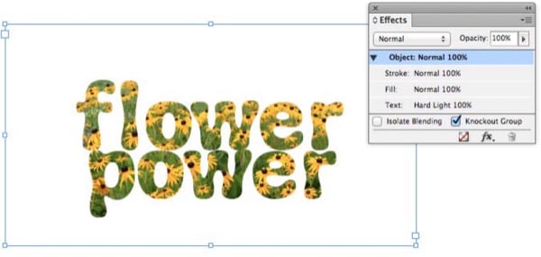
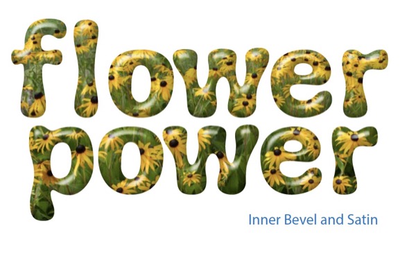
7. Apply Effects and Edit Text as Desired
Now comes the really fun part. You can apply transparency effects like bevels, glows, drop shadow, inner shadow, and so on to your live knockout text. You can experiment and create all kinds of looks, and when the inevitable call comes for you to edit the text or change the font, you don’t have to start all over again, because you never converted your text to outlines. 


Commenting is easier and faster when you're logged in!

Recommended for you

Tip of the Week: Creating Cast Shadows
How to create a realistic cast shadow effect on native objects in InDesign.
Creating Patterned Shadows in InDesign
How to make alternatives to a traditional drop shadow in InDesign

InDesign Nightmares
Terrifying tales of the evil that lurks in some InDesign files, and how to survi...