

Have you ever opened an InDesign document and wondered, geez, why am I seeing all this highlighting?
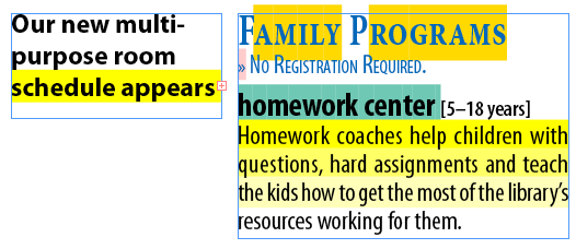
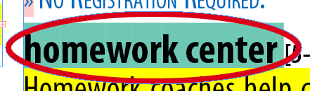
Okay, maybe not THAT much highlighting! But even a single unexpected instance can be disconcerting if you don’t know the cause, as Alex e-mailed us about a few days ago. He wanted to know why a line of text had a yellow background (even though no custom rules or underlines had been applied, as far as he could tell), and attached a screen shot to show us:
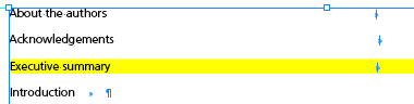
Our best guess here is that he’s seeing Composition Highlighting at work, specifically, a violation of the Hyphenation and/or Justification (H&J) settings for this “Executive summary” line, same as the “Homework coaches help children with” line in the first screen shot.
When you turn on Composition Highlighting for H&J violations, InDesign applies a deep yellow highlight to the lines that veer furthest from your desired Hyphenation settings or (more often) the minimum/maximum spacing values you set in the Justification dialog box or paragraph style for that paragraph.
David and I talked about Composition Highlighting in Podcast #55 (in fact it was part of that episode’s Quizzler contest), but never really showed any examples. So Alex’s e-mail prompted me to actually write about it.
The Dreaded Pinking
There are five different options you can enable in the Composition Highlighting area in Preferences, but only one is turned on by default: Substituted Fonts, aka “The Dreaded Pinking.’
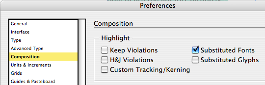
Every InDesign user who’s done more than a few projects is familiar with The Dreaded Pinking; its decaying pink fleshtone color appears behind substituted fonts when you heedlessly ignore the “Missing Fonts” alert and open a layout anyway.
If the smell is getting to you, just turn off the Substituted Fonts highlighting in Preferences > Composition. The font will still be missing and InDesign still substitutes a fake one, but at least you can edit the text without the distracting pinking. (Of course, don’t forget that it’s a fake font! Line breaks and kerning aren’t exactly the same as if the actual font were loaded.)
Substituted Glyphs
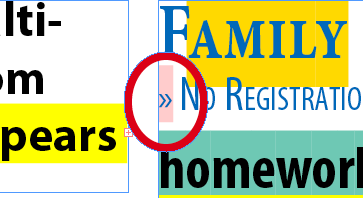
I think this should be called “Alternative Glyphs” since that’s more in line with what the highlight indicates. When InDesign replaces certain glyphs in an Open Type font with alternative ones, if you’ve enabled Substituted Glyphs in your composition highlight preferences, it highlights those alternates with an amber color (what is it with Adobe and shades of yellow … I don’t get it).
For example, if an Open Type font has built-in Small Caps, and you apply small cap formatting to some of its characters, InDesign swaps in those alternative Small Cap glyphs. The Substituted Glyphs highlighting will show you where that and other OT swapping has occured in your layout.
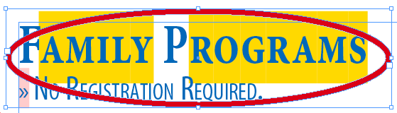
Note that the small caps applied to the line underneath, “No Registration Required,” isn’t highlighted. That’s because there’s no substitution going on, the font doesn’t have any built-in small caps, so InDesign used the capitals in the font and scaled them down, using the Small Caps percentage amount in Preferences > Advanced Type.
H&J Violations
I already covered this in the intro (Alex’s example), except that I didn’t mention that InDesign actually uses three shades of yellow to indicate H&J violations. The lightest shade is for tiny deviations from the H&J settings, then there’s Mama Bear, and the deep Papa Bear yellow is for the severest deviations. You can see the three shades in this screen shot (which did I mention took me about 3 hours to set up so it’d show these in order, I hope you appreciate it…)

No one’s breaking the hyphenation rules here, it’s been turned off completely. But because I applied very little leeway in letter spacing; the first line deviates the most from the desired setting (use the letter spacing in the last, unhighlighted line as the “goal”), the second line deviates a little less, and the third line barely deviates.
Now, when I first saw this, I thought the third highlighted line broke the rules the most, I mean, look at that upcloseandpersonal word spacing! Especially compared to the final line, which has the proper amount of word spacing.
The key is leeway … take a look at the settings governing the paragraph:

Word spacing has room to play, from 90% to 115%, so fewer lines, including the tight one, will have broken that rule. However, Letter Spacing is confined to a 7% range (-5% to 2%), and is weighted toward less (tighter) spacing than more. Look again at the sample text and you can see why the first line, with its relatively loose letter spacing, is the worst offender.
Custom Tracking/Kerning
Next to Substituted Fonts, this composition highlighting is the most useful in a production environment. Turn it on in Preferences and you can immediately see where someone has swiped over the text and tracked it in or out to make things fit.
Sometimes I get files from clients and when I’m trying to puzzle out how they typeset it, I’ll turn on the Custom Tracking/Kerning highlighting and bam! Almost every paragraph is green.
Unfortunately, there’s only one shade of green highlighting (or would you call that turquoise … hard to tell), so you can’t decipher when something is extremely tracked vs. just a little bit tracked unless you actually click inside the text and look at the Tracking/Kerning fields in the Control panel.
Keeps Violations
This is probably the least useful highlighting, only because it’s so rare … InDesign hardly ever breaks the Keeps settings (Keep paragraph together, Keep paragraph with next 2 lines, etc.) that are in effect in a paragraph’s Keep Options; instead it just oversets text frames.
So it was kinda hard to get the bright RGB Yellow highlighting indicating a Keeps Violation for this part of the screenshot:

To force it to appear, I clicked inside the paragraph and set Keep Options to keep three lines together at the start and end of the paragraph:

Then I entered a 5-line paragraph–one line short of what Keeps required–and forced an overset (or I could’ve threaded it to another frame, the same line would’ve been highlighted). Since the paragraph has to break the rule, the highlighting appears. I don’t know why, but Keeps violation highlighting always appears in the last line of a column or frame that the violating paragraph straddles, even if it’s not until the next column/frame where the violation is evident. Probably some programming thing.
So there you go, the Field Guide to Composition Highlighting. Print this out on your color printer and keep it with your bird watching book to spot composition errors in the wild.
In episode 55 of our podcast, by the way, we didn’t tell listeners the color of the Keeps violation highlighting, we saved it for the Quizzler contest question. (And so, in order to discover it, listeners had to figure out how to force a Keeps violation in the first place. Mwa-ha-ha-ha! We’re so evil!)
We received a bunch of wonderful answers, and some users actually measured the color of the highlighting to ensure they were being exact enough so they’d qualify for the prize (David’s InDesign CS3 Essentials video training on DVD.) That’s how I know it’s R255 G255 B0, or RGB Yellow!
This article was last modified on December 19, 2021
This article was first published on June 20, 2008
Commenting is easier and faster when you're logged in!

Recommended for you

Why Are My Hyperlinks Still Working?
Jacob wrote to us with a problem he was having with a file: he was having troubl...
Numbering Lines of Text
S.A. wrote: Do we have any option of inserting auto line numbers in InDesign CS3...
Replacing a Character with an Inline Object
S.W. wrote: Is there a way to convert all instances of font/dingbat to outlines...