Fast Photoshop: Blending Text With a Photo

OK, I realize this is kind of meta, since it’s a CreativePro article about an image for a CreativePro article, but as I was preparing the slideshow image for Erica Gamet’s story on Awesome Autumnal Assets, I thought, “this would make a good tip.” So here it is, how to recognize and execute a small, subtle, but impactful design element in Photoshop.
Daddy, where do slideshow images come from?
CreativePro feature articles all have an image in the slideshow at the top of the homepage. Creating this image is part of the publishing process for an article. And often times, we need to come up with the slideshow image very quickly, in a matter of minutes, since the Web waits for no one. It’s a far cry from my days working in print production, when I could fuss in Photoshop for hours, getting the hooves on a horse to look appropriately hoofy.
So I started by grabbing an autumnal piece of stock art,
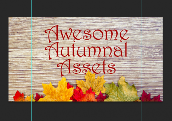
and added the article title in a decorative font.
Never thought I’d use Harrington unironically, but there it is, and I like the way it combines with the wood grain and the leaves. It’s got a little Renaissance Fair in it, but not too much Renaissance Fair.
But when I looked at this image, it still felt like it needed that proverbial something extra. It had no pop.
Searching for a “Pop”portunity
So I thought about the leaves in the photo. What do leaves do in the autumn? They fall and cover over everything on the ground. So it seemed natural that they should interact with the text by sitting on top of it. Like Mother Nature was acting as graphic designer.
Obviously, given the position of the leaves, they could only cover a small piece of the text, but that was OK. I’m looking for a pinch of spice, not a whole new recipe.
If this had been back in the print design days, I probably would’ve found other leaves to drop into the image and scatter them on other parts of the text. But there was no time for that, so I played with the size and leading of the text to get a decent-sized piece of the “s” and the “e” overlapping one of the yellow leaves.
Then to make it look like the yellow leaf was on top of the text, I just added a layer mask to the type layer, grabbed the Brush tool and painted with black where the letters overlapped the leaf. Voila, the leaf is now on top of the text, or so it seems.
It can be helpful to get a view of the mask itself to make sure you don’t miss any important spots. Hold Option/Alt and click on the mask thumbnail in the Layers panel to see it isolated in the image window.
Or hold Shift+Option/Alt and click on the mask thumbnail in the Layers panel to see it in QuickMask mode.
You can also use the Properties panel to refine the mask, or change the QuickMask color (choose Mask Options in the panel menu).
Do what’s necessary, and move on
In all, masking the text like this is about 15 seconds of work, and you’re done. Maybe 30 seconds if you want to be really fussy and get that edge where the leaf meets the letters just right. But my advice if you need to work quickly (and who doesn’t?) is to keep checking what the image looks like at 100% magnification. That’s what people will see. If you love working in Photoshop, it’s too easy to get sucked in by the desire to make every pixel perfect, when the reality is you might be wasting time on invisible details. I’m all for craftsmanship and quality, but only when they serve a purpose. Never lose sight of how the image is to be viewed and by whom. Otherwise, you’re using Photoshop for entertainment and not as a tool to get a job done. Also, get off my lawn.
Brush tool shortcuts
The Brush tool keyboard shortcuts are indispensable for working quickly on stuff like this:
The square bracket keys [ and ] decrease/increase the brush size. And Shift+ the square bracket keys will decrease/increase the Hardness of the brush. In this case, I wanted a hard edge and a relatively small round brush to follow the edges of the leaf.
Or if memorizing shortcuts isn’t your thing, just right-click anywhere in the image to get the Brush Preset picker right at your cursor.
One thing I wish I’d done differently was to change the color of the text. Picking up one of the hues from the leaves with the Eyedropper would’ve given it a warmer Octoberfesty, apple picking, cinnamon-pumpkin-spice kind of flavor without sacrificing too much readability.
Oh well, that’s thing thing about making images for the Web, there’s no time to dwell on feats or fails; there’s always another image that needs to be done…fast!
This article was last modified on January 8, 2023
This article was first published on September 26, 2014
Commenting is easier and faster when you're logged in!
Recommended for you

Daily Dishonesty
If you’re a fan of clever hand-lettered typography, check out a blog calle...

The Measure of Type
Agates. Ciceros. Nuts. Even people who use type every day may not know these wei...

Using InDesign, Illustrator, and Photoshop Together: Getting the Most From the Interface
When Adobe first created the concept of a “Creative Suite,” they wanted to make...


