
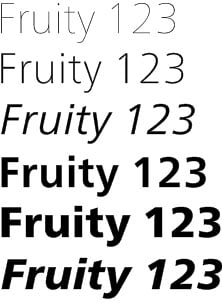
You can keep your suddenly-cool-again Helvetica. My love is reserved for Frutiger, created by Adrian Frutiger in 1968 and released to the public in 1976. But I’m no purist, so the news that Akira Kobayashi (Linotype GmbH’s type director) and Adrian Frutiger had collaborated to create announced the Neue Frutiger font family was welcome.
Kobayashi and Frutiger have redone the italic cursive, adjusted character shapes and proportions, and added five weights for a total of 10 weights that go from ultra light to extra black. Yet Neue Frutiger is still compatible with the original Frutiger.
For more information about Neue Frutiger, go to www.neuefrutiger.com.
This article was last modified on December 14, 2022
This article was first published on August 12, 2009
Commenting is easier and faster when you're logged in!

Recommended for you

The Measure of Type
Agates. Ciceros. Nuts. Even people who use type every day may not know these wei...

TypeTalk: Top Fonts of 2008
Q. What typefaces have been hot recently? A. The past year was a great one for t...

Bob Dylan’s Hand Lettering Experience
We all spend many hours in front of our various screens, wrestling inspiration f...