

Press release
With LAIKA, there is finally a font that can seamlessly use the whole spectrum of its cuts. A font that is able to move between its extremes in real time. An interactive font that is able to respond to its surroundings. A font that questions deadlocked dogmas and throws up completely new design questions, and thus has the potential to revolutionize the understanding of digital typography.
Type has always been something static.
In considering type we speak, for example, in terms of bold, thin, grotesque, classical, roman, italic: terms that all describe a defined variant of the font family. Thus we only ever see individual fixed points in what is actually an infinitely wide space of possibilities.
With digitalisation, however, typeface has left its manifest image – cast in lead – behind, and with it all the associated limitations. Computer-based applications, the Internet and new, fluid advertising media allow us to go beyond the existing, static view of typography.
LAIKA is neither bold nor thin, but swings between these two extremes. Its form is no longer defined statically, but alters dynamically. As well as the font’s weight, the stroke contrast, serif lengths and italic angles of the font all behave dynamically too. All these parameters can be driven and influenced by a range of inputs, in order to create a typeface that changes constantly in real time.
LAIKA requires a whole new, dynamic understanding of typography.
LAIKA from Michael Flückiger on Vimeo.
Why should a typeface be rigidly set, if it is not going to be printed? In a dynamic medium, why shouldn’t the form and the character of the typeface be understood dynamically as well? Why shouldn’t its forms change, transform, and respond to circumstances?
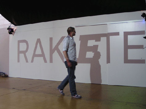
Prototypical applications show their potential in combination with interactive, audiovisual inputs, data requested from the Internet in real-time (RSS feeds), and electronic components such as sensors or simple switches. In this way, an advertising text could react to passers-by, stock market prices could influence a corporate typeface, or ECG measurements taken while writing could breathe new emotional life into digital love letters.
With LAIKA, there is finally a font that can seamlessly use the whole spectrum of its cuts. A font that is able to move between its extremes in real time. An interactive font that is able to respond to its surroundings. A font that questions deadlocked dogmas and throws up completely new design questions, and thus has the potential to revolutionise the understanding of digital typography.
LAIKA “Roman” and LAIKA “as-heavy-as-you-are”:

LAIKA interacting with passers-by:
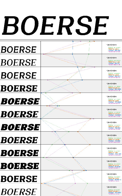
LAIKA, responsive to stock exchange quotations:
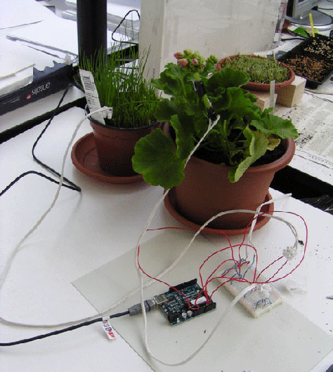
LAIKA can be responsive to any inputs you could imagine. Here it is responsive to the circadian rhythm of a geranium:
This article was last modified on January 18, 2023
This article was first published on February 9, 2010
Commenting is easier and faster when you're logged in!

Recommended for you

Adobe's New Open Source Font: Source Code Pro
This past summer, Adobe released their first open source type family, Source San...

A Font to Fight Illiteracy
Over the years, there have been several notable efforts to use fonts as the mean...
Just Say "No" to Automatic Leading
This could be a very short article: Never use automatic leading. Period. End of...