


InDesign can make decent-looking drop caps at the push of a button, but I always seem to find myself battling to make them look better. After spending much time in the trenches, I have a few insights and undocumented techniques.
You can control the basic aspects of drop caps—how many characters to enlarge and how many lines deep to make them—from the Control panel, but other crucial controls are available only from the Drop Caps and Nested Styles options, found in the Paragraph panel menu (or by pressing Command+Option+R/Ctrl+Alt+R).
Here you should always check Align Left Edge, which causes InDesign to set the visible part of the character flush left against the margin. This ignores the drop cap’s side bearing, the sliver of space that would otherwise cause it to indent slightly (Figure 1).

Figure 1. Almost every character has side bearings, slight spaces on their flanks that keep them from colliding with their neighbors. In large settings, such as display type and drop caps, these spaces become big enough to notice, and even distract, as illustrated here.
The Scale for Descenders option assures that all the drop caps in a document are the same number of lines deep, at the expense of making those with descenders (Q and J, among the capitals) smaller to fit them into this Procrustean bed. I usually leave this one unchecked. For me, it’s preferable to have all the drop caps in a document the same point size, even if the depth of the indent they require may vary. That said, descending drop cap characters are a headache. (We’ll cover them in more detail in “The Curse of the Descending Drop Cap” below.)
Alignment: Kerning Beyond the Margins
Even with Align Left Edge checked, drop caps, especially large ones, will still tend to appear slightly indented if their left sides are rounded. G, S, C, and O are the main culprits (Figure 2). The same is true for characters whose left sides are pointed, such as A, V, and Y. For such characters to appear truly flush left, they should hang out past the left margin a bit. But how to accomplish that?
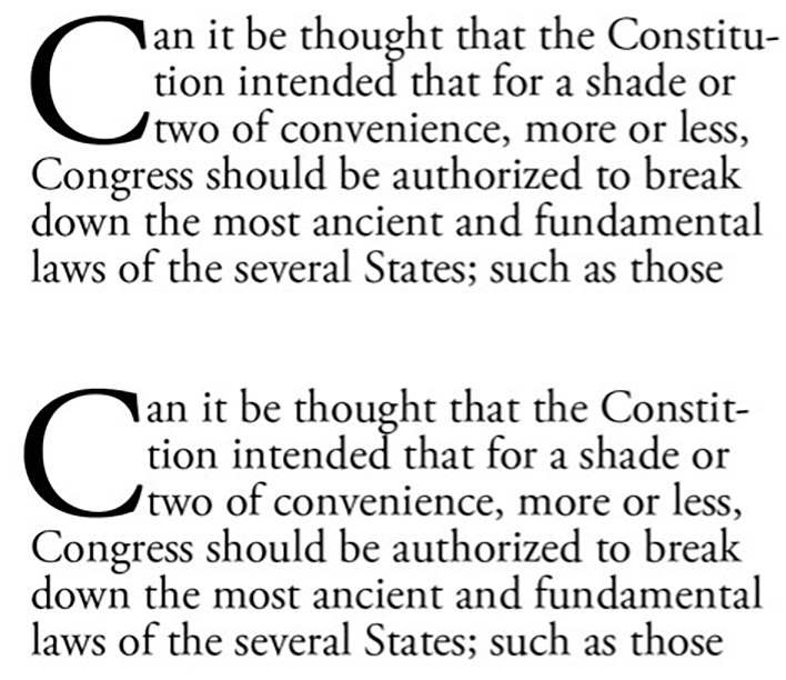
Figure 2. In the upper sample, the drop cap seems slightly indented even though it sets hard against the left margin. That’s because of the graphic weakness of its curved extremity. In the lower sample, the drop cap has been kerned to the left, beyond the nominal margin, to establish more apparent flush-left alignment.
The trick is to precede your drop cap characters with a narrow space—a hair space will do—and set your drop cap to be two characters wide (the space plus the visible cap). Position the cursor between the drop cap and the space, and use your keyboard kerning commands (Option/Alt+Left Arrow) to adjust the drop cap’s position on the left margin. You can cause the left side of the drop cap to move past the margin, even if that causes it to hang out of the frame itself.
You can kern like this until the normal-size paragraph text reaches the edge of the frame. That is, you can move the drop cap far enough left to be wholly outside of the frame, but no farther.
How Big Is a Drop Cap?
But now comes a curious question: What actually is the point size of a drop cap that your program creates? InDesign isn’t talking; its Control panel always shows the drop cap being the same point size as the paragraph text, which it clearly isn’t. If you want to create other type the same size as your drop caps, how can you do so without setting guides around your drop cap and undertaking tedious trial and error?
I’ve found an easy technique to learn a drop cap’s point size, but it starts in a bizarre fashion: by resetting your Auto Leading value to 100%. (Bear with me for what will seem like a digression!)
By default, InDesign sets Auto Leading to 120% of whatever point size you use, and also by default, the program chooses Auto as a leading setting for you.
Reset the Auto Leading value (in the Justification dialog box, from the Paragraph panel menu) to 100% without the text cursor activated. From that point on, InDesign will default to a solid setting, where leading equals point size.
If you have a drop cap in InDesign and want to know its point size, select the drop cap and change its leading to Auto. With the drop cap still selected, choose Create Outlines from the Type menu. Suddenly you’ll see a new leading value appear in the Control panel (Figure 3), and because the drop cap’s leading has been set to solid, this value also represents the drop cap’s point size.
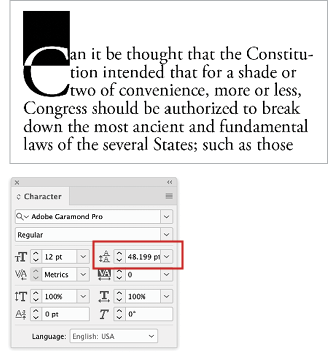
Figure 3. After you’ve converted a drop cap to outlines, InDesign still won’t show you its real point size, but it will reveal its leading, as shown here. As long as the drop cap is set with solid leading, that value is equal to the drop cap’s point size, in this case 48.199 points.
If you just want to know the true measurement of the height of your InDesign drop cap, click the outlined drop cap’s frame. You’ll see the height of its bounding box in the Control panel.
Unless you want to keep your drop cap as an object, press Command/Ctrl +Z enough times to undo your changes and restore the drop cap to normal text.
Refining an Outline Drop Cap
Turning your drop caps into outlines opens a wide range of graphic possibilities. It’s important to note, though, that once you’ve done so, the kerning trick mentioned above won’t work anymore. Be sure to reposition your drop cap before converting to outlines.
Turning drop caps into outlines also changes their spacing relative to the text next to them. The text type now snuggles right up against the drop cap (actually, its bounding box, as shown in Figure 4), so if you do convert a drop cap to outlines for whatever reason, you’ll have to make some spacing adjustments.

Figure 4. The version on top shows a drop cap’s alignment before its conversion into an object. After it’s been converted, as in the lower version, the paragraph text to its right aligns smack up against the glyph—too close for comfort.
Be aware that there are also negative consequences for accessibility since the outlined characters aren’t live text and won’t be read by any assistive technology. In some cases you may be able to use the obscure command Create Outlines Without Deleting Text after positioning your drop cap exactly where you want it to be and selecting it. This command doesn’t appear in any menu. You can only apply it with the keyboard shortcut Command+Shift+Option+O/Ctrl+Shift+Alt+O. The live text will be preserved directly underneath the outlined drop cap.
If you decide to use regular outlined drop caps (without preserving the live text), you’ll be glad to know that InDesign continues to recognize some type characteristics after creating outlines. If you place the text cursor between the drop cap and the first character of regular text in the paragraph, you can use manual kerning commands to push the text to the right and re-establish proper spacing between it and the drop cap. Kerning this one space will cause all the lines indented by the drop cap to move in unison.
Having made the conversion, you can also change the setting controlling how many lines deep your drop cap is without affecting its size. This allows you to create partially dropped caps (Figure 5). You’ll probably have to add space after the preceding paragraph to keep the drop cap from crashing into it.

Figure 5. After you convert your InDesign drop cap to outlines, reducing the depth of the drop cap causes the drop cap to jump upward to align on a higher baseline. Here, a previously four-line-deep drop cap has been made three lines deep.
The Curse of the Descending Drop Cap
Enabling Scale for Descenders in InDesign’s Drop Caps and Nested Styles dialog box will cause InDesign to reduce the size of descending characters to fit them into the indent created when you specify how many lines deep the drop cap should be. But what if you want all your drop caps to be the same point size?
With Scale for Descenders unselected, you may get a drop cap like the one in Figure 6, which is distinctly a problem. The solution is to first select the drop cap, then change its leading to Auto and convert it to outlines. Then look at how many lines deeper your drop cap indent will need to be in order to accommodate the descender, and change your drop cap specs accordingly. This will cause your drop cap to sink lower and out of position, so select it and use the Up Arrow key to move it into proper top-alignment. Lastly, kern the space between the cap and the first-line text to restore correct spacing between cap and text.
This is all seriously geeky stuff, and in a better world, there would be better ways to accomplish these things. But in the meantime, I guess we should be pleased that we can do them at all.
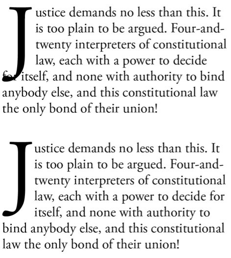
Figure 6. The cure for a descending character, such as the one in the upper sample here, is to convert it to outlines, freezing its size, add another line of depth to the drop cap indent, and then adjust the drop caps vertical position. The lower sample shows the “after” version.
Commenting is easier and faster when you're logged in!

Recommended for you


Valentine's Type Haiku Contest
You know you have a favorite font — we all do. In honor of Valentine’s Day...

Chalk Lettering, a Return to Low Tech
One of the most charming trends to hit graphic design and typographic solutions...