


dot-font was a collection of short articles written by editor and typographer John D. Barry (the former editor and publisher of the typographic journal U&lc) for CreativePro. If you’d like to read more from this series, click here.
Eventually, John gathered a selection of these articles into two books, dot-font: Talking About Design and dot-font: Talking About Fonts, which are available free to download here. You can find more from John at his website, https://johndberry.com.
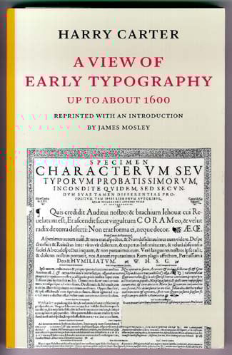
Not many books with scholarly footnotes, and a title that begins “A View of…”, would be considered must-have resources for the modern graphic designer or type user. After all, how much of the minutiae of cutting metal punches in Renaissance France or Reformation Germany will come in useful when you’re faced with a deadline for that product catalog or annual report? But Harry Carter’s book, “A View of Early Typography: Up to About 1600,” recently republished by Hyphen Press, is the exception. If you care anything about the history—the context—of the craft we all practice, then you’ll be richly rewarded by reading this book.
Carter deals quietly and calmly with his subject, in a written voice that must recall his spoken voice (the five main chapters were originally given as lectures at Oxford in 1968) and that is direct, clear, and utterly un-fussy. I have no idea what Harry Carter was like in person (he died in 1982), but I can imagine sitting comfortably in a room with him and—apart from the necessary apparatus of a slide presentation (the talks were illustrated, as the book is)—simply listening to him talk.
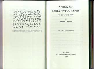
Title page of the original edition.
His subject is the first hundred and fifty or so years of making and using movable type. More specifically, he is interested in how you can tell what types were used in early books, who cut them and cast them, and what that can tell us about who they were and where they came from. Carter is looking at a very specific set of crafts, but he puts the story in the context of its time and place: western and central Europe at a moment of intense cultural revival, political striving, and violent religious confrontation. Being a printer or a punchcutter or a type founder in those days was not necessarily a safe job.
“The Face Comes Loose From the Metal”
Carter’s opening chapter, “The Technicalities of Type,” starts off with the famous first line, “Type is something that you can pick up and hold in your hand.” At the time he wrote, before digital type and when phototypesetting was just becoming popular, this was already a point that he felt it was important to make. Speaking of those who study old books, he went on: “Bibliographers mostly belong to a class of people for whom it is an abstraction: an unseen thing that leaves its mark on paper. For their convenience it has long been the practice to talk about a typeface, meaning, not the top surface of a piece of type, nor even of many pieces of assembled type, but the mark made by that surface inked and pressed into paper.” In the following pages, Carter explains how type was actually made, not just mechanically but historically, and how the various tasks involved got divided up, and later brought together again.
One of his points is that type foundries, which we think of as “where type gets made” and which we have morphed into today’s digital foundries, started out as a bunch of separate jobs being done by different people in several businesses. I have never read a better explanation of what it meant to cut punches, to use them to make matrices (impressions of what’s carved on the end of the punch), and to put each matrix into an adjustable mould and use that to cast type. It wasn’t until the middle of the 16th century, according to Carter, that these tasks started to be done under the same roof. There was a lively trade in punches, and in matrices, as well as in finished type, across much of Europe. In this process there was also a great deal of room for variation, intentional or otherwise, which is how a popular type design might spread across several countries, but the “same” typeface might look different when used by each city’s printer.
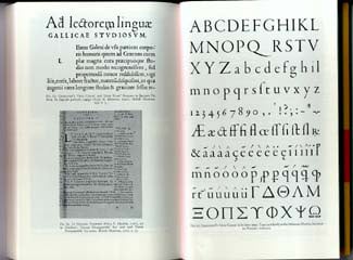
Early French types, including a New Testament in French rather than Latin.
Fewer Forms, More Readers
Carter’s next two chapters, “Diversity of Letter-forms in Print” and “The Establishment of Common Idioms,” explain the enormous variety in the styles of handwriting then current—often different styles written by the same person for different purposes—and how this first got translated into a bewildering variety of type styles, then later got narrowed down into a few standard styles (partly as a result of the centralization of type-founding) used for standard purposes. It wasn’t just a matter of “blackletter in Germany, roman and italic in Italy”; in an age when much of the printed matter had a propaganda purpose, or at least a few political implications, the style of type in which it was presented made a difference.
The fourth chapter, “Latin and Vernacular,” gets into the way printing and type were used to disseminate culture, and the implications of whether it was done in Latin or in the local tongue—and the expectations that readers had about which typeface would be used for each. In 1527, King François I of France ordered that a French translation of Thucydides’ History be printed, as part of a program for “enriching, magnifying, and publishing the French language.” The translator, who was also a diplomat and a churchman, “recommends the literary use of French as an aid to national aggrandizement and the consolidation of the king’s possessions.” As Carter points out, this is precisely what was done.
Cutting Letters
Carter concludes with “The History of Typefounding and Punchcutting,” which goes into a lot of detail but he uses it to show how ideas, tools, and small pieces of metal moved around Europe. He also adds a “Supplement on Italic,” which was not one of the original lecture series. Italic began as a separate style of type, used to set entire books, based on common forms of literary handwriting in Italy; only in the late 16th century did italic start to be subservient to roman, used as a complementary but secondary typeface, until, “After 1600 no punchcutter offered a Roman face without a companion Italic.” And there, at the end of the 16th century, Carter stops.
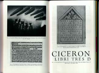
Steel punches and a variety of typefaces in use.
“A View of Early Typography” is generously illustrated, with 84 numbered plates at the back of the book; the captions carefully note whether the examples of printed types shown are at their original size or have been reduced. There’s a page of clearly drawn diagrams showing the parts of a piece of type, as well as photographs of moulds and punches and matrices; there is also a chart of the old named type sizes (long before they were standardized, much less given numbers in points), and at the end a very useful map of the printing centers of Europe in 1476.
Harry Carter’s book has been out of print for years, so it’s a delight to have this new, well-made edition, done as a facsimile of the original printing, with a new introduction by the equally erudite and clearly writer James Mosley and a few additional notes that either correct errors in Carter’s text or add more recent information. (Oddly, they missed one mistake in the original: the reference on page 124 to “Fig. 83” should clearly be to Figure 84, the final figure in the book.) Like most Hyphen Press books, this one is printed and bound in a way that makes it comfortable to hold and to read, and that ought to make it last a long time.
This article was last modified on February 23, 2022
This article was first published on October 20, 2003
Commenting is easier and faster when you're logged in!

Recommended for you

dot-font: Wading into the Dutch Type Library
dot-font was a collection of short articles written by editor and typographer Jo...
dot-font: Hot Metal & Cool Type
dot-font was a collection of short articles written by editor and typographer Jo...
dot-font: The Foibles of Font Substitution
dot-font was a collection of short articles written by editor and typographer Jo...