


dot-font was a collection of short articles written by editor and typographer John D. Barry (the former editor and publisher of the typographic journal U&lc) for CreativePro. If you’d like to read more from this series, click here.
Eventually, John gathered a selection of these articles into two books, dot-font: Talking About Design and dot-font: Talking About Fonts, which are available free to download here. You can find more from John at his website, https://johndberry.com.
When the most recent typeface brochure from House Industries arrived, promoting their new release Neutraface, I gazed at the image of steel letters on a wall and thought of another sans-serif type family with its roots in signage: the Hoefler Type Foundry’s Gotham. Both are geometric and almost aggressively simple in their design, and both date from the heyday of mid-century Modernism, which gives them a certain nostalgic appeal today. Both are inspired by clean, neutral, all-caps display lettering, but have been expanded into full type families with a lowercase, italics, and the attributes of text faces. It would be interesting, I thought, to compare the two.

The front of the brochure for Neutraface shows the steel architectural letters and an outline of Richard Neutra’s 1942 Boomerang chair.
Architect’s Rendering
Neutraface is based on the lettering found on some of the buildings designed by architect Richard J. Neutra. Unlike one of House Industries’ earlier “sources,” the imaginary fashion designer René Chalet, Richard Neutra is quite real; he died in 1970, and was a notable practitioner of Modern architecture. “His holistic approach,” says the House brochure, “affected everything from his choice of building signage to the design of his furniture.” (In typical House Industries fashion—these guys are masters of the collectible object—House hasn’t confined itself to producing a typeface, but is also offering a line of Neutra Textiles, as well as “a reproduction of Richard’s iconic Boomerang Chair” from 1942. “Now you don’t need to own a Neutra home to enjoy a piece of Neutra history,” they say.) Designer Christian Schwartz expanded the actual Neutra letters into a type family of five all-caps display weights, four text weights (with italics and even small caps), and two oddities based on Neutra’s lettering from engineering diagrams.

House Industries’ brochure makes use of metallic ink and spot varnish to give a layered effect in showing off Neutraface.
House Industries even offers the individual letters from several of the Neutraface fonts as three-dimensional stainless-steel letterforms: “perfect for uses ranging from facade signage to typo-centric decoration.” These are priced and marketed on the obvious assumption that you would only buy a few—enough for a house number, say, or initials—but you could use them for the signage of a large building, if you had the budget.

House Industries offers its Neutraface as stainless steel letters for use on buildings.
No-Nonsense Quality
The inspiration for HTF’s Gotham isn’t the work of a single iconic architect, but the lettering style common on buildings and signs throughout mid-century Manhattan. Tobias Frere-Jones celebrated his return to his native New York by designing a typeface based on the unnoticed everyday signage around him, starting with the lettering that labels the Port Authority Bus Terminal, the city’s central hub for long-distance buses, a block west of Times Square.

The Gotham samples bring to mind the visual cacophony of vernacular signage on the streets of New York.
“Like most American cities,” writes Jonathan Hoefler about Gotham, “New York is host to a number of mundane buildings whose facades exhibit a distinctively American form of sans serif. This kind of lettering occurs in many media: the same office buildings whose numbers are rendered in this style, in steel or cast bronze, often use this form of lettering for their engraved cornerstones as well. Cast iron plaques regularly feature this kind of lettering, as do countless painted signs and lithographed posters, many dating back as far as the Work Projects Administration of the 1930s. And judging by how often it appears in signs for car parks and liquor stores, this might well be the natural form once followed by neon-lit aluminum channel letters.
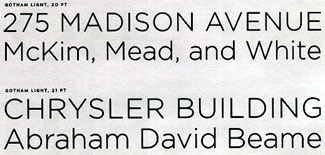
The sample phrases used in the Hoefler Type Foundry’s specimen of Gotham evokes the names and buildings of New York City.
“Although there is nothing to suggest that the makers of these different kinds of signs ever consciously followed the same models,” Hoefler goes on, “the consistency with which this style of letter appears in the American urban landscape suggests that these forms were once considered in some way elemental.”
Frere-Jones took these “plainspoken and practical alphabets of shop windows and billboards” and turned them into a four-weight type family of upper- and lowercase with italics for each weight, plus four weights of a condensed version (with a lowercase but without italics). (Perhaps the Hoefler Type Foundry missed a good bet by not working out an arrangement to offer neon signage based on Gotham. Or would that be redundant?)

Gotham is designed to work in both display and text settings.
The Inflections of Nostalgia
The presentation of the two different type families reflects the styles of the two different type foundries. House Industries’ approach is always consciously, flamboyantly retro, with a smooth, seamless presentation that evokes an era. The Hoefler Type Foundry’s look is more traditionally typographic; its publications hark back to the best type-specimen books of the past, even when the typeface they’re displaying is based on Times Square signage rather than Renaissance calligraphy. Both foundries, in their different ways, have a knack for making you want to get your hands on their fonts and put them to use.

The Hoefler Type Foundry catalog uses just two extra colors in a collage of imagined uses for Gotham.
The actual letterforms, especially in the capitals, are similar between the two typefaces: rounded, generous proportions; uniform thickness of strokes; extreme simplicity of form; and the suggestion that they were drawn by an engineer. The ends of curved strokes in both faces are cut off diagonally, straight across the stroke, rather than horizontally or vertically; but diagonal straight strokes all end horizontally. Letters like O and C are near-circles, while S falls into a more natural, somewhat lazy pair of loops (in Neutraface a bit rounder than in Gotham). In both faces, the M has straight legs, and its diagonal strokes meet well above the baseline. The K in both faces has a bottom leg that springs from the top leg, rather than straight from the stem, and the leg of the R drops down from the loop. But the looping counter of P and R can be rounder in Neutraface, because it reaches farther down the stem.
This is one of the primary differences between the two designs: Neutraface has a low midline, with the center bar of E and F and the cross-stroke of A coming very far down the letter, giving Neutraface a slightly Art Deco feel. This is carried through to the lowercase, which has a very low x-height. Gotham, by contrast, has its midline near the optical center of the capital letters, and its lowercase has a large x-height. In text, Neutraface tends to suggest Futura, even though it’s less obviously geometric, while Gotham evokes the strong but faceless public lettering of the 1950s.
Neutraface includes fonts designed specifically for text, with a small x-height and two-storey a‘s and g‘s.
Both typefaces are carefully spaced to work either in all-caps display or in upper- and lowercase text. Round forms like these need breathing room, especially in the lighter weights (both families include a Light, and Neutraface includes an even lighter Thin), so it’s important to set the default letter-fit of the fonts loose enough. Both foundries have done this.
There and Back Again
These typefaces complete the circle between lettering and type. They are digital fonts based on physical lettering that appeared on buildings long before the digital era, and they will undoubtedly be put to use in print in a great variety of ways: in magazines, advertising, brochures, captions, maybe even books. But in a period when more and more physical signage is created from digital fonts, these typefaces may also end up on signs in shop windows and lettering on building facades, right next to their original sources of inspiration. It would be strangely fitting.
This article was last modified on March 2, 2022
This article was first published on April 7, 2003
Commenting is easier and faster when you're logged in!

Recommended for you

dot-font: Being a Typographer
dot-font was a collection of short articles written by editor and typographer Jo...
dot-font: Finding Fonts
dot-font was a collection of short articles written by editor and typographer Jo...
dot-font: Type Tradition in a Digital Age
dot-font was a collection of short articles written by editor and typographer Jo...