


dot-font was a collection of short articles written by editor and typographer John D. Barry (the former editor and publisher of the typographic journal U&lc) for CreativePro. If you’d like to read more from this series, click here.
Eventually, John gathered a selection of these articles into two books, dot-font: Talking About Design and dot-font: Talking About Fonts, which are available free to download here. You can find more from John at his website, https://johndberry.com.
Jack Werner Stauffacher is one of the pre-eminent letterpress printer/book-designers of San Francisco. At the beginning of September, he kicked off the Zapfest lecture series in an onstage interview conducted by Sumner Stone, which began with a bit of raw film footage of Hermann Zapf in action that hadn’t been seen since 1960.
This is Your Life
In keeping with the Zapfest theme, Stauffacher’s talk focused on his time at Carnegie Institute of Technology (now Carnegie Mellon University), in Pittsburgh, in the late 1950s and early 1960s. Stauffacher had been able to bring Hermann Zapf over from Germany to lecture to the students at Carnegie—Zapf’s first visit to the United States.
While Zapf was in Pittsburgh, Stauffacher put on an exhibition of Zapf’s work, and a local television crew filmed Zapf in a staged tour of the exhibition—walking through it with Stauffacher and others, explaining printed pieces and gesticulating expressively as he described the curves of the letterforms. (Stauffacher calls it “finger dancing,” especially the part where the two of them, in their younger selves, are seen tracing arcs and serifs and stems, and it seems that Zapf is conducting a silent symphony of script.) The original TV broadcast has been lost, but recently—just in time for Zapfest—Stauffacher unearthed the raw footage, unedited and without sound, along with a short piece of film he himself had made of Zapf teaching one of his classes. With the help of the San Francisco Public Library, he had these bits transferred to videotape, and ready to be shown when he mounted the stage at Koret Auditorium on September 8.
Hermann Zapf and Gudrun Zapf von Hesse, who had given their own presentations the week before and were still in San Francisco, were sitting in the audience, near the front. When Stauffacher announced that he had a little surprise, which he wanted us all to watch in silence, they had no idea what was coming. As the footage unrolled, I stole a glance at Hermann’s face, just in time to see puzzlement starting to turn to amazement. Not only had he not seen this film footage in forty years, but, he told Jack afterward, he had never seen it at all. It was total surprise.
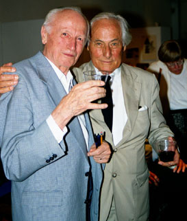
Hermann Zapf (left) joins his old friend Jack Stauffacher (right) after viewing previously unseen film footage of the two in action 40 years earlier.
Hunt Roman
While Zapf was at Carnegie, Stauffacher had the opportunity to persuade the Hunt Botanical Library there to commission a unique typeface—cut in metal, for hand-setting—just for the library’s own publications, and to invite Zapf to design it for them. He had the support of the library’s patron, Rachel McMasters Miller Hunt, herself a master bookbinder and a champion of good printing. The new typeface began life as “Z-Antiqua” (there are sketches of it in the current Zapfest exhibit at the San Francisco Public Library), but it was later given the name it’s known by today: Hunt Roman.
A small, elegant book about it, “Hunt Roman: The Birth of a Type,” was published by the Pittsburgh Bibliophiles in 1965, and copies can still sometimes be found. Although this book uses Hunt Roman for its short text, the face was intended as a display face, for use with Kis Janson as the library’s text face. (Stauffacher had been instrumental in bringing an understanding of the work of Nicholas Kis, the 17th-century Hungarian punchcutter whose types were long misidentified as “Janson,” to the modern printing world.) Hunt Roman, which looks very much like a Zapf roman typeface, with its chiseled lines and its slightly squared curves, was cut only in 14pt, 18pt, and 24pt sizes. It is still a proprietary face of the Hunt Library; it has never been digitized (and Hermann Zapf expressed his hope that it never would be).
A Tradition’s End
After presenting the surprise film, Stauffacher settled down in an armchair onstage for Sumner Stone to interview him. They talked animatedly about the origins of Hunt Roman, the unique circumstances under which Stauffacher found himself at Carnegie with the opportunity to make such a project happen (“it was the will of the gods; I could never have planned this”), and what made that particular time and place special. Stauffacher said that in retrospect he realized that he’d had an unparalleled opportunity to be in at the end of something: the 500-year tradition of metal type. Although Hunt Roman was not the last new typeface cut in metal for hand-setting, it was nearly the last; certainly it must have been one of the last created for commercial use (if a proprietary typeface for a botanical library can be called commercial). As Stauffacher pointed out, shortly after that, everything changed; the world he was lecturing in last month was a world of digital fonts, where letterpress printing and hand-set type are the realm of the individual craftsman and craftswoman, not part of the general tide of mass publishing.
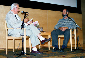
Jack Stauffacher (left) is interviewed by Sumner Stone at Zapfest in San Francisco.
Of course, as a printer and book designer himself (proprietor of the Greenwood Press in San Francisco), Jack Stauffacher continues this line of craftsmanship in his own books. And, although they may be rarities, they are not precious. He has always taken a practical approach to even the finest printing project, making books that are meant to be read, not just admired.
Concurrent with Zapfest, and opening the night before his lecture, an exhibit of Stauffacher’s own work is on display at the San Francisco Center for the Book. The exhibit focuses specifically on this Californian’s time in Pittsburgh: “Jack Werner Stauffacher: the years away, 1955–1963” (which of course includes the period when Zapf came to Pittsburgh and Hunt Roman was created). The opening to that was a well-attended affair, and the attendees had an opportunity to print their own keepsake on one of the Center’s letterpresses—a keepsake set up in the original Hunt Roman type. A rare moment indeed.
It Goes On
Sumner Stone’s interview with Jack Stauffacher, the SFCB exhibit of Stauffacher’s work, the presence of Hermann and Gudrun Zapf at both, and the existence of Zapfest itself draw the threads tight between old traditions and contemporary craft. The art of communication that we practice today is based firmly in techniques and intellectual habits that go back hundreds of years. And it’s the connections made, and the opportunities created, by individual people in their everyday work that make it all possible.
This article was last modified on March 18, 2022
This article was first published on October 5, 2001
Commenting is easier and faster when you're logged in!

Recommended for you

dot-font: A Few Preconceived Notions about Type
dot-font was a collection of short articles written by editor and typographer Jo...

dot-font: Judge for Yourself
dot-font was a collection of short articles written by editor and typographer Jo...
dot-font: Type Show-offs
dot-font was a collection of short articles written by editor and typographer Jo...