


dot-font was a collection of short articles written by editor and typographer John D. Barry (the former editor and publisher of the typographic journal U&lc) for CreativePro. If you’d like to read more from this series, click here.
Eventually, John gathered a selection of these articles into two books, dot-font: Talking About Design and dot-font: Talking About Fonts, which are available free to download here. You can find more from John at his website, https://johndberry.com.
Everyone who knows anything about type has heard of Hermann Zapf. Even the typographically challenged will recognize the name on the typefaces Zapf Chancery and Zapf Dingbats, though they may be surprised to learn that Zapf designed a typeface they use every day, Palatino, as well as the nearly-as-ubiquitous Optima.
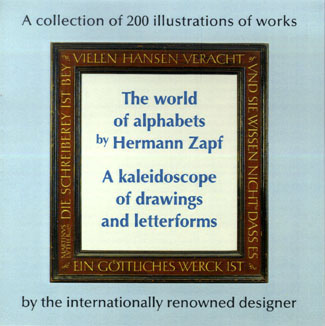
Among those familiar with the art and craft of type, Hermann Zapf is known as a master of three different forms: calligraphy, the design of typefaces, and the design of books. Much of his work related to calligraphy and typeface design will be on display in San Francisco through October as Zapfest continues. For those who want to appreciate Hermann’s work well into the future, the exhibit catalog is a good place to start, but the full range of his work will be available shortly on a new CD-ROM, whose design and production was overseen by Zapf himself: “The world of alphabets by Hermann Zapf: A kaleidoscope of drawings and letterforms.” This CD-ROM is what Zapf used as the basis of his presentation at the beginning of Zapfest two weekends ago.
The World of Alphabets
Although he had hoped to have the CD finished and ready for sale in time for the opening of the San Francisco exhibition, Zapf explained that what he had with him was unfinished, a beta version, which was prepared just before he and Gudrun Zapf von Hesse boarded their plane in Germany the Thursday before.
“You need patience if you use computers,” said Hermann. He has been in the forefront of adapting old traditions to new technology for decades, so he knew what he was talking about.
The CD-ROM, complete with a tasteful sound track and a little animation, illustrates 200 of Zapf’s works, and it’s designed so that you can navigate through it any way you like—browsing and rambling or following the defined course of a chronological presentation. For the talk in San Francisco, Zapf followed his own chronology, but he moved through it quickly, supplying the commentary himself rather than waiting for the captions to appear under the images on screen. (“Going through the whole thing,” he said, “would otherwise take a couple of hours.”)
A Portrait of the Artist
The most fascinating content for those of us familiar with Hermann Zapf’s work were the early pieces and the bits of biography. Zapf was born in Nuremberg just three days before the armistice that ended World War I. Nuremberg in 1918, he said, “was not a good place to come into the world”; in addition to the aftermath of the war, there was revolution in Berlin and the devastating effects of the Spanish flu—which killed far more people than the war did, at least 20 million. Two of Hermann’s siblings died in the epidemic, and as a newborn baby he himself was in poor health and not expected to live. (“As I’m about to turn 83,” he told us, “I guess the doctors were wrong.”)
On the CD you can see inklings of the great talent to come in Hermann’s childhood attempts at writing decorative initial letters, and in the secret alphabet he created so his mother wouldn’t be able to read his notes to his friends. One image shows some of the toys he made himself, since his family couldn’t afford to buy toys from shops. Perhaps most remarkable of these early efforts was a do-it-yourself electrical kit that Hermann put together in a neatly constructed box, complete with an illustrated instruction manual written entirely by hand.
The Lure of Letters
The electrical kit was no fluke; the young Zapf was a tinkerer, and he intended to become an electrical engineer. But this was Germany in the 1930s. For political reasons (his father was active in the trade unions), Hermann wasn’t allowed to study electrical engineering. Almost by accident, he became a photo retoucher (“I went home from the interview and looked up ‘photo-retouching’ in the encyclopedia”), which got him into the publishing and printing world. But it was a memorial exhibition of the lettering work of Rudolph Koch, who had died just a few years before, that captured the young man’s imagination: “This changed my life.” He would become a letterer.
He went to work for the Stempel type foundry, one of the most renowned in Germany, and ended up in charge of its typeface program. (It was in that capacity, after the war, that he met his future wife, Gudrun von Hesse; he saw her lettering and commissioned a typeface from it.) During World War II, he was a cartographer with the German army in France, making maps of Spain (which were never put to use). As a prisoner of war in a military hospital, he learned Arabic from some of the French African soldiers who were there with him. This knowledge came in handy when he later had to design an Arabic typeface, Alahram, for Stempel’s export market in the 1950s.
The type designs of Zapf’s that we now think of as “classic”—Palatino, Aldus, Melior, and Optima—were all done in the ’50s, as were any number of others. On a trip to Italy he discovered the modulated strokes of the sans serif letters set into the floor of the church of Santa Croce in Florence. On the CD-ROM you can see the two 1,000-lira banknotes that Zapf used, for lack of any other paper in his pocket, to sketch out the first ideas for what developed into the typeface Optima, inspired by those letters on the floor.
Pen & Graver
For a rundown of Hermann Zapf’s complete career, get the CD, which will be published in the United States by Cary Graphics Art Press, of the Rochester Institute of Technology. The examples he showed of his lively calligraphy and his exquisite book typography have inspired more than one generation of hopeful practitioners of these crafts. Of particular interest to the attendees of Zapfest, with its theme of typefaces developed from calligraphic roots, is the recently released Zapfino, a purely calligraphic typeface enlivened by dozens of alternate characters and swash terminals and so on. He also showed the digital Palatino Linotype, with a vast character set that includes Cyrillic and Greek, designed for Microsoft to show off the capabilities of OpenType. (“It was Bill Gates’s idea,” he said.) An endearingly personal note crept in when he showed a picture of a mobile he had constructed, which hangs in his house, made out of letters from the Aldus typeface. Like all mobiles, perhaps like type itself, it’s always in motion.
At the end of the presentations by Hermann and Gudrun, calligrapher Georgianna Greenwood presented to them an award from the Friends of Calligraphy, the organization from which Zapfest originated. And, to their delight and surprise, they were also presented with a hand-carved set of calligrapher’s pens. Hermann smiled and said, “Maybe this is a sign that I should get away from the computer and get back to writing by hand.”
This article was last modified on March 23, 2022
This article was first published on September 14, 2001
Commenting is easier and faster when you're logged in!

Recommended for you

dot-font: Using Expert Characters and Expert Sets
dot-font was a collection of short articles written by editor and typographer Jo...
dot-font: The Mischievous Mind behind Microsoft’s TrueType Fonts
dot-font was a collection of short articles written by editor and typographer Jo...
dot-font: Expressive Typography
Learn about the practice of using the physical shapes of letters to create new m...