dot-font: The Type Show Goes On

dot-font was a collection of short articles written by editor and typographer John D. Barry (the former editor and publisher of the typographic journal U&lc) for CreativePro. If you’d like to read more from this series, click here.
Eventually, John gathered a selection of these articles into two books, dot-font: Talking About Design and dot-font: Talking About Fonts, which are available free to download here. You can find more from John at his website, https://johndberry.com.
In an earlier column, I heaped praise on a well-designed, well-presented type specimen, and lamented the fact that very few type foundries have the resources or the will to produce such books for their whole line of fonts. But the other side of type specimens is the booklet that presents just one typeface or a single family of typefaces. These, too, are costly to produce, but there’s no finer way to show off a foundry’s best work.
The Program
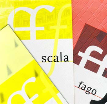
FontShop has begun to provide such booklets for some of its more notable type families, in a series of numbered booklets called FontFont Focus. The first three of these were in the goodie bag that attendees at this year’s ATypI conference in Leipzig got to take home with them.
Each 24-page booklet has the 2:1 vertical format that FontShop uses so often: a little less than 6 inches wide (~150mm) and a little under 12 inches tall (~300mm). These are printed on fine-textured, uncoated white stock (with slightly heavier covers) in two colors. For the first two, which present two of the best-known FontFont type families—FF Scala and FF Quadraat—the second color is FontShop’s trademark yellow; for the third, which focuses on a new family—FF Fago—the second color is a pinkish red.

The Players
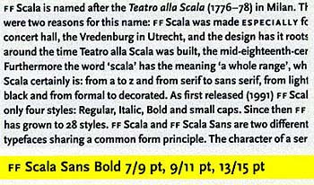
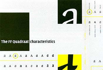
Scala and Quadraat are both text faces that have been turned into extended type families with display versions and sans serif companions. Scala was designed by Martin Majoor, Quadraat by Fred Smeijers: two Dutch type designers who are friends and colleagues, and who once dubbed themselves “modern traditionalists.” Although the look and feel of the two type families are quite different, each suggests an old-style text face—and in fact the serif versions of both make very useful typefaces for books. The sans serif versions strip each face down to its essentials (Scala Sans looks particularly skeletal), yet they both retain the old-style, “humanist” structure that sets them off from geometric or industrial sans serifs like Helvetica.

The Ingenue
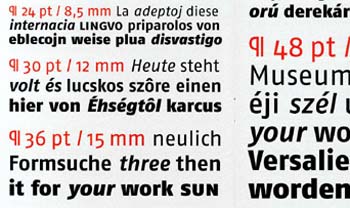
Fago, designed by Ole Schäfer, is a “true corporate typeface,” according to the promotional text. What this means is that it’s supposed to answer all the needs of a corporate graphic design department, with interrelated weights, widths, and styles that go together seamlessly. (This may be the future of type design, although it takes a lot of work; it’s the opposite of quickly whipping out a here-today, gone-tomorrow headline font to catch the wave of fashion.)
Fago is a sans serif type family, except for its monospaced cousin, Fago Mono, which has a few big serifs to give it a typewriter-like look. Fago’s versatility is in its three widths (Normal, Condensed, and Extended) and five weights (from Regular to Black), plus an extended character set for many languages and several styles of numerals. It’s a clean, slightly square, slightly angular sans—a style space that a number of designers have worked in recently. The Normal weight is relatively narrow, so the Extended is really just a more spacious text design.

Opening Act
FontFont Focus reminds me a little bit of the excellent type specimen booklets that Adobe used to published for its Adobe Originals typefaces. (Adobe is doing something similar now for its new OpenType releases, but since the type specimens are PDF files that you have to look at on screen or print out for yourself, it’s not the same thing.) The Scala and Quadraat booklets are quite successful, with imaginative layouts that contrast large details with readable text blocks, and featuring sections in the back that show real-world uses of the typefaces in action.

The Fago booklet is less successful, partly because the face is new so there aren’t any real-world uses to show, and partly because of the effort to show a little of every possible language in the text blocks, which makes it impossible to tell how a paragraph truly reads in any one of them. There’s actually very little text about Fago in the book, so the face isn’t being put to use here the way Scala and Quadraat are in their respective specimen books.
Intermission
Type specimens like these are a pleasure to look at and hold. They’re also extremely useful for designers trying to judge how a typeface will look in use (and maybe for a few ideas on how to use it). It seems clear that FontShop can’t do something this elaborate for all of its typefaces, but producing this type of booklet is a good way to show off the company’s most versatile families. (FontFont Focus No. 4 promises to be about the hugely popular FF Meta.) I would encourage other foundries to do the same.
The three FontFont Focus booklets were the most ambitious form of type specimen given away at this year’s ATypI conference, but they were by no means the only good ones. My next column will highlight a few more.
This article was last modified on April 7, 2022
This article was first published on October 27, 2000
Commenting is easier and faster when you're logged in!
Recommended for you

dot-font: Revival Meetings of Mind
dot-font was a collection of short articles written by editor and typographer Jo...

dot-font: Emigre Migrates to a New Format
dot-font was a collection of short articles written by editor and typographer Jo...

dot-font: Type Show-offs
dot-font was a collection of short articles written by editor and typographer Jo...


