

dot-font was a collection of short articles written by editor and typographer John D. Barry (the former editor and publisher of the typographic journal U&lc) for CreativePro. If you’d like to read more from this series, click here.
Eventually, John gathered a selection of these articles into two books, dot-font: Talking About Design and dot-font: Talking About Fonts, which are available free to download here. You can find more from John at his website, https://johndberry.com.
Christian Schwartz has been a prolific creator of new typefaces in the last several years, for several different digital foundries. His latest, for the Font Bureau, is Farnham, a text and display family based on—or at least inspired by—the work of the 18th-century punchcutter Johann Michael Fleischman.

Figure 1: A variety of styles of Farnham Display
Fleischman’s types have inspired a number of recent designs, after being generally neglected during most of the 20th century. The most thorough is Erhard Kaiser’s studious revival, DTL Fleischmann, which is particularly notable for including the peculiar spurred serifs that appear on some of Fleischman’s original designs. (Because of the scalability of digital type, this serif style is more noticeable in Kaiser’s digital revival than it probably was in Fleischman’s hand-cut metal types.) DTL Fleischman echoes its original in another way, too: Erhard Kaiser is a German type designer, working for a Dutch type foundry (the Dutch Type Library); Johann Fleischman was himself a German, born near Nuremberg in 1707, though he made his career in the Netherlands, largely with the Enschedé foundry in Haarlem. (Fleischman’s name may have been spelled originally with two final n’s, like a German name, but it’s usually spelled Dutch-style with only one.)
Fleischman’s types influenced Matthew Carter when he designed Fenway, commissioned as a custom magazine typeface in 1998. Although Fenway is no revival (Carter rarely indulges in direct revivals), the roman is in part inspired by Fleischman’s 8pt newspaper type of 1745—one of the very first types created specifically with newspaper text in mind. (The italic of Fenway is inspired by an italic type cut by Fleischman’s contemporary at Enschedé, Jacques-François Rosart.) Fleischman’s types were also one of the inspirations behind Mercury (1997–99), designed by Tobias Frere-Jones and Jonathan Hoefler; Mercury too began life as a display face, and was later expanded into a text family for newspapers.
Farnham’s Inkhold
Farnham is clearly not a direct revival either, though the influence of Fleischman is obvious. In fact, says Christian Schwartz, Farnham began as a “purely speculative” design: “It was originally conceived as Amplitude Serif, but that idea went by the wayside fairly quickly when I realized it was converging with the Fleischman characters I had been sketching a lot during that period. Fleischman had the angularity and tension I was interested in focusing on, without needing any of Amplitude’s gimmicks. In the end, I think the two faces are sympathetic to each other—and work well together—but aren’t formally related aside from a few vestigial ink traps, which I left in because they allowed me to extend the curves on top of the arches as far as possible.”
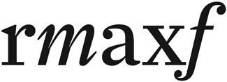
Figure 2: Some of the details of Farnham’s design that give the typeface its visual sparkle
The “ink traps”—wedges of white cut into the letter where one stroke meets another, which were first introduced into type design during the phototype era to compensate optically for the way these angles tended to fill in when the film was exposed—help to give Farnham some of its “sparkle,” the most noticeable feature of Johann Michael Fleischman’s metal types. Another way that Schwartz gives the letters sparkle is by making many of the strokes themselves slightly wedge-shaped, tapering toward one end instead of having straight, even edges. Some of the serifs, too, are wedge-shaped, though others are thin and flat.

Figure 3: The stress is vertical, but some of the horizontal strokes are wedge-shaped
Overall, the characters have the sort of rounded, closed-in-upon-themselves compactness that is often seen in typefaces for newspapers or magazines. But Farnham wasn’t originally designed with that in mind. “I didn’t necessarily set out to design a magazine face,” says Schwartz, “but the aggressive forms naturally lend themselves better to a magazine than to newspaper or book design. One newspaper designer tested it for about ten minutes before declaring it to be ‘much too scary’ for her client’s readers.”

Figure 4: A text sample set in Farnham Text Regular and Italic
Nonetheless, Farnham has already seen service in publication design. “When the Display was about halfway finished, Michael Lawton at Men’s Journal (who has since moved on to Popular Mechanics) called up, looking for a new serif face. He liked Farnham enough to throw some money at me to finish it up a little faster, but beyond a few strange requests for alternates (a ball-less J and j; a Jenson-style R; and bigger French quotes, if I remember right) he didn’t really have—or want—any input into the design.”
Displayful & Textish
Schwartz designed two versions of Farnham, one for text and one for display; each series has several weights. The differences between the text and display designs are subtle, and don’t always go in the directions you’d expect. Apart from a few exuberant capital-letter forms that are present in the Display Italic but not in the Text Italic, it’s sometimes hard to tell which is which. If they’re used right, of course, the difference is never obvious.

Figure 5: Farnham Display Regular Italic (top) compared with the Text Regular Italic (bottom)
“I took my clues from Miller,” says Schwartz, “and wasn’t afraid to make the differences subtle. Overall, the thins are a little bit thicker in the Text version, to make sure the junctions wouldn’t be too brittle at small sizes. The ascenders and descenders are also a bit longer in the Text version. This runs counter to tradition, but makes sense in the context of contemporary publication design, where headlines are often set with very little leading but text is given adequate breathing room.”
The other difference is that the slant of the italic is steeper in the Text version. Fleischman gave his italic types a very steep angle, and the slant of Farnham Text is close to that. But, says Schwartz, “the larger the intended use, the less tolerance art directors seem to have for a severe slant,” so the Display version has a more modestly oblique angle. This, again, is counterintuitive—you might expect a display face to be more extreme than its text companion—but it fits the needs of today’s clients.

Figure 6: A showing of some of the differences, most of them subtle, between the text and display versions of Farnham
Bedazzled
Christian Schwartz is probably right that Farnham isn’t destined to be used as a book typeface; it’s too dazzling and demanding for that kind of quiet work. But it may find a lot of use in magazines and even the less pedestrian parts of newspapers. It’s got the look of being a publication typeface, while sparkling much brighter than most; it gives a sort of liveliness to sobriety. Farnham also promises to be a useful addition to the repertoire of typefaces available for advertising and brochure design. Perhaps even for certain kinds of signage.
Three-quarters of a century ago, the type historian D.B. Updike dismissed Fleischman’s typefaces as “singularly devoid of style”; today, these typefaces have influenced a number of our best type designers. The sparkle of Johann Michael Fleischman has spread to unexpected places.
This article was last modified on February 16, 2022
This article was first published on February 21, 2005
Commenting is easier and faster when you're logged in!

Recommended for you

Download Second dot-font Book for Free
From digital to print to digital again—that’s the path John D. Berry...
dot-font: The Human Side of Sans Serif
dot-font was a collection of short articles written by editor and typographer Jo...

dot-font: Front-Page Fonts
dot-font was a collection of short articles written by editor and typographer Jo...