


dot-font was a collection of short articles written by editor and typographer John D. Barry (the former editor and publisher of the typographic journal U&lc) for CreativePro. If you’d like to read more from this series, click here.
Eventually, John gathered a selection of these articles into two books, dot-font: Talking About Design and dot-font: Talking About Fonts, which are available free to download here. You can find more from John at his website, https://johndberry.com.
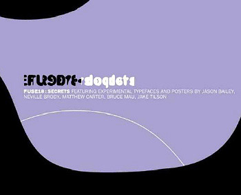
The experimental typographic publication “Fuse” is back, after a long hiatus. “Fuse” is a periodical (once quarterly, now “sporadic”) that consists entirely of a set of four or five experimental typefaces by several designers, distributed on a disk (these days, a CD-ROM), plus a printed poster from each designer and usually an accompanying text by series editor Jon Wozencroft. Each issue has a theme, but the designers have complete freedom in how they interpret that theme.
“Fuse” was created almost ten years ago by Jon Wozencroft and Neville Brody for FontShop International, and FontShop published the first seventeen issues. This new issue, “Fuse18,” is distributed by FSI but “produced and published by Neville Brody.” (It’s “available while supplies last for $59” from FontShop, at 888-FF FONTS or through the FontShop website.) Otherwise “Fuse 18” fits neatly into the series: It takes the same radical approach, uses the same simple but effective graphic effects in the five posters, and even comes in the same cleverly folded cardboard box with the big “FUSE” logo. The fonts each have the prefix F (for Fuse), in a neat take-off on the FF prefix that FontShop affixes to its own FontFont line.
The theme of the current issue is “Secrets.” “Fuse” has always stretched the limits of what a font is, just as Neville Brody has stretched the limits of typography and taken type into the realm of art. New fonts and posters (and PDF versions of those posters) were created for this issue by Brody, Jason Bailey, Jake Tilson, Matthew Carter, and Bruce Mau.
F Can We Imagine
“Can we envision 1. a font that asks more questions than it answers 2. a font that has projective memory, that reminds you to remember 3. a font with a limited lifespan 4. a font with an expiry date 5. a font that has gone bad 6. a font without temporal inflection, without the imprint of its time…”
This is the beginning of the text on the poster for Bruce Mau’s “font” F Can We Imagine. I put “font” in quotes because there is, in fact, no digital font by that name on the CD-ROM. There are, instead, two QuickTime audio files, both very short, that play a voice (Mau’s, presumably) asking two questions:
“Can we make a font that has memory?”
“Could you imagine a font that…that has a limited lifespan?”

Bruce Mau’s intriguing F Can We Imagine poster (partially shown here) and “font” ask more questions than they answer.
The idea is all question. Both the “font” and the text on the poster (the poster is entirely text) simply ask question after question about fonts. In a way, this is a pure form of artistic endeavor. The poster is printed in a plain typeface, in a screened-back blue, and the printing is deliberately faded in patches. The questions, written by Bruce Mau with Nancy Nowacek and Kyo Maclear, go on from 1 to 100:
“…91. an action-packed, eye-popping, over-the-top font 92. a glossy font 93. a ‘lite’ font 94. a facelift gone wrong font 95. a fluid font that oozes, bleeds and leaks and weeps 96. a viral font 97. an unstable font, in need of constant intervention to maintain appearances 98. a Chinese torture font, that interminably drip drip drips its meaning onto your forehead 99. a tragic American font of youthful promise and naive exuberance, driven to an abrupt and violent end 100. a font whose uniqueness lies in its program, not merely in its image?”
F Httpwc
Jake Tilson’s font isn’t so much a typeface as a key to unlock the relationship between his poster and a Web site he set up for the purpose. Each character in the font is simply a two-digit number, roughly hand drawn to look like a slightly condensed version of a bold grotesque face like Franklin Gothic. Using the typeface on a page doesn’t give you anything much, except a string of numbers. But add any one of those numbers to the end of the URL at Tilson’s website, and you’ll find yourself navigating to one of fifty-six pages of individual photographs. So each letter corresponds to a specific photo. Twenty of these photos are also on the poster.

The poster for Jake Tilson’s font F Hhttpwc shows twenty of the photos one can find by visiting his associated website.
And what might these be photos of, you ask? Toilets. WC’s. Men’s rooms, specifically, or at least details of them: partial shots of the fixtures and accoutrements, from cities in Italy, Belgium, Japan, the USA. Men’s rooms from various forms of British transport are also represented, including British Air, British Rail, and my favorite (conceptually, at least), “Jet Foil—English Channel.”
I wouldn’t call these so much secret as unnoticed, the kinds of places we all spend part of our time in but that we don’t much think about when we’re not actually in them. Apart from the comparisons of international toilet hardware, it’s a reminder of the ordinariness of our daily lives.
F DeFace
Matthew Carter is a designer of elegant typefaces, so even his take on distressed and subversive type is elegant. But it’s also gleeful.
He thought about the way the lettering on monuments, such as the imposing inscriptions on tombstones and public buildings, which are intended to proclaim something to the ages, end up both weathered and defaced by later inscriptions or the graffiti of vandals. So he designed a typeface that incorporates both parts of this equation.
“This typeface,” he says, “contains a set of inscriptional capitals that are self-vandalizing: each letter has graffiti associated with it that deface neighboring letters. Depending on the text, the graffiti can vandalize both the underlying capitals and other graffiti to make a palimpsest of marks that are individually legible but obscure in combination.”
Matthew Carter’s F DeFace, as shown in this partial view of its “Fuse” poster, is “self-vandalizing,” inspired by vandalized inscriptions on tombstones and buildings.
Note that this font can appear vertically squashed on the screen (although it will print just fine), if you have “preserve linespacing” turned on in Adobe Type Manager. As Erik van Blokland, who tested the Fuse fonts, put it: “When ‘preserve linespacing’ is selected, the characters will be scaled vertically to make the glyph fit in bodysize. For ‘normal’ fonts this is not much of a problem but DeFace has such extreme bounds that the scaling is very much visible.”
F Sclerosis Script
Jason Bailey’s poster (see below) is simple and striking, and his font is deceptively simple: a representation in digital form of his mother’s handwriting as it was affected by multiple sclerosis.

F Sclerosis Script, an experimental font by Jason Bailey, represents his ill mother’s handwriting.
“One of the most frustrating aspects of MS,” he says, “is the way in which one’s ability to communicate is impaired. I have tried to translate this frustration into the font Sclerosis Script. The letterforms that make up the font are digitized examples of my mother’s handwriting, with certain characters having had their ‘natural’ kerning relationships with other characters greatly exaggerated. Thus, like the condition itself, the experience of using Sclerosis Script cannot be completely controlled.”
F Lies
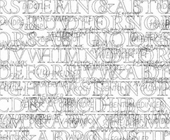
We’ve got bold lies and light lies—or at least F Lies Light and F Lies Bold, courtesy of Neville Brody. This is a real typeface, just shifted a bit to the left. If you imagine the alphabet written in order—a, b, c, etc.—in a strong, somewhat blob-like sans serif type, and then you divide the letters in the middle, rather than on either side, you’ve got some idea of what Lies looks like. The character you get when you press the d key, for instance, looks like the left-hand side of the d with the right-hand side of the previously letter (c) to its left. This looks coherent when you type the alphabet in order, but as you can imagine, it gets a little mixed up when you type real words.
Neville Brody’s F Lies typeface offsets the alphabet by half a character. The F Lies poster (partially shown here) also serves as the poster for “Fuse 18.”
It’s a simple device, yet it does “hide” the message in a visually confusing rearrangement of what we expect to see. And it creates shapes that are interesting in their own right, as Brody shows in his own poster—which is also the poster for this issue of “Fuse.”
Hidden Text
The “Fuse18” poster, designed by Neville Brody, is an abstract composition made of characters from the font F Lies—making very skillful use of two-color printing on a textured, recycled paper. The back of the poster, however, is a landscape photograph by Jon Wozencroft, overlaid with a dense blue text—dense in every sense, typographically and intellectually. The combination of enormously long lines of small text and the blue ink against a background photo of hillside and forest makes Wozencroft’s words almost illegible. I wouldn’t be surprised if I’m the only person outside Brody’s Research Studio who has actually read every sentence, from beginning to end.
At first I thought this was a deliberate statement about obscurity and secrecy—especially in light of the intentionally faded sections of type in Bruce Mau’s poster—but I began to doubt this when I realized that the statements of the type designers themselves were lost in the final section of blue text, set in even smaller type against the darkest part of the background photograph. Jason Bailey’s serious and sometimes moving statement about his mother’s multiple sclerosis and the genesis of his typeface F Sclerosis Script is nearly impossible to decipher. This is a disservice to the type designers, but I can hardly imagine that it was intentional. I’d guess that Wozencroft and Brody simply misjudged the visual effect of their blue ink printed against that brown-and-white photo—either that, or they got exceptionally bad work from their printer.
The backside of the “Fuse 18” poster is not included as a PDF on the CD-ROM; nor is the text to be found anywhere on the “Fuse” website, as far as I can tell. So the text really is lost, unless you make a superhuman effort to retrieve it from a sea of little blue type. Wozencroft’s screed is not really rewarding enough to justify the effort (he sometimes pens wonderful rants, but this isn’t one of them), but the designers’ statements are.
Of course, the promotional card for this issue of “Fuse” says, “Fuse 18: Secrets challenges the notion of hidden vital meanings in our culture, and explores expression beyond words through specially commissioned work by Bruce Mau, Matthew Carter, Jake Tilson, Jason Bailey and Neville Brody.” So maybe they really did intend the text to be hidden among the trees.
The visual effect of this poster is different from the others, because it’s printed on both sides. While I was drafting this column and holding up the poster, trying to interpret some of the obscure text, my partner Eileen Gunn glanced over and pointed out: “Backlit, and viewed by the glow of your laptop, it’s really much more striking than it is in ordinary light.” Maybe this, too, is part of the intended effect.
Light Fuse and Get Away
Fuse is experimental by nature and intent. It’s never a finished process, although each issue, in the end, has to be finished at some point. (This one took a lot longer than some.) The fonts themselves are not always “usable” in normal professional work, but they are always provocative; they are designed to make you think.
I’m not sure where Brody and Wozencroft plan to take “Fuse” in the future, but it will always be worth keeping an eye on.
This article was last modified on March 31, 2022
This article was first published on February 23, 2001
Commenting is easier and faster when you're logged in!

Recommended for you

dot-font: A New Typographic Glasnost
dot-font was a collection of short articles written by editor and typographer Jo...

dot-font: Serifs from the Portuguese
dot-font was a collection of short articles written by editor and typographer Jo...
dot-font: “It’s [Still] Alive!”
dot-font was a collection of short articles written by editor and typographer Jo...