

dot-font was a collection of short articles written by editor and typographer John D. Barry (the former editor and publisher of the typographic journal U&lc) for CreativePro. If you’d like to read more from this series, click here.
Eventually, John gathered a selection of these articles into two books, dot-font: Talking About Design and dot-font: Talking About Fonts, which are available free to download here. You can find more from John at his website, https://johndberry.com.
How often do you see typography in an art museum? Apart from the signage, I mean. At the San Francisco Museum of Modern Art (SFMOMA), now through June 30, you can see an exhibition of prints made by Jack Stauffacher in which he used huge wooden letters to make abstract collages.
The prints are typographic in form and inspiration, but they are not typographic in purpose: The letters are there as elements of art, not to communicate a verbal message. The museum describes the prints as “an exercise in typography, lettering, and composition in the tradition of the Russian Constructivists.” Since Stauffacher is better known as a letterpress printer and book designer, whose usual concern is giving the right form to the content of a book, this experimental side to his printing comes as a surprise to many people.
Complementing the SFMOMA exhibition, the San Francisco chapter of the AIGA hosted “In Conversation with Jack Stauffacher” on May 15, an evening celebrating the achievements of the Greenwood Press and Stauffacher’s profound influence on the printing and design community of the Bay Area and beyond.
Words About Letters
Jack Stauffacher doesn’t make speeches, and the AIGA conversation was just that: a sort of guided conversation. It took place in an environment congenial to printers: Watermark Graphics, a large working printshop in an industrial part of San Francisco. There was no stage, just a screen, which divided off part of the huge room, a podium, and a sea of folding chairs, beyond which sat several large, idle printing presses. Former Print magazine editor Chuck Byrne, who along with Dennis Letbetter had organized an exhibit of Stauffacher’s work at San Jose State University in 1999, gave a run-down of his professional life, illustrated with slides, while Stauffacher himself sat next to him, responding, correcting, telling stories, and commenting on what the audience could or couldn’t see. (“Don’t look at that; you can’t see any of the details.”) After the biographical conversation, Stauffacher stepped off to the side and listened, amused and sometimes embarrassed, to short tributes from MetaDesign co-founders Terry Irwin and Bill Hill, typographer Sumner Stone, former Adobe art director Laurie Szujewska, and designer and critic Jim Faris. To close things out, Faris showed a short film that he had made about Jack Stauffacher at work, and talking about his work. (The sound on the film seemed out of whack, but on the whole it was a good taste of Stauffacher’s approach to printing and art.)
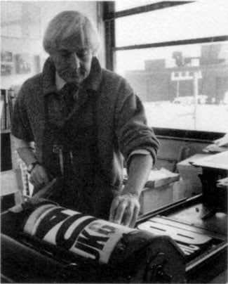
Stauffacher at work
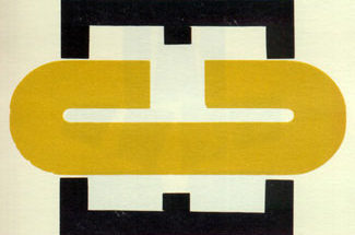
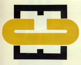
When they came to the prints that now hang in SFMOMA, Byrne explained that the wooden letters used were from a batch of 65 assorted pieces of wood type given to Stauffacher by a previous tenant when he moved into the building at 300 Broadway in 1966. (His Greenwood Press is still at the same location in North Beach, although Stauffacher himself and his wife Josephine now live a ferry-ride away across the Golden Gate, rather than within walking distance of the press.) There weren’t enough letters to print with, so Stauffacher began using them as design elements in their own right, experimenting in several series of prints, beginning in 1970 and most recently continuing with the series called “Wooden Letters from 300 Broadway” (1998). He worked with the shapes of the letters and numerals, and with different ways of printing them. Several of the prints shown at SFMOMA involve what he calls “on and off inking” (1990), where he mixed inks and solvent in varying ways to achieve a strange combination of precise printing and flowing pigment. In the 1998 series, the juxtapositions of shape, size, and color, all impressed into the surface of the fine paper, create what Byrne called “new character shapes entirely.”
For many younger artists and designers, Stauffacher’s work was first brought to their attention in an article that Byrne wrote for “Émigré” magazine, about Stauffacher’s “marriage of classical typography and modern typography.” It was this article that led Aaron Betsky, who was then the curator of architecture and design at SFMOMA, to add the series of experimental prints to the museum’s permanent collection.
Anecdotal Evidence
Some of the subjects touched upon in the AIGA conversation overlapped those that Stauffacher had talked about last fall, in his presentation at Zapfest: the five years he spent at Carnegie Institute in Pittsburgh, his bringing Hermann Zapf to the United States for the first time, and his getting Zapf involved in the creation of a new typeface for the Hunt Botanical Library. But there was much more.
Chuck Byrne told how Stauffacher received a Fulbright scholarship in 1955 to go to Italy and study the Florentine printers. “Jack must be the only person who ever stretched a one-year Fulbright scholarship into three years,” said Byrne. While in Italy, Stauffacher made “pilgrimages” to Switzerland to meet some of the people who had influenced his own approach to type and printing: Jan Tschichold, the lion of the New Typography in the 1920s who had become an old lion of traditional typography in his later years; and the pacesetters of the modern “Swiss” style of functionalist typography, Emil Ruder and Armin Hofmann, in Basel.
Stauffacher was not wedded to the stark Swiss style, but he found it gave him a sort of “clarity, order to work off of.” He reminded the audience that in the context of earlier styles of typography, the Basel school offered “refreshment for people who had ornaments in their heads.”
When Stauffacher came back to his California roots in the early 1960s, he did so as Typographic Director of the Stanford University Press, in Palo Alto. He described how he had envisioned such a post as the ultimate job for a typographer, at a center of enlightenment where he would commune with the “illuminaries” of printing. Unfortunately, his hands-on style clashed with the established hierarchies of the press in those days. He would go into the Linotype shop and talk to the operators, explaining to them how to letterspace small caps and teaching them about the long tradition of printing techniques: “It’s not what I want, it’s what has to be!” Although he pulled the standards of typography at Stanford up to a higher level and set the press on a track towards excellence, he didn’t last long there himself.
No Boundaries
Having his work bought by SFMOMA and exhibited there brought Jack Stauffacher “full circle,” he said: from his brother Frank’s establishment of “Art & Cinema” at the museum in 1946 to the fact that “I met my future wife in that space in 1947.” (Presumably not literally “in that space,” since the museum’s current building is recent.) And it recognizes the full integration of art, type, and society: the sort of integration that to Stauffacher comes naturally, while others try to build walls and jealously guard their categories and niches. Jack Stauffacher is a modest, down-to-earth man, apparently immune to bombast and hype, but as Chuck Byrne said in conclusion, “He takes his obligation to civilization seriously.”
This article was last modified on March 10, 2022
This article was first published on May 28, 2002
Commenting is easier and faster when you're logged in!

Recommended for you

dot-font: Tippling with the Titans of Type
dot-font was a collection of short articles written by editor and typographer Jo...
dot-font: Can a Book Teach You to Set Type Perfectly?
dot-font was a collection of short articles written by editor and typographer Jo...
dot-font: Importing Text
dot-font was a collection of short articles written by editor and typographer Jo...