

Photos by Idan Gil
dot-font was a collection of short articles written by editor and typographer John D. Barry (the former editor and publisher of the typographic journal U&lc) for CreativePro. If you’d like to read more from this series, click here.
Eventually, John gathered a selection of these articles into two books, dot-font: Talking About Design and dot-font: Talking About Fonts, which are available free to download here. You can find more from John at his website, https://johndberry.com.
Hebrew letters that melt, extrude spiky appendages, and crawl around on three-dimensional surfaces—those are the disturbing and inventive forms that Oded Ezer creates when he wants to get away from everyday typography.
Ezer is a versatile graphic designer and type designer working in Israel, where his poster, logo, and publication designs reflect the commercial side of his work. His angular Hebrew typeface family Maya was honored in both the ATypI bukva:raz! type-design competition and the Type Directors Club’s TDC2 competition in 2001, and was shown among the winners in the book Language Culture Type. But Ezer also practices experimental typography that he calls “typo art,” manipulating Hebrew letters in space and turning type into three-dimensional objects.

One of Oded Ezer’s poster experiments, “The Message” (2001), which he calls “a typographic homage to the music of the Israeli composer Arye Shapira.”
Communicating Rooms
In his most recent experimental project, “Rooms,” Ezer tried to release himself from the limitations of a two-dimensional format and create an environment that was both typographic and sensual. “My starting point,” he says, “was to see myself as a typographer who was creating sensations by combining materials, colors, and compositions in space. The initial sketches were ideas only, but they changed and developed when they became real. I hoped to create live, almost cinematic situations where the letters acted as ‘characters’ that had their roles.” The photographic records of these tactile constructions took on a documentarian feeling.

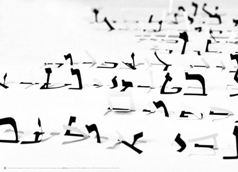
An image from the “Rooms” project. Is that aleph climbing the wall? Are those letters or writhing snakes below? What is going on here?
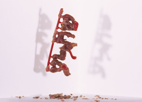
Ezer’s letters not only take on three-dimensional forms; they take on very strange three-dimensional forms. Some of them sprout sharp, pin-like legs, which lift the letters off the flat surface, but also look as though they could stab into the surface, to hold themselves there. They look menacing, which is just what Ezer intends: “The ‘legs’ are there to give a threatening nature to the letter.” Other letters take on melted or distressed forms; they can look a little like plastic toy soldiers that some willful child has half-melted. And the letters often seem to be moving, as though they were alive.

Under the wax-like accretions, letterforms are barely discernible.
Playing with the Typographic Environment
“I see myself as someone who uses his abilities to change and reshape the visual appearance of our environment in a way that will reflect the reality instead of hiding it,” says Ezer. “I see this as not only a visual or professional act, but also a political one.
“My work is composed of commercial, typeface, and experimental design. As a commercial designer I serve the needs of my clients; as a typeface designer, I am a sort of a meditator; creating the typo/artistic images is, for me, running away from the banal, predictable demands of the market, as if playing seriously a game like a six-year-old boy. In this last category, the sillier, the more absurd, the more politically incorrect and shameless the results are, the more successful I feel.”
Has someone been playing with wax? Are those plastic snap-off letters? Is this supposed to be a word?
If you don’t read Hebrew, then there are fewer familiar forms to recognize among the morphed and melted shapes in these photographs. Yet they are letters, and Ezer explains that a Hebrew reader would recognize many of them. Some, though, are too altered to be clearly identifiable, even if Hebrew is your native language. The play of meaningful symbols and bizarre shapes is fundamentally abstract; it’s not typography.

A single letter, with extrusions, lying flat but looking as though it’s ready to spring up and start running about.
In fact, Ezer declares that what he is doing here is neither typography nor art. “When working on the ‘Rooms’ project, I call myself a ‘typo artist,’ and the medium I deal with is ‘typo art.’ This differs from ‘typographer’ or ‘type designer’ in the sense that I see this new field as neither traditional typography (which will always want to deliver a message) nor art (which deals with cultural aspects of society). I’m trying to define a language for a field I have just discovered.”
What are the Letters Thinking?
Ezer’s inspiration comes from many fields, including architecture, music, science, and philosophy. His idea, he says, “was always to play while experimenting, to experiment while playing.” The combination of photography and typography is reminiscent of some of Studio Dumbar’s posters in the 1980s, but in those, the type itself was usually a two-dimensional overlay. Others have explored letters as physical objects, of course, but there’s something kinetic and tactile about Ezer’s creations. They seem like scenes from some ongoing but inexplicable drama.
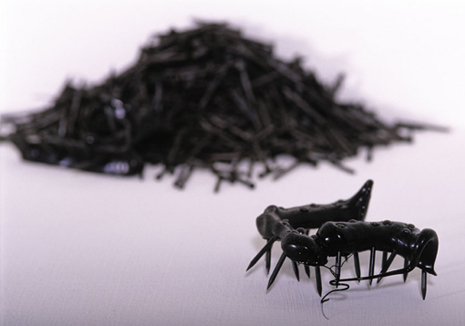
One letter among many. First among equals?
“Some of the questions I ask myself while creating are: How does typography ‘behave’ in different situations? What do letters ‘do’ when they are happy? How do they ‘look’ when they are shy? How will a letter ‘act’ when it is slapped, kissed…? How will typographic design look in 10, 20, 50, or 100 years?” What are the borders of readability on the one hand, and typographic expressiveness on the other hand? How can one use the tension between literal meaning and visual meaning in typographic work?”
The games that Oded Ezer plays are on the borderline between typography and art. They have meaning, but they’re not a medium for communicating directly. Are they “about” communication? Perhaps. They are most certainly about form and its meaning. And they are strange enough, unsettling enough, to wake us up and make us look at our letters with fresh eyes.
This article was last modified on February 16, 2022
This article was first published on October 24, 2005
Commenting is easier and faster when you're logged in!

Recommended for you

dot-font: Finding Fonts
dot-font was a collection of short articles written by editor and typographer Jo...
dot-font: Boundary Disorders
dot-font was a collection of short articles written by editor and typographer Jo...