


dot-font was a collection of short articles written by editor and typographer John D. Barry (the former editor and publisher of the typographic journal U&lc) for CreativePro. If you’d like to read more from this series, click here.
Eventually, John gathered a selection of these articles into two books, dot-font: Talking About Design and dot-font: Talking About Fonts, which are available free to download here. You can find more from John at his website, https://johndberry.com.
Hermann Zapf designed his most famous typeface, Palatino, more than half a century ago. The drawings were completed in 1948, and by 1950 it was in use both as hand-set type and as a hot-metal typeface set on Linotype machines. In the early 1950s Zapf extended the Palatino family to include Aldus, a version designed specifically for text setting, and a pair of display variants (Michelangelo and Sistina), as well as narrow and swash italics.
Although he designed it originally for hand-setting and for Linotype composition, Palatino has proven to be a very durable typeface. In various versions, it has been in constant use since 1950, and as a digital font it appears all over the world on laser printers and in a wide range of software packages. Zapf himself has always believed in designing new type for new eras, and he has been at the forefront of efforts to design type that can meet the challenges of new technologies. So only those who don’t know him would find it surprising that last month, when Linotype hosted a celebration in Kronberg, Germany, in honor of Hermann Zapf’s 87th birthday, it was also the official launch of Zapf’s new digital reworking and expansion of Palatino: Palatino Nova.

Palatino Nova—a detail from the cover of Linotype’s brochure presenting the new type family.
Hard Work
At the birthday banquet, held in the sumptuous Schlosshotel Kronberg, a converted 19th-century German chateau, Linotype managing director Bruno Steinert recalled Hermann Zapf’s relentless work ethic. Far from giving 100% to any effort, Steinert said with an admiring laugh, Hermann would give “150% or even 200%.” (I was watching the face of Hermann’s wife, the calligrapher and type designer Gudrun Zapf von Hesse, at that moment; she laughed heartily in acknowledgment of the truth of this exaggeration.) When Hermann would come in to the Linotype offices, said Steinert, he would disappear into the office of type director Akira Kobayashi at 9 a.m. and not emerge until they came out for a twenty-minute lunch break in the middle of the day; then they’d both disappear again and not be seen until five o’clock. This fruitful collaboration had already produced a new version of Optima (Optima Nova, 2003), and they’re now working on the soon-to-be-released Palatino Sans—a departure for Zapf’s designs.

Hermann Zapf (right) and Akira Kobayashi working together on designing a new version of Palatino. (Photo courtesy of Linotype.)
Among the guests were renowned typographers, type designers, and calligraphers, several of whom rose and spoke in German or English. Hermann was surprised by the number of Americans in the group and decided that he should deliver his own remarks in English, although he had prepared them in German; his fluent English made this impromptu translation go smoothly. (Zapf has said that one of the strategic choices that had benefited his career was learning English, so that he could communicate directly in the United States as well as in German-speaking countries.)

Hermann Zapf at the celebration of his 87th birthday; greeting calligrapher Julian Waters. (Photo by Jill Bell.)
Highlights of an Ongoing Career
Jovica Veljovic, who like Hermann is both a calligrapher and a type designer, spoke about the seminal influence of Zapf’s little book About Alphabets, which chronicled the development of his type designs up to 1960—by which point Zapf had already established his reputation and designed several of the 20th century’s most popular typefaces. This remarkable book, which was republished in 1970 but not, as far as I know, since then, has been the catalyst for a love of typography in many readers (myself included).
Akira Kobayashi also spoke of About Alphabets, which he said gave him his first step into the Latin alphabet and the traditions of Western calligraphy twenty years ago. That path led Kobayashi in 2001 to Linotype, where he now has the opportunity to work on new projects with Zapf. Clearly he enjoys this, though he smiled and said, “It’s not always easy to work with Hermann.” (Gudrun again laughed.)
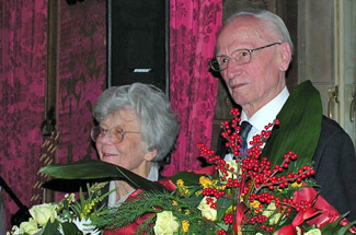
Gudrun and Hermann Zapf, awash in celebratory flowers. (Photo by Nancy Leo.)
Calligrapher Rick Cusick talked about Zapf’s years as a consultant to Hallmark, where Cusick works today as a calligrapher and type designer. The film that Zapf created there, which contains his virtuoso performance of complex, elegant calligraphy on a chalkboard, is another strong influence on many people’s appreciation of the beauty of letters. Rare-book curator David Pankow spoke of Zapf’s ten years of teaching at Rochester Institute of Technology and about his indispensable early collaborator, the punchcutter August Rosenberger. Calligrapher Susie Taylor, curator of the Harrison Collection at the San Francisco Public Library, alluded to the 2001 celebration in San Francisco of both Hermann and Gudrun Zapf’s calligraphic type designs (Zapfest). David Siegel recounted tales of driving Hermann around at the ATypI conference in San Francisco in 1994 and spoke fondly of Gudrun’s apple strudel. The accolades and memories kept coming, and the sense of a long-running community of friends and colleagues with mutual admiration and a shared tradition was palpable.

Group photo of the attendees at Hermann Zapf: Finest Hours Revived, November 24, 2005. (Photo courtesy of Linotype.)
Debut of the New
Around the sides of the dining room were large typographic posters showing the new Palatino Nova in use. The new Palatino types look at first glance much like the old, including new versions of Michelangelo and Sistina (called Palatino Nova Titling and Imperial) and a reworked Aldus. The differences appear in various details, and in the extensiveness of the range: four weights each of Palatino Nova roman and italic, plus Aldus Nova Book in roman and italic, all with both roman and italic small caps; Titling and Imperial in roman caps and small caps; lining and old-style figures, each in both proportional and tabular widths, for all the text faces; full sets of accented characters for a range of Western and Eastern European languages; all the expected ligatures plus a few more besides, along with various swashes and alternate characters; and full Greek and Cyrillic fonts in two weights. Palatino Nova is more systematic than the original Palatino.

Subtle differences in some of the letterforms between Linotype Palatino and Aldus (left) and the new Palatino Nova and Aldus Nova (right).
Palatino Nova only officially went on sale that day, so it’s too soon to see how it will fare alongside its still-popular parent. But Palatino has gone through a number of slight changes over the years, particularly as it was adapted from one typesetting technology to another (not to mention being imitated and pirated many times under many names); it’s good to see a version that incorporates Hermann Zapf’s fifty years of reflection on type design and printing technology. And it’s inspiring to see someone with so many laurels to rest on instead continuing to invent and create in the midst of his ninth decade.
This article was last modified on February 16, 2022
This article was first published on December 12, 2005
Commenting is easier and faster when you're logged in!

Recommended for you

dot-font: Sparkle, Sparkle, Little Type
dot-font was a collection of short articles written by editor and typographer Jo...
Download Second dot-font Book for Free
From digital to print to digital again—that’s the path John D. Berry...
dot-font: Avant-Garde Page Design
dot-font was a collection of short articles written by editor and typographer Jo...