

dot-font was a collection of short articles written by editor and typographer John D. Barry (the former editor and publisher of the typographic journal U&lc) for CreativePro. If you’d like to read more from this series, click here.
Eventually, John gathered a selection of these articles into two books, dot-font: Talking About Design and dot-font: Talking About Fonts, which are available free to download here. You can find more from John at his website, https://johndberry.com.
Printed specimens are still the best way to judge new typefaces. There’s no substitute for seeing them in use, and most of the time “in use” means on the printed page. The best Web-based type samples can be inviting and intriguing, but inevitably they give a false impression of what the type will look like when it’s printed; aside from the big problem of resolution, it’s just not the same looking at light projecting from a screen if you’re judging how something will look when light reflects from its surface.
Type foundries and type distributors have produced some very good type-specimen books to show their wares. The two Indie Fonts books differ by not selling the offerings of one company exclusively, even though they’re published by the people behind the P22 Type Foundry. Rather than selling fonts themselves, the publishers direct readers to the individual foundries, with Web sites and addresses and other contact information listed in the back of the book. The idea is that you will browse through the book, see something that you like, and go straight to the source to get it. Meanwhile, the books function as a handy reference.
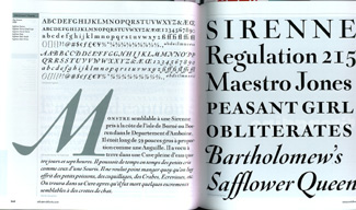
Alan Greene and Mark van Bronkhorst developed MVB Sirenne from engraved captions in “an old and weird natural history book” from 1719.
Nineteen foundries are represented in Indie Fonts 2—none of them the same ones that appeared in the first Indie Fonts (2002). Both books ($39.95 each or $70 for the set) are available from P22. The nearly square format of Indie Fonts lends itself to displaying type samples effectively, and many of the designers have created eye-catching specimens of their typefaces. Even those that simply show alphabets in various faces are at least functional, though they don’t invite us to get the fonts and put them to use the same way the more imaginative showings do.
The production values of the book are high, and so far I haven’t detected any missing or wrong fonts (always a worry in producing a type-specimen book that requires hundreds of individual fonts). The type specimens are all black-and-white, except for the opening pages of each foundry’s section. The glossy paper is not too reflective, and it has relatively little show-through (again, a worry in a type-specimen book). The binding should hold up to constant use.

Baroque typefaces digitized by Frantisek Storm as part of his efforts to take his Storm Type Foundry “back to the roots” of type design.
New Not Novelty
While some of the typefaces shown are in the “garage type” vein that you might expect with a title like Indie Fonts, others delve deep into lettering and typographic tradition, and many (in both categories) show very careful attention to detail. These are, after all, the work of designers who care about their work, no matter what styles and modes they may choose to work in. And not everything is flashy display faces, by any means; there are some fine text faces in this book.

Miguel Hernández’s circus-poster typeface as rendered as a bitmapped screen font, from Atomic Media.
The Central European typefounding traditions that Frantisek Storm has revived and extended in his offerings from the Storm Type Foundry would give dash and flair to a wide range of printed matter. The inspired craziness of Atomic Media’s screen-font interpretation of a circus-poster face, “Circa,” or its similarly contradictory “Dotic” (a lo-res blackletter), both designed by Miguel Hernández, make you want to invent a project that would let you use them. Jim Parkinson, whose work is also well represented in the type libraries of the larger foundries, offers display and large-text typefaces that lend themselves to use in magazines and other publications (not surprisingly, since that’s his specialty). Mark van Bronkhorst, who designed U&lc when I was editing it (and designed it brilliantly) and has more recently worked with FontShop and Octavo, takes on every tradition from the Renaissance to the Industrial Age; since, as a designer, he pays close attention to the details of text typography as well as to the expressiveness of display pages, his fonts tend to work well in text.

Jim Parkinson delights in finding unlikely headlines to show off his display typefaces.
A few others that I find particularly interesting, from among the foundries represented here, are Underware, Feliciano Type Foundry, Holland Fonts, Terminal Design, and Neufville Digital. But part of the fun of leafing through this book is finding foundries, and typefaces, that you hadn’t known existed.

Union Fonts shows alternative type designs with attitude.
Not surprisingly, Indie Fonts 2 includes a CD at the back of the book, with unlocked fonts and various other kinds of material from most of the foundries featured in the book. It’s a sampler, plain and simple, intended to whet your appetite while giving you a bonus besides the printed pages.
Staying Curious
At the end of the book, there’s an essay by New York typographer/type director Peter Bain, called “Typocurious, and how to stay that way.” It’s aimed squarely at people who don’t know much about type, but are interested. Bain’s short sections deal with basic typographic ideas in an informal way, and each section directs readers to one or two other books that might be useful. (These are not always books that are easy to find.) My list would be different—but then, whose wouldn’t? Everything he mentions is worth a look.
As an example, one of Bain’s sections (“Seeking to become a better person?”) recommends two books as “guidance for typographic seekers” who want to find out how to handle the details: Better Type, by Betty Binns, and Finer Points in the Spacing and Arrangement of Type, by Geoffrey Dowding. Both books, though entirely different, are valuable and ask all the right questions; but in the end they both encourage setting type that’s just a little too tight for continuous text: between words (Dowding) and between letters (Binns). As Bain says, quibbles.
Clearly, Indie Fonts 2 is aimed at a larger market than just professional graphic designers. Its name, its format, and its cheeky approach all speak to the wider world of people who find themselves dealing with digital fonts but don’t have a lot of guidance in how to use them—or in which ones to use. As a catalog of some (not all) of the available typefaces that we might buy and put to use, Indie Fonts 2, like its predecessor, is a resource that deserves its place on the shelf.
This article was last modified on February 23, 2022
This article was first published on September 22, 2003
Commenting is easier and faster when you're logged in!

Recommended for you

dot-font: Typeface With Flourishes
dot-font was a collection of short articles written by editor and typographer Jo...

dot-font: Free Fonts for All?
dot-font was a collection of short articles written by editor and typographer Jo...

dot-font: The Vico Collaboration
dot-font was a collection of short articles written by editor and typographer Jo...