

dot-font was a collection of short articles written by editor and typographer John D. Barry (the former editor and publisher of the typographic journal U&lc) for CreativePro. If you’d like to read more from this series, click here.
Eventually, John gathered a selection of these articles into two books, dot-font: Talking About Design and dot-font: Talking About Fonts, which are available free to download here. You can find more from John at his website, https://johndberry.com.
Letters are not just abstract notions, carriers of meaning; they are also real, physical shapes. Paying attention to those shapes, and using them as a visual element in graphic design, is an essential part of the art of typography.
This is sometimes called “expressive typography,” and it has been practiced by designers as diverse as Herb Lubalin in New York and Massin in France. There is no single style associated with this approach to type; it’s a matter of seeing the graphic elements on the page, including the letterforms, and arranging them in a way that seems natural, in fact inevitable, once it’s done (see Figure 1).

Figure 1: From a recent page in the French newspaper “Libération,” the opening of an article about the books of May 1968.
Sometimes the size and shape of the letters have a direct bearing on the meaning of the words, as in this illustration from the first of Carl Dair’s little booklets on type for Westvaco, in the 1970s (see Figure 2). Dair showed what he was talking about in the very letterforms that he chose, and in how he arranged them together.
Figure 2: The letterforms that describe themselves, from one of Carl Dair’s “Typographic Quest” booklets.
In general, I’m not talking about visual puns, which can get out of hand unless they’re used with extreme restraint, but occasionally you can find the perfect congruence between the meaning and the type itself. Jost Hochuli used a simple fi ligature, and the Italian forms of the names of France and Italy (“Francia” and “Italia”), to create this meaningful image of unity and integration between two countries (see Figure 3).

Figure 3: Linking the names of France and Italy, and the first letters of their names, in a ligature and a word play; from Jost Hochuli’s “Alphabugs.”
Sometimes letters get used as visual elements with only allusions to their meaning; this becomes more a matter of collage than of typography. But it’s not always easy to draw the line. A Neiman Marcus ad in “The New York Times” last week uses type in a visually arresting way, though it’s perhaps only peripherally typographical (see Figure 4).

Figure 4: An ad from “The New York Times”: type as almost pure texture.
Of course, you can leave typography behind entirely and use letters as the building blocks of art. Jack Stauffacher, who spends most of his time perfecting the craft of printing and designing books meant to be read, has created several portfolios of art prints using huge wooden letters, some of them broken, and the hand techniques of letterpress printing (see Figure 5). This is no longer typography, but it’s beautiful.
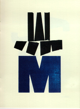
Figure 5: Pure art, not typography, using wood type: a letterpress print by Jack Stauffacher.
You can use striking contrasts of size and style and position of type to grab someone’s attention in order to impart a message. By making the image visually rewarding, you invite a potential reader in and present your message in an entertaining way. You can entice that person to read the fine print by making something large and dramatic—as long as the drama doesn’t come at the expense of the meaning. I used contrast and strong letter shapes to do this in a simple hand-out card for the online science-fiction magazine, “The Infinite Matrix” (see Figure 6).
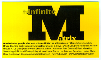
Figure 6: This one-color 3-x-5-inch card was a handout meant to be distributed to people at a large convention—something to stick in the pocket and take home.
Dramatic display typography is often used today in newspapers—especially in features pages. Newspaper designer Lucie Lacava brought highly unusual and effective use of type to her redesign of the Montreal daily “Le Devoir,” a paper well known for its role in the intellectual life of Québec. This detail from the first page of the arts section (“Les Arts”) mixes type in visually arresting ways, drawing the reader in to the story below (see Figure 7).

Figure 7: Detail from an arts page of the French-language Québec newspaper “Le Devoir,” designed by Lucie Lacava.
These images are just suggestions, reminders of what’s possible and keys to opening up our visual vocabulary. Typography doesn’t have to be staid. It does, however, have to be functional; playing with the type without regard for the meaning of the words, or the purpose of the message that needs to be communicated, is just self-indulgence. Typography—whether it’s the most straightforward text or the wildest display—is a seamless melding of the verbal and the visual. It needs to be practiced mindfully, creatively, and respectfully. And often.
This article was last modified on July 18, 2023
This article was first published on November 17, 2003
Commenting is easier and faster when you're logged in!

Recommended for you
dot-font: OK to Typeset
dot-font was a collection of short articles written by editor and typographer Jo...

dot-font: The Hyphenation of Justification
dot-font was a collection of short articles written by editor and typographer Jo...
dot-font: Optima nova—New Take on Timeless Face
dot-font was a collection of short articles written by editor and typographer Jo...