

dot-font was a collection of short articles written by editor and typographer John D. Barry (the former editor and publisher of the typographic journal U&lc) for CreativePro. If you’d like to read more from this series, click here.
Eventually, John gathered a selection of these articles into two books, dot-font: Talking About Design and dot-font: Talking About Fonts, which are available free to download here. You can find more from John at his website, https://johndberry.com.
Last week’s brouhaha over the so-called “butterfly ballot” in one county in Florida made it brutally obvious that the quality of graphic design has real-world importance. It seemed pretty clear when the story broke that it was a matter of bad information design. Good design communicates its message clearly, without ambiguity; the ballot design used in West Palm Beach was certainly an attempt to do that, but it was a failure.
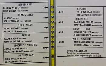
For those of you who may have just returned from months at sea without so much as a message bottle for communication, the ballot was of the hole-punch variety. You set the ballot down on a surface that aligns it correctly, and then you use a little pointed metal or plastic punch to poke through the ballot opposite the candidate or proposition vote that you prefer. You turn pages until you’ve gone through all the candidates (or propositions, or whatever) to be voted on, then you remove your ballot and turn it in. Generally, the candidates and propositions are listed only on the right-hand page.
The designer of this particular ballot was trying to fit a long list of presidential candidates onto a single page (or rather, a single spread) of a fairly short ballot. Her solution was to put some of the candidates on the left-hand page, and others on the facing right-hand page, with the holes to be punched running in a line down the middle. What evidently flummoxed a lot of voters was that to vote for the second candidate on the left-hand page, Al Gore, you had to punch the third hole; the second hole was meant for the first candidate on the right-hand page, Pat Buchanan.
Is That Clear?
I must admit that when I finally saw a photograph of the ballot in question, I didn’t think it was all that hard to figure out how to vote for the candidate you wanted. Arrows pointed from each candidate’s name to the appropriate hole; you just had to pay attention to where the arrows were pointing. But as a graphic designer I’m trained to notice the arrangement of graphic elements on a page, and to think about things like the visual hierarchy. This sort of symmetrical arrangement around a central gutter isn’t strange to me. To many of the local voters in Florida, it obviously was.
Whether or not I could figure the ballot out, it was definitely not an example of good design. It failed in its purpose; and because of the closeness of the election, that failure has had enormous consequences for the political life of the United States.
Subtly Unreadable
I’ve seen less spectacular examples of bad visual design in politics. I’m not talking about poorly designed posters or bumper stickers; that’s too huge a subject to get into now. I’m talking about plain old poor typography.
Many states, counties, or cities publish voters’ guides before an election: booklets that list the candidates and propositions and give more or less detail on the people or issues in question. If there are proposed new laws or changes to existing laws on the ballot, then the voters’ pamphlet may contain quite a lot of text—either the contents of the laws themselves, or commentary on them and statements by supporters and detractors. If the idea is that voters should actually read all this material before making up their minds, then the material should be presented in an inherently readable fashion.
When I perused the San Francisco voters’ pamphlet this month (it was the size of a medium-size city’s phone book), I noticed that one of the many propositions to be voted on was harder to read than the rest. The whole book was set in Helvetica, at an ordinary size and with ordinary leading, if somewhat over-long line lengths—nothing terribly inviting but at least reasonably readable. But in one section dealing with one of the propositions, all the text was set much tighter. It looked like negative letter spacing had been used, so that the letters were all squashed together with almost no space in between. The effect was to make that one proposition and its supporting text much less readable, which in turn made it all the more likely that voters would skip over the fine print of that section.
I didn’t keep the voters’ pamphlet once the election was over, so I can’t tell you which proposition was so afflicted, or whether it succeeded or failed at the ballot box. But I can tell you that the information in the voters’ pamphlet about that particular proposition was made noticeably less accessible than the information about all the other propositions. Enough to make a real difference in the voting? Who knows.
I’m sure the poor typesetting wasn’t deliberate, that it was no disgruntled typographer’s electoral sabotage. It was probably just sloppiness; someone turned on a tight-tracking command when they set that type. I’ve seen the same kind of mistake before, in a voters’ pamphlet in Washington state a few years ago, where the typography of the text was so uninviting that it may have discouraged quite a few voters from familiarizing themselves with all the details on what they were being asked to vote into law.
Design Kills
What all this means is that design hurts when it’s done badly, and we’re not just talking about aesthetics.
In fact, bad design can kill. Confusing highway signs have undoubtedly led to many a roadside fatality—not to mention a lot of lost time and tempers. One of the most appallingly instructive lessons in the importance of design is the case of the airport at Dusseldorf, in Germany. There was a catastrophic fire in the airport a couple of years ago, in which a number of people died. After the fact, it was determined that some of those people died because the signage in the airport was so bad that they couldn’t find their way out. The airport authorities proceeded to hire MetaDesign in Berlin, well-known specialists in information design, to create a system of temporary signage while the airport was being rebuilt—a system that was later expanded into the airport’s permanent signage. In September I passed through the Dusseldorf airport; I had a hard time finding a cash machine, but by God I could tell where the emergency exits were.
Help Wanted (and Needed)
The lessons are clear. When you need to communicate something clearly, think clearly about what you want to say. If you’re in charge of a public process or a public facility, hire someone who’s good at this sort of thing—a designer experienced with the task at hand would probably be appropriate—to design your information system, to make it consistent and easy to follow.
Not every “designer” will be good at creating systems that convey information quickly and clearly. Too many of us devote too much of our time and effort to developing a style, or to decoration, or to self-expression in the name of creativity. But the effectiveness of good information design is easy to gauge: Just look at it. Put it to the test. Does it work?
This article was last modified on April 1, 2022
This article was first published on November 17, 2000
Commenting is easier and faster when you're logged in!

Recommended for you
dot-font: Seven Principles of Typographic Contrast
Carl Dair, an expert typographer, reveals the secrets of typographic contrast in...

dot-font: Numbers Don’t Lie
dot-font was a collection of short articles written by editor and typographer Jo...
dot-font: Putting OpenType Through its Paces
dot-font was a collection of short articles written by editor and typographer Jo...