

dot-font was a collection of short articles written by editor and typographer John D. Barry (the former editor and publisher of the typographic journal U&lc) for CreativePro. If you’d like to read more from this series, click here.
Eventually, John gathered a selection of these articles into two books, dot-font: Talking About Design and dot-font: Talking About Fonts, which are available free to download here. You can find more from John at his website, https://johndberry.com.
What is a page? In particular, what is a page as a design unit, a frame for art and information, a medium of communication? This is a question that cutting-edge writers and artists were beginning to ask at the end of the 19th century (beginning, perhaps, with Stéphane Mallarmé’s arrangements of his poems on the printed page) and that is being asked again as we move into a digital world where much of our communication is done on the flickering surface of a computer screen.
In the course of the 20th century, the printed page has been expanded, shrunk, turned around, uprooted, deconstructed, and rebuilt along radically different lines, by dozens of book artists and graphic-design pioneers, working in a plethora of schools and movements and individual situations. Jaroslav Andel’s recently published book “Avant-Garde Page Design 1900–1950” (New York: Delano Greenidge Editions, 2002) gives an overview of this process during the first half of the century, when tradition was being questioned and Modernism was in flower. Many of the images reproduced in this large book will look familiar, from other books and articles on modern design, but here they’re brought together in a compendium laced with a coherent text (in three languages). The well-printed illustrations can new provide inspiration for graphic designers, as well as making us aware of just how much experimental work has already been done.
Artists and Movements on the Page
The chapter titles give some indication of how the book is organized. Beginning with “Precursors and Pioneers” (such as Mallarmé), it proceeds thematically rather than chronologically, with chapters on topics such as “Architecture on the Page,” “The Photomechanical Page,” and “The Cinematic Page.” Themes overlap—architecturally inspired pages often include photographs, for instance—but the groupings make sense, and they give us a structure for dealing with such a mass of graphic material.
Some chapters focus on specific movements, such as Dada or the Futurists, because they came early (before and during the First World War) and because they had such a huge effect on others. The very last chapter deals with the page as pure art, in “artist’s books,” with the work of Henri Matisse and Marcel Duchamp.
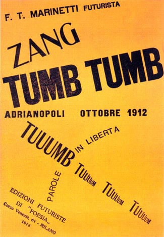
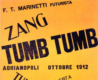
Designed by Italian Futurist Filippo Tommaso Marinetti in 1914.
There’s a vast variety here. The intentionally disruptive, chaotic pages of scrambled words by the Futurist founder Marinetti contrast with the starkly practical New Typography of Jan Tschichold. Some of the most beautiful and dramatic pages are the work of the Russian Constructivists, with their industrial exhortations in black, white, and red. It helps to be able to read Cyrillic type to appreciate them fully. Indeed, only a reading ability in several languages would make this book completely appreciable, since the examples are taken from a variety of European countries and the words on the pages may be in English, Czech, German, Spanish, Russian, French, or Italian. The captions translate any titles there may be, which is helpful, but they don’t attempt to translate the full text of what’s shown in each illustration. (For example, on page 201 one of the illustrations is captioned “Title page of ‘Flugblätter mit dem Buntquadrat’ [Leaflets with the Motley Square], no. 1, 1924,” but you have to read German to understand that the text is about what makes good design in advertising. A provocative opening sentence like “Advertising is the handwriting of entrepreneurs!” makes me wish my German were better.)
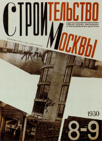
Designed by Russian Constructivists Georgi and Vladimir Stenberg in 1930.
New Media, Then and Now
The use of photography in print, on the same page as lettering or type, was new and exciting in the early 20th century. It’s not unusual today, but it’s still very effective, because of the contrast between the texture of type and the visual nature of photographs. This kind of contrast is even carried over into video animation, where the collage of moving words and pictures still relies at least partly on the fundamental contrast between the two forms of visual communication.
Andel’s introduction ties these developments together in the context of our current moment, here in the early 21st century:
“The introduction of the printed page and the painted picture to the computer screen is the latest in a series of countless artistic and technological developments that advanced the ways in which pictures and texts are interconnected, produced, transmitted, and received. Originating in crossovers between the fields of art, science, and technology, these inventions were often deeply intertwined. Going back to the nineteenth century, and continuing through the twentieth, photography, the telegraph, the telephone, motion pictures, television, the fax, the computer, and the internet have depended on contributions made by artists, architects, film directors, and designers.”

Designed by John Heartfield in 1931.
Pages on Pages
Since the subject of this book is the printed page, it’s interesting to see how the book designer (Enzo Cornacchione) deals with the pages of this book itself. The trilingual text runs in three blocks across the pages, in the same sans-serif typeface but in three different weights—English on top (light), French in the middle (medium), German on the bottom (bold). But not all the text pages carry all three languages. Sometimes only one, or two, of the languages is displayed on a particular page, with the other third or two-thirds of the space taken up with illustrations. The effect is to intersperse the text throughout the highly illustrated chapters, beginning at the same point and ending at the same point but not necessarily taking the same path to get there. This technique also disguises the inevitable problem that the same text will run longer or shorter in some languages than in others. (Since English tends to be the shortest, the typographer could have improved the readability of the English text, and at the same time made it slightly longer, by loosening up the rather tight letter spacing of the lightest weight of type.)
One final quibble: the index only lists the names of people, not of organizations or schools or publications. If you want to find references to the German radical magazine A.I.Z., for instance, you have to know that it was designed by John Heartfield, and go look up his name in the index. An index of proper names is never enough.
This article was last modified on July 18, 2023
This article was first published on July 8, 2002
Commenting is easier and faster when you're logged in!

Recommended for you

dot-font: The Typographic Art of Matthew Carter
dot-font was a collection of short articles written by editor and typographer Jo...
dot-font: Letters as Art
dot-font was a collection of short articles written by editor and typographer Jo...

dot-font: Optima nova—New Take on Timeless Face
dot-font was a collection of short articles written by editor and typographer Jo...