


![]()

We all remember the first Web pages we created. At the time, we thought they were all that and a bag of chips. But looking back, they contained a number of things that just screamed "rookie," "amateur," "newbie." Now, that you’re a professional you’ve surely overcome your newbie ways, right? To make sure you haven’t fallen back into old habits, we polled our team of experts (an art director, a couple of writers, and our favorite bartender) to determine what immediately says "amateur" to them as they surf the Web. Here are our findings.
Can’t See the Forest For the Trees
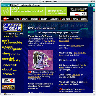
By far, the biggest mistake people make when designing Web pages is using a background image or color that makes the page illegible. Even the folks at ZDTV sometimes forget these basics, as illustrated in Figure A. Granted, you could argue they’re going for a feel, but the only thing the viewer will feel is eyestrain. You don’t see book publishers using textured backgrounds for their print pages do you? And when was the last time you saw a book printed on black pages with white letters?
Figure A: Concept pages are often headache pages.
Just because you have the ability to add a texture or picture to a Web page’s background, it doesn’t mean you should. You have two hands and a face but that doesn’t mean you should go around all day slapping yourself (although our Aunt Millie was able to secure a comfortable living from the government with this ruse).
If you’re going to add a background graphic to a page, you should ask yourself what it actually adds to the page. If you must add a graphic, make it very innocuous. Should you decide to add a color to the page, make sure it doesn’t take away from legibility. As boring as it may sound, black type on a white background is still the best way to ensure legibility.
Shoot the Piano Player
Do we all really need to hear Barry Manilow played on some cheap keyboard and loaded onto a page as a MIDI file? For that matter, do any of us really need to hear Barry Manilow at all? Here again, just because you have the ability to do something doesn’t really mean you should. If your viewers are at work, chances are they don’t want your musical choice being played all over the office, and if they’re at home, they’re probably listening to something better anyway. Like before, the question has to be whether the music lends anything to the page. Will it keep the viewers there longer or will they leave because the music is so obnoxious?
Warner Brothers You Ain’t
A well-designed, well-placed animated GIF is a good way to highlight a portion of your page. It isn’t, however, a way to highlight several portions of your page. Sure they’re cute and eye-catching but they simply lose their effectiveness as you add more to the page. One works–five distract. Also, while we’re on the subject (and our soapbox), do the animations really need to loop continuously? If the viewer doesn’t notice the GIF in the first few seconds, is a continual assault with your visual trinkets going to do any good? A good idea is to set the last frame of the animation to pause for around 10 seconds before it repeats. Then set it only to repeat a few times.
Don’t Go Over a Few Thousand Words
If a picture is worth a thousand words, then you shouldn’t need more than oh, say, five to eight thousand to get your point across. What we’re trying to suggest is that you forgo adding tons of graphics to your page. Remember that this only leads to an increase in download times.
Garanimals for the Web
Remember Garanimals? They helped kids mix and match their clothes based on the animal on the label. Why don’t we have this type of thing for the Web? As unfortunate as it may sound, there are people out there posting pages to the Web that simply use some abysmal color choices. If you can’t match, stick with primary colors. Or ask an artistic friend to help you with your color scheme.
My Other Me Likes This Page
Your site should remain consistent in look and feel throughout, instead of one page like this and another like that. Don’t make your site look like things were just thrown up to the server in a hodge-podge manner. Make the viewer at least think you’re organized.
This Page Best Viewed From the Caribbean
It was all the vogue a few years ago to include a little line, and maybe even a graphic, saying something like This page designed to be viewed by Netscape Navigator 3.0. If you think about it a second, what’s the purpose? There are still so many variables in Web design that there’s no way to guarantee what you see on your machine will look like what the viewers see. And do you really think they’re going to read the message, quit their browser, load the one you suggest, and then come back to your page? As the old eight ball says "Very Doubtful." Just leave the suggestions off.
Badges, We Don’t Need No Stinkin’ Badges
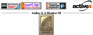
Some people seem to think that free graphics are cool graphics. That’s probably why they have all those little images (referred to as Web badges) promoting everything from search engines to the software they used to design the Web pages. Or even worse you may be promoting both browsers, a Web service, and the fact that you found a badge for ActiveX, as shown in Figure B. (The site we found this on didn’t actually use ActiveX, but it sure is a darned nice graphic!) These graphics clutter the page, increase download time, and add nothing very useful to the page. Get them off of there.
Figure B: Wow, and they’re a member of the HTML Writers Guild too!
Use ’em or Lose ’em
Frames can help the viewer navigate the site but only if you’ve designed them correctly. If you just can’t get the knack of frames, don’t use them at all. You’ll just cause the viewer to leave.
And a One, and a Two…
It’s always good to know who’s coming to your site and how much traffic you’re getting, but really, who cares? You, possibly a few people in your company, or your client. Why clutter your page with something that no one else cares about? Have you ever seen a counter on the sites of Apple, Yahoo!, or Microsoft? You can monitor the traffic without displaying the counter.
I Before E
One thing sorely lacking from the current generation of HTML authoring tools is a good spell checker. That’s not, however, an excuse to post things to the Web that are spelled wrong, or contain huge grammatical errors. Take some time and get it right.
Conclusion
At this point we hope you feel proud that you’ve overcome all those newbie signs. If on the other hand you’re blubbering like a baby, chances are some of these things hit a little too close to home. But hey, don’t worry, you still have a few more minutes to change your site before everyone else on the Web reads this article. Better get crackin’.
Copyright © 2000, Element K Content LLC. All rights reserved. Reproduction in whole or in part in any form or medium without express written permission of Element K Content LLC is prohibited. Element K is a service mark of Element K LLC.
This article was last modified on January 8, 2023
This article was first published on May 19, 2000
Commenting is easier and faster when you're logged in!

Recommended for you

Special Characters
Nigel French weighs in on how to locate those hidden gems on the Glyphs panel—an...

Linotype's New Serif, Script, and Stencil Fonts
Malabar For the next 30 days, all customers who purchase any font licenses at Li...

InDesigner: Raphaël Freeman
Addison Lalier shows how one designer has mastered the complex layouts and types...