


I make my living teaching people about color management. I use a variety of tools including spectrophotometers, colorimeters, inkjet printers, and various computer programs to build color profiles. I often use these in conjunction with large printing presses. These are my day-to-day tools, and I’m very comfortable with them.
With these color management tools I measure color, create color palettes, and manage the output of color as it’s displayed on my computer or printed on a printing press. On my desk are a variety of color instruments and on my computer desktop are a variety of color management applications that I use when preparing artwork for printing. Of the tools and software I’ve used over the years, I’ve been impressed by the features the X-Rite ColorMunki Design because it has the ability to bridge the gap between the world of color that’s used in graphic arts and printing and also the world of pigments that can be used in painting and decoration. That’s a nifty feat.
But when not measuring color or printing pages, I enjoy doing many things. For example, I also have a nice woodworking shop, one I use for making furniture, repairing things, and building the occasional picture frame. Using these analog tools in my wood shop gives me as much — if not more — pleasure as using digital tools in my print shop. It’s not surprising that one day these tools crossed paths.
I recently had the chance to use both sets of tools from my professional and personal interests to create a custom picture frame: my woodworking shop to build the frame and my color management tools and instruments to get the right color paint for the frame. Let me explain.
A couple of summers ago I bought a lovely painting from my friend Paula Zima, a wonderful artist who lives in Santa Fe, New Mexico. Her works include paintings, drawings, sculpture, and everything in between.

This painting by my friend Paula Zima was made with acrylic paint on a sheet of Masonite. With its lovely palette of colors, I wanted to be sure the frame complemented the work.
I wasn’t sure how I would present the painting, but I had an idea that I wanted to put it in a frame of my own construction, so that’s where I started. I bought some clear fir boards at the local lumber mill, then ripped them on my table saw — that is, cut the wood parallel to its grain — into sizes more appropriate to picture frame moulding. After ripping the wood into smaller pieces, I ran it several times through a finishing drum sander to get the dimensions perfect as well as to put a smooth finish on the boards.

The drum sander not only refines boards to precise dimensions but also puts a smooth finish on the boards.
To add a bit more flourish to the frame, I chose a decorative router bit that’s used to create ogee mouldings of the type that are usually found in crown mouldings, or along the edges of antique furniture). I ran the boards through a router table with the ogee bit, which put a nice pattern into the face of the mouldings.
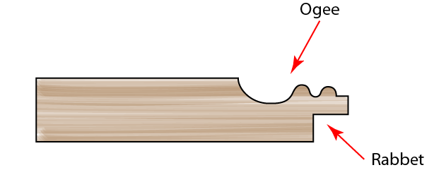
This is an approximate cross-section of my frame mouldings. The ogee router was used to cut the decorative part while the rabbet cutter made the square cut for the painting and the backer board.
I had to cut a rabbet — a square cutout — into the back of the moulding to accommodate the painting, a backer board, and glazier’s points. I did that on the router table also. The result was beautiful smooth Douglas fir boards ready to be made into a picture frame.
After measuring the painting itself, I cut the boards to the right length, mitering the corners and sanding them to perfect 45-degree angles. I put the frame together with biscuit joints — little wooden disks that are glued into slots on both sides of a wooden joint. I clamped the finished frame up for a couple of days, after which I did a lot of hand sanding to complete the job. The artwork fit into the finished frame perfectly.
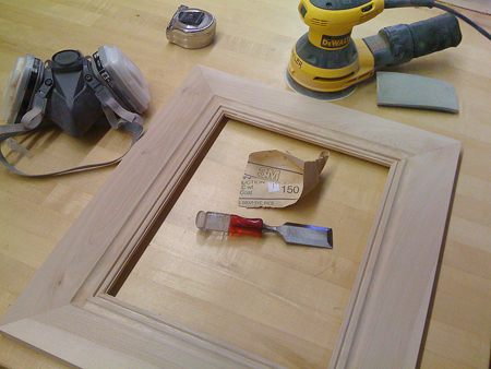
The frame after gluing and sanding is ready to paint. Construction of the frame was relatively easy; sanding it was relatively hard.
Then I moved to phase two: choosing the color for the frame, painting it, and completing the project. Here’s where my “daytime job” of teaching about publishing and photography comes in. I decided to use the color tools I use in preparing artwork for printing to choose a color with which to paint the frame. I was curious to see how a program like the ColorMunki Design application could help in an unconventional setting. For that I followed a path I usually take when I am making reproduction-quality photos for printing.
Here’s how I proceeded.
First, I set up a tabletop photo studio with an easel to hold the painting. Then, using two Alien Bees strobe lights, I photographed a Gretag/X-Rite ColorChecker DC target (replaced by the X-Rite ColorChecker Digital SG) and built a camera profile for my camera-and-lighting set up with ProfileMaker Pro software. This is my normal procedure when I am making fine-art reproductions on printing presses or inkjet printers (though recently I have switched to the ColorChecker Passport from X-Rite).
The idea behind a camera profile is that the behavior of a digital camera and a specific lighting arrangement can be measured and replicated. This ensures that colors in the original can be reproduced accurately in the image. The technique is to photograph a special camera target (the ColorChecker), and then put that image through a program that analyzes the colors in the image (the ProfileMaker Pro software). The software builds a profile that when applied to a digital image makes the colors in the image as faithful as possible to the original thing. When fed into Adobe Photoshop, the profile corrects any inaccuracies in color caused by the lighting or the camera itself.
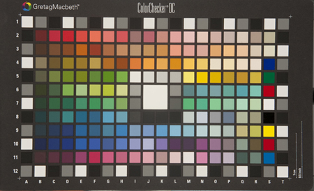
This is the special target I use to build a color profile in X-Rite’s ProfileMaker Pro software. Called the ColorChecker DC, it has a variety of colored tiles that are used to measure the behavior of a digital camera and lighting.
With the same lighting set up, I photographed the painting using my Canon 1ds Mark III DSLR camera. I applied the same camera profile as above to the image of the painting. The result is that on my computer screen I have what I believe is a reproduction-quality color image of the painting.
All this profiling and correcting can be a bit baffling at times. The color image that was corrected by the camera profile created a “corrected” image from the camera. But how can I be certain that the image I see on my computer screen is accurate? This is the challenge that befalls all of us when we need to trust the display on our computer to make corrections in images.
My best recommendation is to calibrate the display occasionally using an instrument like the ColorMunki Display, or the new i1 Display Pro calibrator, both from X-Rite and both of which do an extraordinary job of making the display behave correctly. I calibrate my displays about every three months (though the software reminds me to do it more often).
With the image of the painting open in Camera Raw, I exported a TIFF version of the painting to disk and then opened that image in my ColorMunki Design software. This application not only controls the ColorMunki measuring instrument but also creates and modifies color palettes. (I think it is Pantone/X-Rite’s finest creative color tool.) In the ColorMunki Design software, the colors of the TIFF image are represented as color tiles. I can sort them by name, luminance, category, and similarity. I chose similarity, which is based on their color content — yellowish-gray, bluish-gray, reddish-gray for example — to put them into an order where all of the blues are arranged together, all of the browns are ordered, and so on.
Using the Color Harmony tool in ColorMunki Design, I chose a series of additional colors that are harmonies and complements of the colors in the painting. What I was seeking was a palette of colors that go well with the painting, as opposed to a group of colors that are in the painting. Of course I could have chosen black or white, but I was seeking a palette of colors that would make the painting look extraordinarily nice when ensconced within the frame.
Color complements are sometimes surprising. One color that was suggested by the ColorMunki software is a pale violet. I would not have guessed that color to be a natural harmony of the colors in the painting, but it was. I considered painting my frame with that color but decided to be a bit more conventional. I dragged color complements and harmonies that I liked from the Relations palette in the ColorMunki software into my master palette.
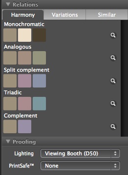
The Harmony palette in ColorMunki Design software shows a series of harmonic and complementary colors based on the selection of a color tile in the main window. These derived colors can then be dragged out into the main palette and exported to the Adobe Creative Suite or used to order paint from some local paint stores.
Once I finished my color palette, I exported it to a file that is compatible with Adobe Photoshop, a file called Painting Colors.ase. I opened this palette of colors in the Photoshop Swatches palette, which added them to the colors available to me for my images.

This is my complete color palette, a combination of the colors in the painting — imported from the TIFF file — and the harmonies and complements I added in the ColorMunki software. I exported this palette in a format that is compatible with Adobe Photoshop.
I then opened the painting image in Photoshop and around it placed a series of rectangular frames onscreen that look approximately like the actual frame that I had built. I filled various parts of those rectangles with colors from my palette of colors in the painting, their harmonies and complements. With a little experimentation I came up with a primary color I wanted for the frame, and then darkened it to simulate the shadows that would fall on the painting. A framed painting is usually lighted from above, which creates predictable shadows at the top of the opening of the frame. I was very pleased with the result.

Placing mocked-up frames around the image in Photoshop allowed me to experiment with colors and test the effect of shadows.
As we all know, every paint store claims to be able to match almost any color you can carry in to the store, but few advertise that they can translate Munsell paint formulae into actual paint mixes. From an earlier article I wrote for CreativePro.com (“The Colorful Identification System”), I knew that the Munsell Color system was used by the paint industry for most of the 20th century so there would be a paint store where a Munsell color formula could be made into a can of paint.
I returned to the ColorMunki software where I chose my frame color and then selected the Munsell color output from the menus. The ColorMunki software gave me the following formula: 2.5Y 7/2, which is the Munsell specification for a light grayish-brown color.
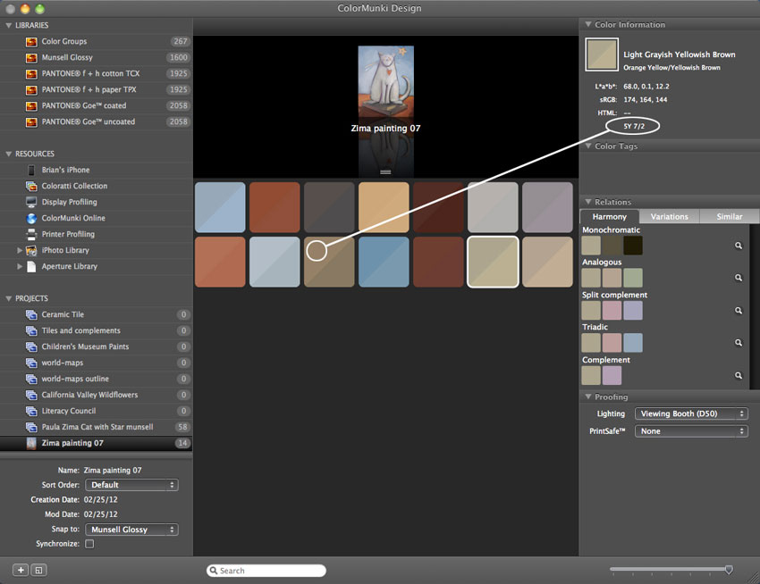
Once the colors from the painting were entered in the ColorMunki Design software, I added to them from the Harmony palette. When I picked my frame color and chose Munsell as the target color system, it generated a paint-mixing formula. Click on image for larger view.
I called around town, asking local paint suppliers if the 2.5Y 7/2 formula meant anything to them. Most responded “huh?” But at one local Sherwin-Williams dealer, the paint specialist entered my formula into his mixing computer, and he got a result for the store’s current mixing system. He was delightfully surprised, as was I. About an hour later I had a quart of paint mixed with that 2.5Y 7/2 formula. When a spot of it was dried on a white card, the color looked almost exactly as I had seen it in Photoshop and the ColorMunki software. Compared against the painting, and it was a delightful complement in every sense of the word.

The paint specialist at my local paint store is shown here mixing the somewhat mysterious Munsell formula for my frame. He and I were both pleasantly surprised that his store’s more modern paint-mixing software accepted the Munsell formula without hesitation. The color was perfect.
I chose to paint my frame with a brush. With all the nooks and crannies of my frame, I had to work really hard to get the paint to look good and streak-free. I succeeded, but next time I will paint my frame with a spray gun to avoid visible brush strokes.
When the frame was dry, I inserted the painting into the frame (no glass), backed it with an archival board, and put in glazier’s points to hold the artwork in place. I used framer’s double-sided adhesive to adhere a sheet of black paper to the back, and added a set of frame hangers and a kevlar string across the back. The painting now hangs in a place of honor in our home. It’s the first thing you see when you come in the front door. And every time I see it, I smile, and not just because I like the artwork.
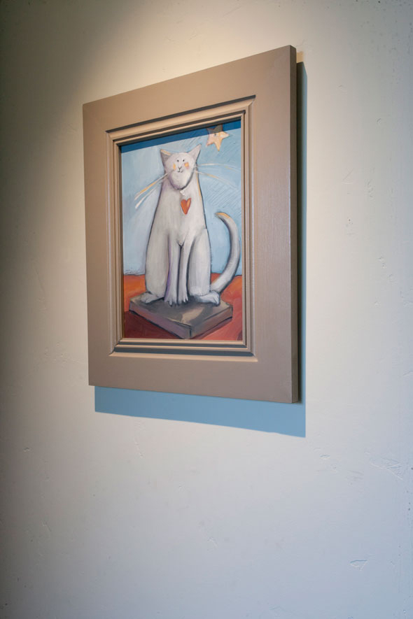
This is the finished product: Paula Zima’s painting hangs inside my home in a place of honor.
This article was last modified on January 6, 2023
This article was first published on February 29, 2012
Commenting is easier and faster when you're logged in!

Recommended for you

Exporting Graphics From InDesign
How to export graphics for websites, PowerPoint, or Word documents efficiently f...

PictureArts Expands Collection Offerings with IBid Partnership
PictureArts, the leading provider of specialty images for professional communica...

Scanning 101: No More Moiré
In your career as a graphics pro, sooner or later you’ll encounter a moiré...