


This article appears in Issue 137 of InDesign Magazine.
In the early days of digital printing, we were limited to just CMYK inks. If we wanted to use spot colors, we had to settle for CMYK approximations.
Anything exotic, such as fluorescents or metallic effects, required putting the job on a more expensive offset press or applying the additional content offline, in a separate operation. To make matters worse, paper stocks certified for digital presses were limited to a fairly dull range of boring colours.
Today things are different. As digital presses have become more sophisticated, they’ve come to rival offset presses in quality. And they offer advantages like fast turnaround and the use of variable data. According to Vicki Strull, design strategist and packaging designer for top-tier and emerging brands, “When brands discover that they can affect inventories, cash flow, and sustainability initiatives by printing smaller runs and/or on demand, with the same or even better color quality, they are thrilled. Then, marketing directors and packaging designers are delighted when they discover how to use versioning to support the messaging of their online campaigns.”
In addition, the inks used by digital devices are not the same as those used on offset presses. They differ in composition and pigments, even the basic CMYK inks. Consequently, the color gamut of digital devices can sometimes exceed that of offset presses. That’s why David Blatner and I preach that you should keep your images RGB as late as possible in the game to let the device’s front-end interpreter (called the Raster Image Processor, or RIP) do the most appropriate conversion to CMYK for that device’s capabilities.
Because digital press colorants have a wider color gamut, they can often approximate spot colors from the PANTONE library more closely than the CMYK inks on offset presses. That’s
why most printers recommend that you leave spot colors defined as such in the files you submit for digital printing; this allows the RIP to optimize the conversion for the device’s colorants. Note that offset presses can use extended-gamut CMYK inks too, but this article focuses on the digital side of things.
But sometimes you want something even beyond what those CMYK inks can muster. That’s when specialty inks come into play.
Note: Example images in this article are RGB (unless you print the article yourself, in which case they’ll be rendered in CMYK), so you’ll see only an approximation of the inks and effects described. Fluorescent and metallic inks simply can’t be rendered in RGB or CMYK, so you’ll have to use your imagination for some of these concepts.
And this is important: Not all digital press vendors offer all of the described inks. Even within a vendor, not every device supports all inks that the vendor offers. So don’t get too carried away until you know the capabilities of the printing company handling your job.
Digital vs. Offset Printing
Although it’s true that everything you create on a computer is, by definition, digital, it’s the printing process itself that differentiates digital printing from offset printing.
A conventional offset press (think of those giant machines you’ve seen in movies about newspapers and magazines) requires multiple plates, one for each color of ink. While the process used to image those plates is digital, the plates are real—not virtual. They are mounted on the press and inked. Next, the inked areas are transferred to a blanket, which then transfers (offsets) the ink to the paper. This happens for each individual ink. The use of an intermediate blanket is the reason the process is called offset printing.
By contrast, digital printing eliminates the plates and the individual printing units. Instead, the presses use an electrophotographic process. Some accumulate all colors on a drum, then apply them directly to paper. The HP Indigo process is called digital offset, because the image is transferred via a blanket. Because the data is imaged for each single impression on a digital press, variable data can be used to customize each successive page. Large-format inkjet printers don’t use plates, either: Ink is squirted directly on paper.
White Inks
White inks are surprisingly versatile. Note that white inks are not necessarily fully opaque, so they may require more than one application to achieve the desired results. Certain digital devices, such as some of the HP Indigo presses, can use premium white inks that offer more opacity in a single hit.
Clear substrates: White ink can be used alone on clear materials. It’s also commonly used as an underlay for CMYK when the clear product will be applied to another surface (e.g., decals, labels, and window signs). In addition, color content can be printed in reverse (flopped) on clear substrates, then the opaque white ink is laid down last (Figure 1). Viewed from the other side, the printed content reads correctly, but it’s protected from wear because it’s “under” the plastic material. You’ll see this approach used on items such as gift cards and package sleeves.
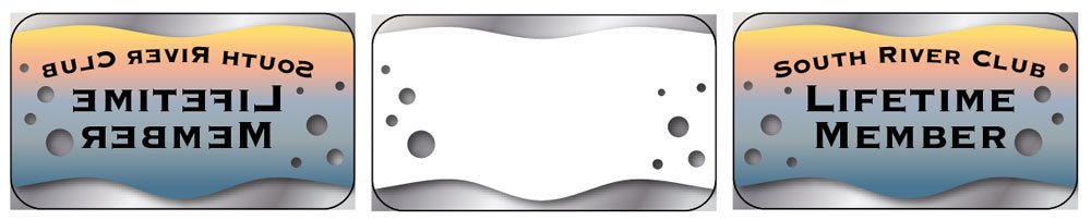
Figure 1. Print artwork backwards on the back side of transparent substrate (left); then, apply opaque white backwards on back side of the piece (center). When flipped over (right), the artwork reads correctly and is protected by the substrate material. This technique is useful for labels, decals, greeting cards, as well as membership and gift cards.
Foil substrates: Because printing inks are somewhat translucent, you often need a white underlay to optimize for text and imagery printed on foil. The next time you buy toothpaste in a shiny package, look closely—the metallic part of the package is the substrate. If imagery were printed directly on the metallic stock, it might be hard to see. The white ink areas exist to provide a backdrop for color content, as well as white artwork to contrast with the metallic stock. Holographic metallic stocks using this approach can be stunning! Note that not all digital presses support foil stock.
Dark or Kraft stocks: Again, because color inks are translucent, they would be lost on very dark paper stocks. To create white text or artwork on a dark stock, you may have to apply some white inks in multiple hits, although “premium” white inks with sufficient opacity may require only one or two hits. If you want to print color on a dark stock, a white underlay facilitates this: First, apply the white ink, then print the color content on top of it.
Expanding the Spectrum
Even with the extra bit of gamut that digital CMYK inks afford, it’s still not sufficient to print some colors faithfully. Bright oranges, vibrant greens, and rich violet tones are still a challenge. Pastel tones (especially light flesh tones) can sometimes print with banding. Additional inks can greatly extend the printable color range. Let’s examine some of the advantages of these special inks.
OVG (Orange, Violet, Green): A number of digital presses and large-format inkjet devices add these three inks to capture brighter reds and oranges, purples and dark magenta tones, and bright greens (Figure 2). HP Indigo presses can also add vivid pink and vivid green to further expand the printable range of colors.

Figure 2. CMYK inks come close to rendering these lovely pansies (left). But adding Orange, Violet, and Green inks (right) really brings them to life.

Figure 3. Subtle color transitions can sometime produce banding, especially in skin tones (left). Adding Light Cyan, Light Magenta, and Light Black can aid in rendering subtle intermediate tones, smoothing the transition (right).
Fluorescent Inks: Yes, you can use brilliant fluorescent toners or inks for bright accents and for artwork with a festive atmosphere to displayed under ultraviolet lights (disco time!). But you can also use them to enrich photographic content far beyond traditional CMYK capabilities (Figure 4). Understandably, this approach will add a bit to your job cost. You’ll find that not all digital press vendors offer fluorescent inks, but rendering these vibrant tones on a high- profile job can be worth the added expense.

Figure 4. Adding fluorescent pink, yellow, and green makes this colorful image fantastic, even without a black light. (Left, CMYK inks; right, CMYK + fluorescent pink, yellow, and green)
Silver: Metallic accents can add class and elegance to a printed piece without the expense of creating a die for foil stamping. While silver ink (whether digital or offset) can never be quite as glossy and striking as foil stamping, it’s much more affordable. Using metallic silver as an underlay allows overlaid artwork to attain a metallic sheen. Here’s a short video showing how one printer is using this approach.
Invisible Yellow and Blue: Why print something you can’t see without special lights? There are creative reasons—“surprise” content for prize contests, for example. But the most common use for inks that are invisible until exposed to ultraviolet light is for security and tracking purposes. Packaging clients often use these inks to prevent (or catch) counterfeiting. At least one printer is using invisible yellow barcodes on printed signatures as part of workflow management.
Transparent Ink: Transparent ink may not be highly visible, but it can be tactile. Multiple impressions can add up to interesting textures, without the added cost of embossing. Used in the same way as spot varnishes on conventional offset presses, clear inks can add shine as well as a tactile aspect to a piece.
Custom-Mixed Spot Colors: Although many digital presses have the capability to print a small range of actual spot colors (not just CMYK approximations), not every color in the PANTONE rainbow is available. However, vendors such as HP Indigo can often custom-mix spot inks as necessary for corporate colors—think of Home Depot orange or Enterprise Rent-a-Car green.
Fade-Resistant Inks: You’ve probably seen old posters in store windows that have taken on a bluish-purple hue. That’s because the yellow ink normally absorbs the blue part of the solar spectrum (and the magenta does so to a lesser degree), but after time it degrades. But now there are fade-resistant yellow, magenta, and orange inks for outdoor usage. No more purple people!
Variable Scratch Off
Here’s a slightly complicated but very clever solution to scratch-off pieces. You’ve probably scratched a few of the old-fashioned game pieces, rubbing off the rubbery gray patch to reveal that you haven’t won anything. HP Indigo Easy Release ink allows a much more attractive approach, using a “sandwich” of inks to achieve the result, with no ugly gray blob. Because digital output supports variable data, this is a great way to set up game pieces and lottery cards so that the prizes are varied. Here’s how the process works on an HP Indigo 7K press:
- Print the underlying artwork that will be revealed through the scratch-off process.
- Apply a coat of varnish.
- Apply a solid coat of Easy Release ink over the entire artwork.
- Print solid black, then solid white to ensure that the underlying artwork is completely hidden and will be a surprise.
- Print the topmost CMYK artwork. See Figures 5–7 for a diagram of how the job is printed, as well as the final result.
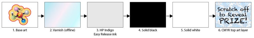
Figure 5. The HP Indigo Easy Release solution for scratch-off pieces is a “sandwich” of six layers, applied in this order. The base art is printed on an HP Indigo press, then the piece is sent to a separate device for the varnish coat. The piece is returned to the Indigo for steps 3 through 6.
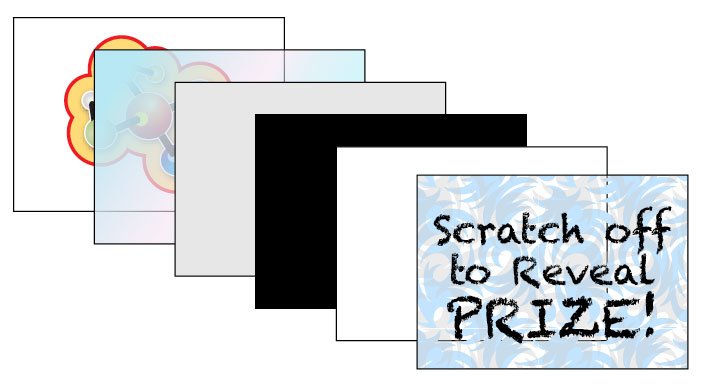
Figure 6. An exploded view of the HP Indigo Easy Release “sandwich”
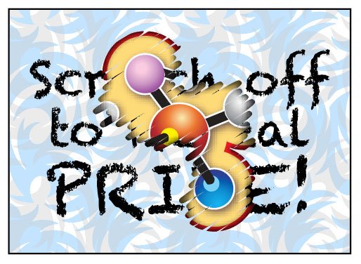
Figure 7. Scratch-off results
Color You Can Trust
The covert marking system developed by VerifyMe can be printed on HP Indigo presses, but can be viewed only with a smartphone with a special attachment. High-end manufacturers, such as cosmetic and perfume companies, use this to spot-check retailers’ inventory to ensure that genuine products are on the shelves—not knock-offs. Curious? Check out verifyme.com/brand-protection.
Digital Foil
Metallic ink, whether on a digital press or a conventional offset press, can never match the brilliance of foil stamping. The traditional method of foil stamping requires the creation of a metal
die which, when heated, enables the transfer of foil from a carrier sheet, baking it onto a printed piece. It’s a lovely effect, but it’s expensive due to the creation of the stamping die, and the fact that the stamping process must take place off the press on a dedicated device (usually re-purposed letterpress equipment). But now Konica Minolta offers a fully digital solution for applying foil, using Spot UV or a varnish as the base for foil adherence—the JETvarnish 3DS press, in conjunction with the iFOIL-S attachment (Figure 8).
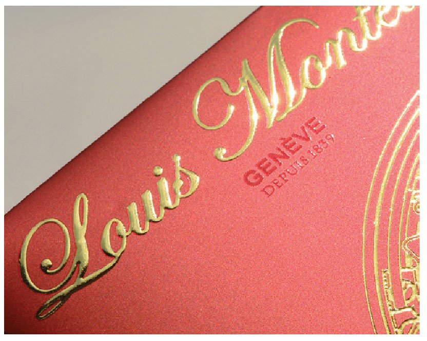
Figure 8. The Konica Minolta JETvarnish 3DS, in conjunction with the iFOIL-S system, offers fully digital varnish and metallic foil application. (Image courtesy of Konica Minolta)
The Konica Minolta solution uses a combination of the spot varnish as the adhesive base for the foil; as the printed sheet is passed through the JV3DS, UV varnish is applied using inkjet technology. The sheet continues into the iFOIL unit, which applies foil that adheres to the varnished areas only. The end result is 2D/3D UV textures and embossed foiling on a wide variety of applications and substrates, including paper, plastic, and synthetic material, all in a single pass. This 100% digital process requires no die or other makeready typically required with traditional foil processes and has all the advantages of digital printing, including variable data or, in this case, VDF (variable data foil). Artwork preparation is much like the approach used for traditional spot color, varnish, or foil applications.
Explore the Rainbow
Now that you have an idea of the wide range of inks and effects available for digital devices, have some fun conversations with your print provider about the possibilities. Keep in mind that digital presses are not intended for long-run projects such as books or magazines; they’re intended for runs in the range from 500–10,000 pieces. Adds Vicki Strull, “If all the inks weren’t enough, the ability to create customized, one-of-a-kind, and even personalized printing with digital printing is very compelling as we’re connecting with customers on a much more personal level. Why not do that with all your print projects too?”
Thanks!
I’m fortunate to have access to some industry folks who are generous with their knowledge, enabling me to share this fun stuff with you. I’d like to thank:
Randy Jamerson — Production Solutions Consultant for Alabama, West Tennessee, Arkansas, Mississippi, Konica Minolta
John Dembia — Manager, Product Marketing, Industrial Print Products, Konica Minolta
Lisa Salerno — Manager, Product Management-Production Print, Konica Minolta
Álvaro Mantilla — Supplies Product Manager, HP Indigo AMS
Laura Field — Worldwide Commercial Media Lead, HP Indigo
Becky Shick — Workflow Architect, GSB Solutions, HP, Inc.
Vicki Strull — Design Strategist and Packaging Designer
Commenting is easier and faster when you're logged in!

Recommended for you


A Closer Look at Obscure Features
Blink and you might miss these 20 obscure InDesign features worth knowing

InDesigner: Cindy Kelley
How unwavering passion led Cindy Kelley to a full-time career in freelance desig...