
Designing Web Sites That Sell: Components of Commerce

Carts and Checkout
The checkout process is the most common cause of failure on commerce sites, causing 40 percent of customers to abandon their carts. According to research by the usability experts at Creative Good, these shopping cart problems amount to $3 billion in lost sales each year.
Creative Good says there are three common interaction design problems with checkouts that result in buying failures:
- Confusion over the difference between “New” and “Return” customer log-in options. Many first-time shoppers mistakenly fill-in return customer log-in fields.
- Asking for personal customer information at inappropriate times, such as before a customer begins to shop or put items in a cart.
- Ineffective error messages such as “An error has occurred” or “You made a mistake on this form.”
Looking at sites like Amazon.com and taking advice from usability experts, it is clear that proven information and interaction principles exist for designing a successful shopping cart and checkout process (see figure 5)
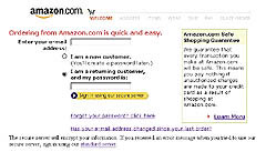
Figure 5: Most shopping carts use a customer sign-in process similar to Amazon’s. Note the reassuring shopping guarantee.
Experts say that your team should follow these guidelines:
- Make the cart accessible on every page. Make it easy for the customer to view the cart and return to the shopping process. Insert a cart icon or “view cart” link into your global navigation.
- Carts should be simple. The shopping cart should include the option to easily add or remove items and change the quantity desired. Let a customer know if the product is in stock before they enter the checkout process. Providing too many other options could distract from these key tasks.
- Show related products. Suggest items similar to ones already in the cart or accessories for the chosen item. For example, if a customer chooses a portable radio, suggest batteries, headphones, or carrying cases.
- Simplify ordering options. Well-defined features need no explanation. If anything in your process requires lengthy explanation, it’s probably too difficult for the customer to use. The ideal ordering process gets customers to the merchandise and their purchases as quickly as possible. Clearly label options. Customers don’t want to read a lot of instructions. They look for an action to take that will bring them closer to their goal.
- Make the shopping cart more forgiving. Provide obvious navigation options for returning to shopping pages. Make sure the customer’s cart will be correct even if the browser’s Back button is used. If an error occurs, the site should call attention to the mistake with a clear, simple, and polite message.
- Allow items to be saved for future purchase. Amazon lets customers save their choices in their cart for up to ninety days. Keeping the cart alive even after it has been abandoned lets customers change their mind and return to the checkout process. Amazon also provides “wish lists” as an option for customers to store items they can share, review, or buy later.
- Let customer review past purchases and recipients. This function prevents customers from having to reenter addresses for family and friends.
- Visually show the process. Once customers are in the checkout process, remove navigational interference. Replace navigation with a process bar that lets the customer know what to expect and where they are in the ordering process. An easy way to do this is by numbering and labeling steps at the top of the page. Make it clear to the customer which steps are already completed and those that remain. In Fig. 4.15, you see that Amazon.com has removed their tab navigation and replaced it with a graphic that clearly outlines the steps of checkout.
Be secure. It’s standard operating procedure for businesses to store user addresses and credit card data securely. But your team will need to reassure the customer that the site is a credible and safe place to do business. Provide links to privacy policies and third-party verification services. Good commerce sites promote security throughout the shopping experience. Amazon.com promotes their safe shopping guarantee under the Add to Shopping Cart button (see figure 6). Amazon.com reinforces the security message with an explanation of the guarantee (see figure 5).
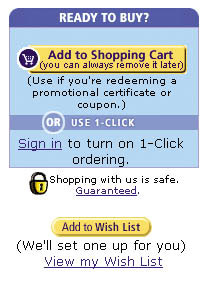
Figure 6: By making the shopping cart accessible on every page and reinforcing its safety guarantee, Amazon.com set the standard for commerce ease-of-use for Web customers.
- Differentiate customer paths. New customers must register before checking out. Return customers merely need to log in. These are distinctly different experience paths. Don’t combine new sign-up forms with return customer log-in forms. Clearly separate them on the page, so that new users don’t fill out log-in forms and wonder why there is a problem.
- Don’t make the customer log in to use a cart. The appropriate time to ask customers to log in is the first step of the checkout process. Asking customers for all their registration information any earlier is prohibitive to the shopping experience. Does a grocery store ask you for a driver’s license every time you put a bag of chips in your basket?
- Keep order forms simple. Make filling out forms as quick and painless as possible. For repeat customers, automatically fill in fields with their existing customer information. For example, fill in the shipping address fields with the Bill To address. Use the customer’s e-mail address as the log-in ID or user name. Their e-mail address is easy to remember and is a vital piece of information that the site needs anyway.
Frustrated customers will leave their carts full in the checkout line. They will be equally frustrated at a Web site when faced with forms that make them think they’ve completed a sale when in fact they’ve only registered on the site, or with fields that don’t accept phone numbers typed in different ways. Good forms are hallmarks of an effective interaction design.
This article was last modified on January 8, 2023
This article was first published on September 18, 2002
Commenting is easier and faster when you're logged in!

Recommended for you

Publishing With Sound
How to add all the bells and whistles to ePubs, PDFs, and DPS apps with audio fi...

New HOW Logo Design Awards
This is the first year for HOW Magazine’s Logo Design Awards. Like its Pos...
Changing an Arrow’s Direction (Reversing Paths)
When you assign a Start or End style for a path in the Strokes palette (for exam...