
Designing Web Sites That Sell: Components of Commerce

Breadcrumbs
Breadcrumbs augment global navigation and provide an efficient way to indicate where the customer is on the site. Breadcrumbs show the path from the home page to the current page. To be effective, breadcrumbs should be kept simple and be nested above or below the global navigation bar.
Local Navigation
Local navigation complements global navigation. It provides more specific options that would overwhelm the customer if they were always part of the global navigation. Typically, local navigation defines the hierarchy of a category page.
For example, the local navigation components of an automotive category area would offer subcategories like accessories, batteries, brakes, and so forth. Local navigation gets customers browsing by offering them more specific information targeted to their interest.
Contextual Navigation
Contextual navigation guides customers through content related to the product or service. Amazon uses contextual navigation in brilliant ways. Every book, DVD, toy, or power tool is surrounded by contextual navigation that reveals the amount of information available for a given product.
Successful navigation schemes make content accessible to the customer. They are sensitive to customers’ information needs and goals. When a navigation scheme fails to get customers to the content they want, they turn to the search function.
Search
The search engine has become one of the standing elements on many commerce sites. Some commerce sites even forego a large product promotion, opting for a large search box instead. With the predominance of search boxes on commerce sites, you’d figure they are the answer to a successful site.
Unfortunately, that doesn’t appear to be the case. Usability experts Erik Ojakaar and Jared Spool have found that visitors to a site are 77 percent more likely to find the content they want when they don’t use the search engine.
These experts also found that visitors go to search only after they could not find what they wanted through links. Search is not a panacea for poor navigation design.
Therefore, according to Spool and Ojakaar, the best commerce site designers try to keep their visitors from having to use search at all. Not to mention, a well-thought-out navigation scheme can be more valuable, and less expensive, than a sophisticated search engine.
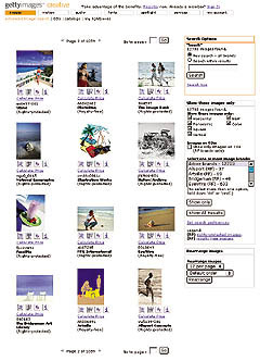
Figure 4: Stock-photo agency Getty Images orients its search results page to the goals of the customer by offering options to sort by shape, color, brand, and licensing.
But since most customers expect a search to available on a commerce site there are some interaction guidelines to make the search engine more useful to your customers:
- Keep the search box in the same place. Making it part of the global navigation will keep it from moving around from page to page.
- Make the search box easily recognizable. Don’t make it fancy. Use the word “Search,” not “Find” or “Browse.” The box should make it clear what will be searched-the entire site or just within a category.
- Understand how your customers use search. Focus search interaction on how customers will probably use the information. Do they need highly detailed descriptions? Will they use search to browse products?
- Display results sensibly. Consider grouping search results in logical categories. If someone types in “shoe,” display results under headings “Women,” “Men,” “Running,” etc.
- Provide understandable feedback. Display the original search query prominently, show how many pages retrieved, make it easy to revise the search, and make it obvious when the search found nothing.
- Add navigation that encourages browsing. Again, get your customers to browse. Add contextual navigation like related products or categories to the results page.
This article was last modified on January 8, 2023
This article was first published on September 18, 2002
Commenting is easier and faster when you're logged in!

Recommended for you

Quark Announces Support for Windows Vista
Quark announced today it will post a free download update online within 30 days...

The InDesignSecrets Chutzpah Award for Creative Uses of InDesign
Daniel T. wrote us to report a creative use for InDesign: My current contract ha...

Tracking Down a Mysterious Linked Text File
A great bit of troubleshooting reveals the source of a missing text file in the...