Designing a President

As election day nears, you pretty much have to hide under a rock to avoid political messages in any and all media. A lot of time and effort go into crafting the brand images of the candidates. Chief among these efforts are the campaign logos that adorn everything from lawn signs and bumper stickers to banners, buses, and airplanes. But can good (or bad) design really affect the outcome of an election? How much do campaign graphics contribute to your overall impression of the person running for office? It may be impossible to quantify, but it does make for an interesting discussion. Here are some resources for learning about graphic design’s role in Presidential politics.
Logo Design Works has a list of their Top 10 Presidential Campaign Logos from 1968 to 2008.
4President.org has campaign materials, including signage, bumper stickers, and TV ads spanning from the present back to 1960.


Constitution Daily offers All the President’s Serifs: Typography on the Campaign Trail.
Imprint analyzes how the font choices of President Obama’s 2008 campaign influenced designs of candidates across the political spectrum in 2010.
Salon’s Campaign Font War casts the current presidential campaign as a contest between two fonts from Hoefler & Frere Jones, Gotham (Obama) and Mercury (Romney).
Back in 2008, The Boston Globe decoded the designs of all the presidential candidates, in What fonts says “Change”?
When it comes to presidential branding, like everything else nowadays, there’s an app for that. Designing Obama is an iPad app to chronicle the use of art and design in Obama’s 2008 campaign.
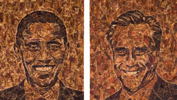
Finally, here’s a piece that speaks for itself (or at least I hope it does, because I have no idea what it’s saying): portraits of Obama and Romney by artist Jason Mecier entirely done in beef jerky, from Huffington Post’s Hail to the Beef.

Mecier’s past works include portraits of Jerry Seinfeld in breakfast cereal, and Rachael Ray in pasta and beans, and Condoleeza Rice in, well…I bet you can guess.
This article was last modified on January 6, 2023
This article was first published on September 25, 2012
Commenting is easier and faster when you're logged in!
Recommended for you

Glyph Positioning and Baseline Shift
If you are a creative professional who is a stickler for typographic details, or...

New Fonts Popping Up All Over!
With the warmth of spring sunshine, great new Font Bros fonts are poppin’...

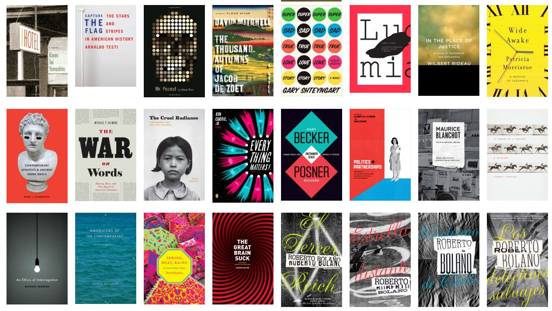
The Book Cover Archive is a Treasure Trove of Design Inspiration
Next time you feel the need for a little visual inspiration, head directly to Th...


