
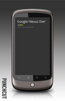
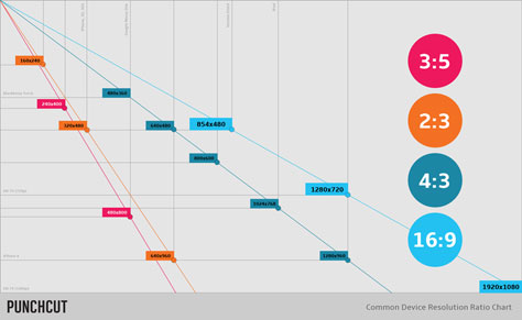
2:3. 3:5. 4:3. 16:9. If your designs have to accommodate the many aspect ratios and screen resolutions that proliferate in the mobile device market, these numbers are all too familiar. Certainly Punchcut (a company that designs user interfaces for a whole raft of devices) knows the pain you’re feeling. Punchcut’s designers have suffered through it themselves. Now they’re sharing the fruits of their experiences–and a handy set of tools.
The toolset includes the following:
* Photoshop marquee-tool presets for common screen resolutions.
* Templates of common devices intended for design presentation.
* A reference chart for resolutions and device landscape.
Get more information and the entire toolset here.
This article was last modified on December 14, 2022
This article was first published on April 6, 2011
Commenting is easier and faster when you're logged in!

Recommended for you
A Designer’s Guide to InDesign and XML
I'm very happy to report that I have just received a copy of A Designer's Guide...
InDesign Typography
InDesign users who want to improve their typography knowledge and skills have an...

Before&After: Picture It Twice
Use the same image twice—differently—to fill your space beautifully.