

This article appears in Issue 34 of CreativePro Magazine.
Think of a time you saw a new logo for one of your favorite brands. Most likely, you felt a reaction immediately. You loved it, you hated it, you were intrigued, or perhaps you were annoyed. It’s unlikely you had no opinion at all. If this sounds familiar, you already understand the power of a logo. You already know that a strong logo appeals to a certain audience, reflects the company’s values, and suggests a story.
Researching these factors is a critical step in strategic brand design. Yet, in many ways, a strategy is only a starting point, because even the most comprehensive understanding of a brand’s market and vision does not guarantee a well-executed logo.
So, what are the traits of a strong logo, and how do you design one? Let’s get into the basics.
Species of Logos
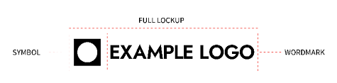
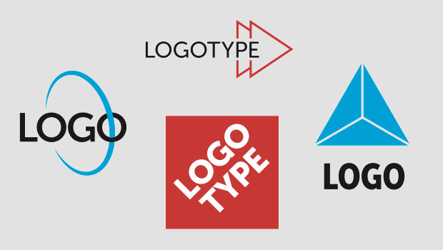
Logos mostly fall within three categories. The two most common types are the wordmark logo (Figure 1a), which is only text (such as the FedEx logo and the Netflix logo), and the graphical logo (Figure 1b), which
consists of a wordmark paired with a graphic (such as the Dropbox logo and the Spotify logo). The third main type of logo is the badge (Figure 1c), in which the text sits within a larger shape (such as the UPS badge and the Starbucks badge).

Figure 1.
Three common types of logos: wordmark (a), graphical (b), and badge (c)
The wordmark logo tends to present a name most straightforwardly, which can be useful for clearly typesetting long names (like Pottery Barn and Crate & Barrel) or adding a distinctive style to shorter names (like HBO and CNN). The lack of a symbol accompanying the wordmark, however, can result in the need for some kind of small mark designed for use when the wordmark cannot fit legibly, which could be initials from the wordmark or a symbol used separately from the wordmark.
The graphical logo offers flexibility, especially since the symbol part often can be used both in lockup (see “Logo Anatomy,” previous page) and separately from the wordmark part. These logos must be designed carefully so that the symbol appears visually balanced when appearing with the wordmark and both components are easily discernable together and apart.
A badge is often very eye-catching and memorable because of the larger shape unifying its text and graphical components. Badges can be difficult to implement effectively in a variety of contexts, such as narrow spaces where many letters or graphic details would not fit legibly. Because of this, often a branding system with a badge logo includes non-badge logo variations.
Some designers assert there are more categories of logos, pointing to combination-style marks (like Burger King), those that have mascots who appear next to the wordmark in different postures (like Planters), those that are primarily used as only a symbol (like Apple), and more. These other types of logos are also worth studying, because they demonstrate that logos do not have to follow common formats to be effective and can evolve as brand recognition is built.
Distinguishing Marks
In terms of design execution, good logos almost universally are:
- Legible
- Simple
- Scalable
- Limited in colors
- Logical
Let’s examine what these mean in practical terms.
Legibility
Logos must be easy to read and their images should be easy to discern—after all, a logo doesn’t work if no one can tell what it is. Logos should be designed with enough clarity that they can be reproduced in any kind of media, including fabric.
Legibility of text can be improved with a simple typeface that has sufficiently thick lines throughout the letterforms, including the serifs. Typefaces with many fine details or too much contrast in line thickness can often lose their thin lines when scaled too small.
Fine-tuning the space between letters is key when typesetting for a logo, since any problems in letterspacing will be magnified whenever the logo is scaled large. One way to achieve good letterspacing efficiently is to apply optical letterspacing first, then manually kern the letters, zooming in and out to evaluate your results at different scales. Perhaps the only instance when adjusting letterspacing is not recommended is when the logo is a script font with letters that should connect.
Simplicity
Simplicity aids legibility and can help people recognize and remember the mark. Be careful, however, of over-abstraction. If a symbol you invented requires an explanation to people familiar with what the brand offers, it may be too abstract. Testing your work on people with fresh eyes can help immensely. Beware of overly complex logos, as they can be difficult to discern quickly or reproduce in small contexts. However, also beware of relying on overly simple shapes, which can seem generic unless they are paired with a distinctive wordmark or are brought to life in the broader branding system.
Scalability
A logo that is highly legible and simple almost certainly leads to excellent scalability, meaning it works well when applied large (on a billboard, on a bus wrap, on a presentation screen) and small (on the side of a ballpoint pen, on a browser tab, on a zipper pull). Usually, designing something that works well at small sizes is more challenging than designing something that works well when large, because letters can optically run together, lines can grow faint, and shapes can appear to “merge” when the design is reduced. If there is no way the full lockup can work well when small—perhaps the name of the company is very long—you may need to design a separate mark that can function like an abbreviation for use in those situations.
Limited colors
The colors in a logo should coordinate well and integrate with the broader branding system. Different logo versions can be created to ensure legibility in different applications—for instance, a logo with dark text that is meant for use on light backgrounds, and a logo with light text that is for use on dark backgrounds. Relatedly, a logo featuring many highly contrasting colors (for instance, one with pastels and darks) can be difficult to apply on dark and light backgrounds because some part of the logo will be less legible. The fewer the colors, the easier it will be to apply the logo in different contexts.
While logos with gradients have experienced a resurgence in recent years, gradients are often impractical and can look tacky if executed poorly. Printing gradients can lead to unreliable results and applying logos with gradients to fabric materials and embroidery can be particularly disappointing. If you design a logo with gradients, it’s a good idea to consider creating a version that has solid colors.
Pro Tip: Begin a logo design by listing all possible end uses.
Logic
The logo design should make sense for what the company does or its story. It sounds obvious, but this is sometimes forgotten when clients want to see random personal preferences in the logo (for instance, demanding that you include their favorite color or font) or ask for changes that complicate the design.
As a logo designer, you must be able to explain why you would not recommend doing something because it would result in a less effective logo. Never shy away from explaining your design rationale—consider it a professional responsibility. Most of the time, clients hire you because they trust your skills and want to hear your opinions on what will make their logo more effective. Similarly, you must always be able to explain why certain choices are logical given what the company does or its story.
Pro Tip: Sometimes, modeling an unwise request can help a client understand your concerns, so together you can consider a better solution. But keep in mind that in some situations, seeing the model may only make the client love their idea even more, despite the shortcomings evident to you. Use your judgment of the situation to decide if you should take this route.
Logic can also take the form of mathematical relationships in the logo. A quick internet search for this will provide dozens of examples of logos that are designed based on the Golden Ratio or on circles, squares, or triangles. It is difficult to prescribe a set of rules for deploying mathematical relationships in logo design as it is specific to the logo, but finding ways to design with “internal rhymes” can improve the balance and integration of a logo’s parts.
Caveats
Logos can lack some of these traits of good logo design and still be successful because they resonate with the right audience, one of the key functions of a logo alongside stating the name of a company.
For instance, a high-end calligraphy pen company may find that a logo featuring intricate script suits its clientele that values fine details, even though this mark is less easy to read than a logo in simple typeface (Figure 2).

Figure 2. A calligraphy company may find an ornate logo, though technically not high in functionality, appeals to more of its target customers than a more legible option.
Similarly, the mark for a dirt bike rental company could attract more of its target customers when designed to be somewhat messy (Figure 3). Gauge the logo’s audience to determine when it may make sense to sacrifice some legibility for aesthetic resonance.
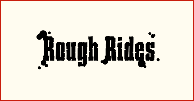
Figure 3. A dirt bike rental company may find a messier logo that suggests a mud-splattered tire tread attracts more customers than a simpler design.
Some traits are less important to certain brands given their use cases. For instance, many governmental seals (badge logos, really) have detailed imagery that does not scale down well but conveys continuity and gravitas. Because these marks are rarely used in tiny spaces, scalability is somewhat less important. While a sleek, modern mark might be more technically functional, it would likely be less effective at its emotional function of communicating authority and tradition.
The function of a logo can also include appealing to the heart. It’s important to recognize, especially when taking on a brand refresh, that fierce loyalty can exist for an amateurish logo design that technically does not function well—this can be because of the charm in the scrappiness or how the informal style conveys a certain personality. Of course, this does not mean a beloved amateurish logo should never change. Instead, explore ways to retain what is beloved or express those traits in a more functional way.
Now that we’ve identified the makings of a strong logo, let’s talk design technique.
Designing in Illustrator
Even if you begin by sketching on paper, it’s best eventually to create the final logo in Illustrator or other vector-based design software. The infinite scalability of vector graphics means that no matter how large you need to export the logo, you’ll never experience jagged pixel edges or blurriness.
Pick your own process
There are many ways to approach logo design. Many designers start by sketching rough ideas in pencil on paper or on a tablet. These sketches can be loose and rough (with the intention of figuring out the bulk of the design after moving into Illustrator), but some designers prefer to polish them to crisper drawings (with the intention of doing less exploration digitally or even vectorizing the sketch as a foundation for the final logo). Other designers may brainstorm better in their minds, finding that they visualize ideas better in imagination instead of getting caught up in drawing them.
Regardless, these rough ideas are then taken into Illustrator, where there are again different ways to proceed. One way is to set the text of the logo first, then design other aspects, and fine-tune everything at the end. Another way is to work on the symbol portion first and the text portion after. Another way is to figure out the overall shape, then the details. Still another way is to explore a little of everything at once, working and reworking to hone the text and graphics holistically.
Through experience, you will find your preferred method. You may also discover that your process changes depending on the project.
Point-level precision
A significant advantage of working in Illustrator is the ability to reshape or move elements with mathematical precision. Because Illustrator can do addition, subtraction, multiplication, and division calculations in the Transform panel (Window > Transform), you can move a point to an exact measurement. For example, to move a point exactly 2 millimeters left, type in -2mm and press Return/Enter.
Another helpful tool is turning on Illustrator’s background grid (Command/Ctrl+’), which can be customized in the Guides & Grid section of the Illustrator Settings/Preferences panel, and to which you can snap points (View > Snap to Grid). When creating the symbol part of a logo or refining outlined type, you can check the positioning of individual anchor points to make sure they are precisely aligned by clicking each of them with the Direct Selection tool (A) and referring to their X/Y axis positions shown in the Transform panel (Figure 4).

Figure 4. Manually checking the Y axis position of the top points for perfect alignment, rather than relying on Illustrator’s snapping functionality, is a good idea, especially with complicated designs, where points might snap to positions you don’t intend.
Pro Tip: It’s a good idea to check the point-level accuracy of any typeface you use in a logo. Errors are rare, but font file corruption can occur, and even uncorrupted typefaces can contain slight errors that could make your final logo look slightly off in large sizes or create misalignments as you design with other elements. Outline the letters (Command/Ctrl+Shift+O), click anchor points individually with the Direct Selection tool (A) with the Transform panel open, and review the X/Y axis positionings.
Versions
You may need to create additional orientations and color settings for the logo. For instance, a vertical logo may need a horizontal version for use in horizontal spaces (Figure 5), and a logo made with dark colors may need a version in light colors so it can sit legibly on dark backgrounds (Figure 6). Because these other versions should all look like the same identity, it’s often more efficient to produce them after you’ve planned out the primary logo that will be most used throughout the brand.

Figure 5. A logo in its horizontal (a) and vertical (b) versions

Figure 6. The light-colored versions of a logo for use on dark backgrounds
Pro Tip: Working only on a screen can warp your sense of scale and visual balance. Printing out all versions of the same logo, each at different sizes, on the same sheet of paper can help you notice problems that you might not catch on screen.
Packaging for delivery
When the logo suites are complete, it is time to prepare the files for packaging. The first step is to outline all fonts (Command/Ctrl+Shift+O) and expand all strokes (Object > Expand). This ensures that your client will not open an AI file to find fonts that are missing or discover disproportionate stroke weights as they scale the logo.
Next, package the logo in ways that will be most useful to your client. In most cases, this means saving each version as an individual file in multiple file formats. Saving as individual SVG and PNG (with transparency) may be sufficient for many clients, but others may also want AI, EPS, JPG, and PDF files (which you may need to explain to the client does not support transparency). Always check that the export resolution is sufficiently large and name the logo files descriptively.
The Big Reveal
Designing a logo is easy. Designing a good logo is very hard. It takes technical skill, creative vision, and business and marketing acumen to create a mark that can serve as a company’s signature and integrate with a broader brand identity system for years to come. A logo designer shoulders tremendous responsibility, as the creativity and quality of a logo can help make or break a company.
But the demands on a logo designer don’t end there. Unveiling a logo to the public eye requires something more: courage.
Just as you instantly react to a new logo for a favorite brand (or potential favorite brand), others will react to your newly designed logo. Rebrands particularly tend to spark a #trending storm of criticisms or praise on social media. The weeks around a logo launch can be emotionally turbulent for the designer. As you take in the (usually unsolicited and very public) feedback, keep in mind that there is no single, correct answer for any logo design.
Whether people say you did a terrific job or a terrible one, know that you have done something important in shaping a company’s identity, and you’ve become a more experienced designer because of the project. Neither lose faith in your abilities nor grow overly confident in them, because the challenges you solve for one logo rarely appear the same way in the next. These challenges are what keep the work of a logo designer ever fresh and engaging.
Design the best logos you can. Dare to share them with the world.
Commenting is easier and faster when you're logged in!

Recommended for you
Make a Grungy Logo in Photoshop
If you’re a seasoned Photoshop user, this little tutorial might not be for...

A Look at Modernism in Logo Design
A new book—Logo Modernism—by Jens Müller set to be released in November showcase...
Creating a Logo in Illustrator
Learn to combine, shapes, symbols, and typography to make a great logo.