
Designing Graphics for Proposals
How to craft graphics that enhance important selling points and drive your message home.


This article appears in Issue 13 of CreativePro Magazine.
“The human brain was built to process content visually.”
—Marcel Just, Director of the Center for Cognitive Brain Imaging at
Carnegie Mellon University
In “Visualizing Data” (CreativePro Magazine, Issue #6), Amy Balliett presents a foundation for why we need graphics in our communication. We know we must marry text content with compelling graphics to create infographic elements.
But the task of creating graphics can be a daunting one. After all, graphics are potent communicators. We should wield that power carefully to find the balance between communicating effectively versus overwhelming our readers, especially with irrelevant graphics. We need to avoid creating an overly busy layout and diluting our message.
This conundrum is especially true in the world of proposals and statements of qualifications (SOQs). Firms are often required to respond to specific questions as part of a bidding process from a corporate or government entity. (See my article “Easy SOQ Compliance” in InDesign Magazine, Issue #144, for more about SOQs and proposals.)
Developing visually compelling, customized content for SOQs and proposals within the schedule constraints is challenging. We know we need to make our firms stand out from the competition, and infographics draw in the reader.
And yet, we often create documents filled with words.
So. Many. Words.
This challenge is certainly not limited to SOQ and proposal development. Designers must often create a single document that includes different types of narratives and messages that need visual attention.
So how do you make your document visually appealing but not graphically overwhelming?
Determine Objectives
First, determine your objectives and ask yourself:
- Does this graphic further the message or just fill space?
- Is this graphic easy to understand, or is it so hard to comprehend that I need a graphic to describe the graphic?
- Does this graphic clearly communicate the message? Am I using the right type of graphic to illustrate the point?
- Can this graphic include an action caption—text that complements it and communicates the message further?
Visual Opportunities
Once you determine the objectives to consider, break your content down and look for opportunities to visualize your text in key areas:
- Statistics
- Geography
- Time
- Process
- Hierarchy
Statistics
Numbers in text are among the most complex pieces of content for our brains to decipher. Statistics in a narrative are simple to identify and easy targets for infographic development.
“Numbers force readers to pause, find the digits amid the text, ponder their relationships to each other, and weigh their relative values.”
—Laura Stanton and David LaGesse,
Superpowers of Visual Storytelling
Example: Our company has five project managers, 10 account executives, 15 professional administrative staff members, 20 designers, and 35 project engineers, offering you the depth and breadth of engineering staff to complete this project on time and within budget.
The text above will slow the reader down as they try to discern the importance of the numbers and how they relate to each other, possibly missing the most important message—that the firm has enough engineers for the project to meet the budget and schedule requirements. This text is a good candidate for a graphic. But what kind of graphic is appropriate?
The content describes one company divided into five categories of staff types. You can use a pie chart (Figure 1) to illustrate an object with five pieces, with further graphic emphasis on the one piece that highlights the engineering staff (Figure 2).

Figure 1. This simple pie chart illustrates the breakdown of the staff but stops short of furthering the message. In this scenario, all pieces appear to have the same importance.

Figure 2. With a quick glance, this chart illustrates the message, calls out the engineering piece, and the caption communicates the message.
Geography
Text focusing on a region, demographics, or specific locations is perfect fodder for a map.
Example: To serve your needs on this Dallas project, our company has teams in five Texas offices in Dallas, Fort Worth, Austin, Houston, and San Antonio.
Clearly, a map would work well here. You can easily get sucked into all the cartographic options we have available as designers (Figure 3), but the message you need to convey is simple: “We have a Dallas office near your project.” Don’t force readers to discern the importance of extraneous graphic features. A simple, identifiable map is all you need to support this message (Figure 4).
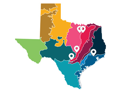
Figure 3. While the map of Texas is identifiable, this map includes ecological areas irrelevant to the message without any additional context.
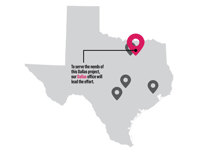
Figure 4. Simplifying the map and calling out the Dallas icon with an action caption provides the reader with the message.
Example: Being accessible to the physical site is essential to this project’s success. And while this project location is remote for most people, it’s close to us. In fact, our project manager lives 10 miles from the facility and can be on-site within a short 15 minutes.
You could bury that fact in text—or you could reinforce it clearly with an image (Figure 5).
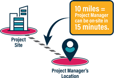
Figure 5. You can differentiate your team by illustrating that a critical team member is based close to the site, especially if it’s remote.
“Get rid of everything that is not essential to making a point.”
—Christoph Niemann, illustrator, graphic designer, and author
For details about creating maps with ArcGIS, see Sarah Bell’s “Designing with Maps” in CreativePro Magazine, Issue #8.
Time
You can take content that describes a firm’s history, an itinerary, or a schedule and reimagine it as a timeline.
Example: Our company was founded in 1987 in Atlanta, Georgia. In 1997, we expanded to the West Coast, and in 2006, we won our first $500M+ project in the industrial sector. In 2011, we expanded our services to include bridge and roadway construction. Now, in 2022, we have 2,000 employees in three countries.
Because humans think of time in a spatial context, you can create a visual diagram of time to assist the reader in understanding the content (Figure 6).
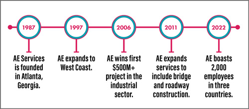
Figure 6. A timeline offers a visual break in the text, putting each element on a single line, representing time spatially.
Across cultures, human time concepts depend, in large part, on metaphor—in particular, on what cognitive scientists call conceptual metaphor, in which we think about something, in this case, time, in terms of something else, in this case, space.
Process
A process can be linear or cyclical. It defines a workflow or instructions not connected to time—instead, the focus is on each step.
Example 1: As a client account manager, Juan Marcello’s primary responsibility is to find potential projects with his client accounts. Once identified, Juan leads the effort to procure the work, whether it’s through a formal or informal proposal process. When we win the project and the first task begins, Juan is the liaison to ensure we meet the client’s needs throughout the project lifecycle. Once complete, Juan follows up with the client with a satisfaction survey and determines if more projects are on the horizon.
This content clearly illustrates a process. But does this content have a definitive start and end (linear), or does the process start over again (cyclical)? In this example, Juan’s work is never done. Because he repeats the process with each new project, a circle provides an ideal way to communicate the concept (Figure 7).
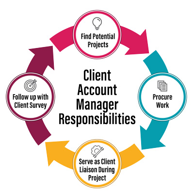
Figure 7. Juan’s process is cyclical as he continues to develop new work.
Example 2: The project begins with a project kickoff followed by conceptual design. After a review meeting, our team will create a detailed design and submit it to the owner for review. Then we enter the final design phase, followed by construction.
A good process graphic (Figure 8) illustrates a single path or a sequence that’s easy to follow. Use lines and arrows to illustrate movement.

Figure 8. A linear process flowchart can illustrate the project lifecycle because it’s not tied to specific points in time.
Hierarchy
When communicating a message that shows relationships in order—top to bottom, left to right, center to outside, greatest to least—you can use a hierarchical graphic, such as an organizational chart, a pyramid, or concentric circles.
Example 1: Project Manager Maria Espino will lead this project. Maria will serve as the main point of contact for the client. Maria directs the efforts of the Civil Engineer, Structural Engineer, Surveyor, and Environmental Specialist.
Illustrating a company or team hierarchy is the perfect time to use an organizational chart. An org chart shows reporting responsibilities and the relative level of each position within the structure. Figures 9 and 10 show you how you should be careful with the details.
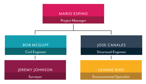
Figure 9. Pay attention to the lines in your org charts. Do they clearly show the reporting structure? This example shows a relative hierarchy but conveys the reporting structure incorrectly. It illustrates the Civil Engineer directing the Surveyor and the Structural Engineer leading the Environmental Specialist.
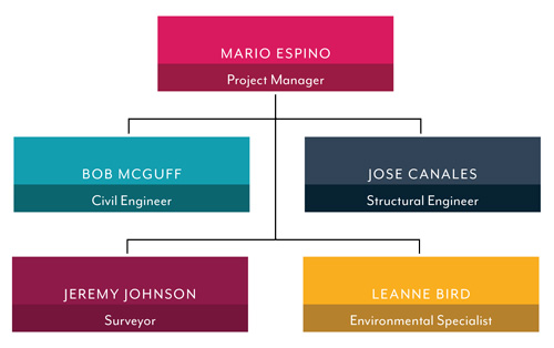
Figure 10. This org chart example subtly, but correctly, illustrates reporting responsibilities.
Example 2: Communication is central to the success of this project. We have the following tools in place during project execution:
- Custom document management tool
- Custom online meeting platform
- Custom client review portal
- Direct contact information for project manager
You can reimagine this text with a centric hierarchy graphic (Figure 11).
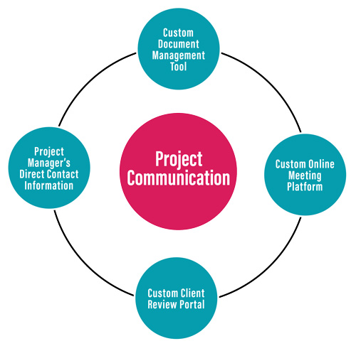
Figure 11. This simple centric graphic illustrates the message without overwhelming the reader.
Pay attention to the importance of each element. You can represent hierarchy from top to bottom, from left to right, or from center out.
Make Sure Your Graphics Support Your Message
Although we have covered five text areas that are good candidates for infographics, remember your objectives and the power that graphics have on the reader.
For example, if you want to tout your Texas presence for an El Paso project and your closest office is in Houston, consider that El Paso is closer to Las Vegas, Nevada, than it is to Houston. Creating a map might not be in your best interest.
It’s Your Turn
Developing graphics is not always so simple. Most text overlaps more than one of the five key areas we’ve discussed here.
Example: Your journey will begin on December 1, 2022. You will spend three days in Paris and board a train for Munich on December 4. After four days of exploring southern Germany, you will fly to northern Spain, where you will spend seven days immersed in Catalan culture. Then, on December 15, your vacation culminates with a farewell dinner in Barcelona before you board your flight home.
This example is a tricky one. It combines time and geography. Can you combine the two in an easy-to-understand graphic?
Ideas in SOQs and proposals can be complex, but when you explore opportunities to break up your text and reimagine narrative content as infographic elements, you can bring your documents to life, make your company stand out, and boost your bottom line.
Commenting is easier and faster when you're logged in!

Recommended for you

CreativePro Conference Speaker Spotlight: Keith Gilbert, the Typeface Nerd
Welcome to our new series of posts called Speaker Spotlight, designed to highlig...

Making Heat Maps with GREP and Data Merge
With this scripted technique for creating heat maps in InDesign, you can craft s...
CreativePro Week Conference Speaker Spotlight: Keith Gilbert, the Typeface Geek
Welcome to our Speaker Spotlight series, designed to highlight some of our Creat...