
Designing a Restaurant Menu
How to use InDesign to create a menu for a restaurant or cafe that’s attractive, easy to edit, and cheap to print

This article appears in Issue 122 of InDesign Magazine.
So you’ve been asked to design a menu! It seems like sooner or later every designer must attempt it. But menus can be tricky, even though they share many common design considerations with other print projects. Of course, you must decide page size, font, colors, and how to present a large amount of information in a finite amount of space—all in a way that is both appealing and functional. But we’ve all seen ugly menus and beautiful menus. So how to tip the scales so your menu will tend toward the latter?
For this article, I’ve invented my own fantasy restaurant, one that serves some of my favorite dishes and beverages. The restaurant (in my mind) has an informal, shabby chic, eclectic vibe that I want the menu design to reflect and promote. It is a wooden floor, comfy seats, not-too-brightly lit, not-too-loud kind of place offering an unhurried dining experience that won’t break the bank.
First Steps
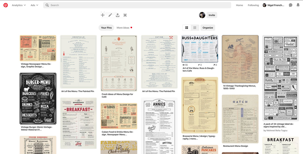
As with any project, I start out by researching how others have solved similar problems, looking at other menus, especially at those of competitors. As I go along, I compile a mood board for inspiration. This can be as simple as creating a Pinterest board or a Behance collection (Figure 1).
I should mention that there are some perfectly serviceable free InDesign menu templates available if you scroll down in the New dialog box. If you’re in a hurry and/or you don’t feel comfortable in InDesign—or if you just like the look of these templates—these can be a good starting point. There’s also a menu template in the collection of Premium Templates at InDesignSecrets. And you’ll find dozens of paid templates at design resource sites such as Envato Elements.
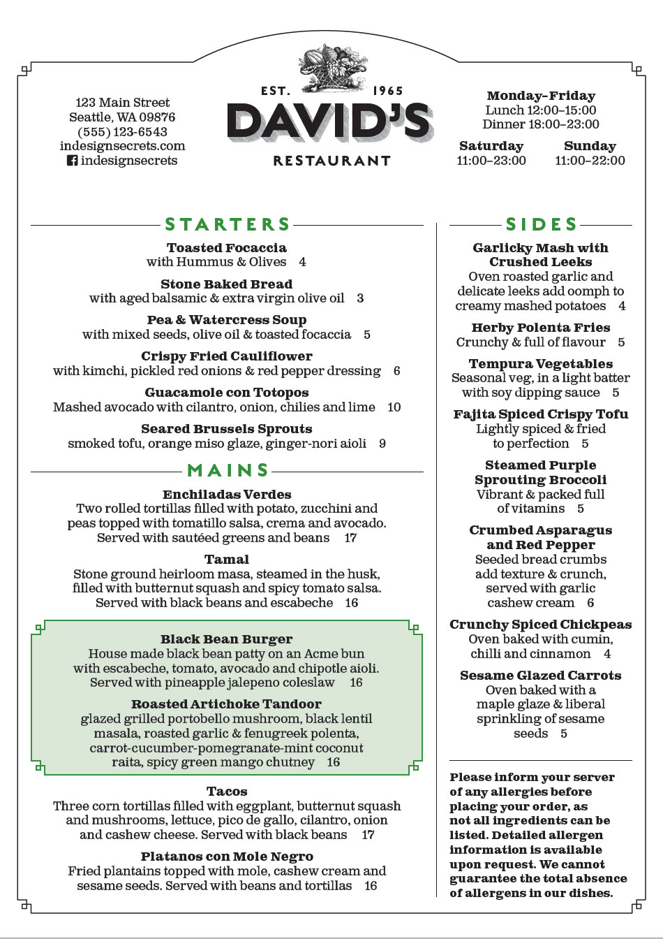
Because nostalgia is an important motivator when it comes to food, I’ve chosen a vintage design vibe with Victorian fonts that evoke a past era, albeit an idealized one when food was fresher, healthier, and tastier. The slab serif Clarendon also has the advantage of being easily read in the restaurant’s romantically-lit booths and corners. (Designers under 40 years of age, take note: the choice of font and text size are more important than you’d expect if your restaurant caters to the rest of us.)
The green used as an accent color reinforces the healthy, natural theme (Figure 2).
Creating the Layout
Restaurant-goers expect a menu to follow a basic format. This probably isn’t the time to conceptually and visually challenge your audience. The item descriptions should be short and unpretentious—but enticing enough to make a guest’s mouth water.
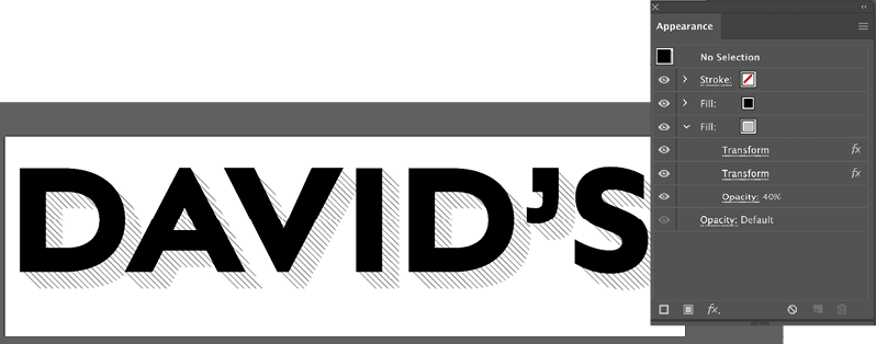
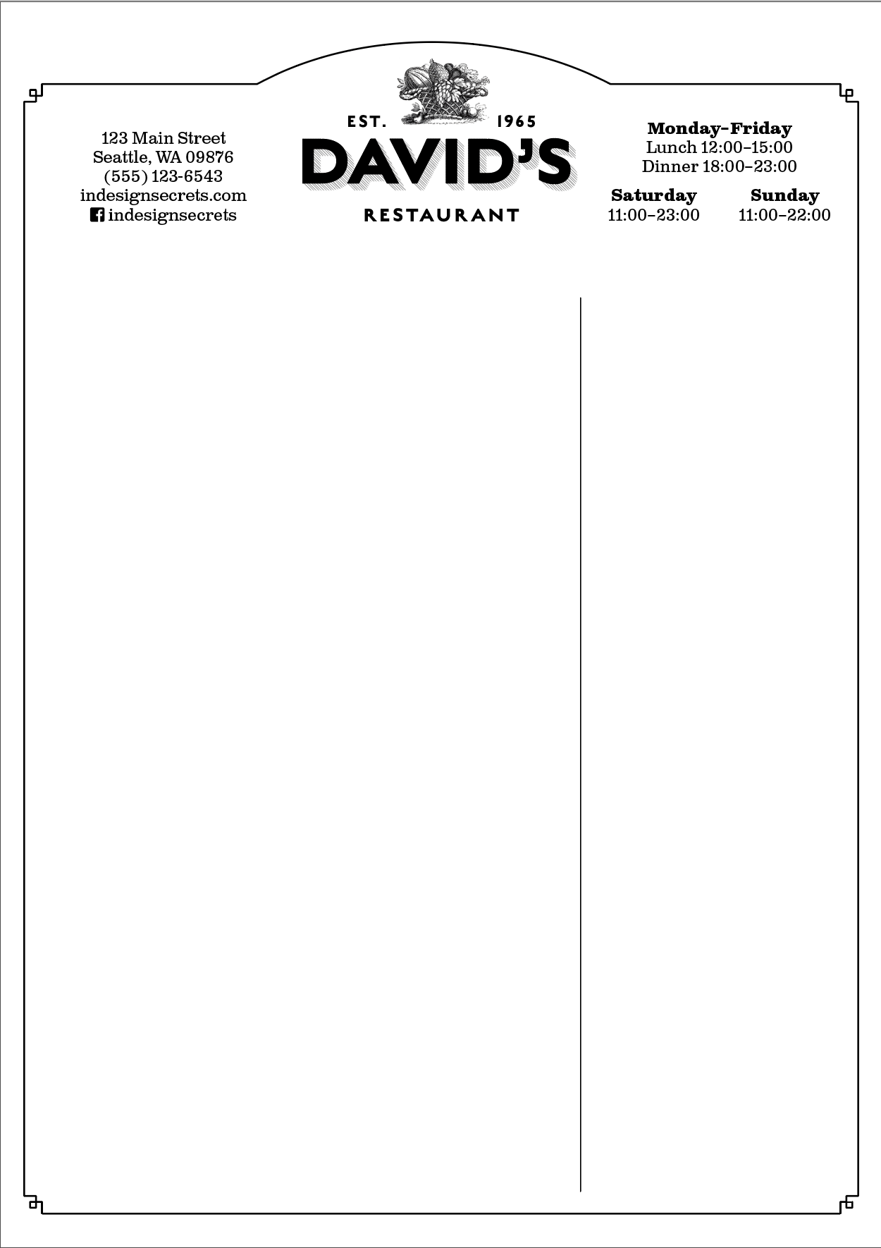
I’ve placed the restaurant logo and name at the top of the menu. I created the logo in Illustrator so I could add the shaded and extruded shadow—an effect that would be a huge pain to create in InDesign (Figure 3).
The hierarchy is unambiguous, with the menu broken into clear sections—starters, mains, desserts, and so on. Because space is tight, I carefully used the limited white space to logically organize the information and guide the reader. I’m reminding myself as I go to keep things simple.
Of course, budget and practical considerations must also be taken into account. How often will the menu be updated, and by whom? My menu is designed to be printed on an office laser or inkjet printer, so it can be updated as needed—daily, if necessary. For this reason, there are no elements that bleed to the edge of the page.
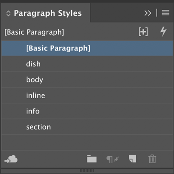
Similarly, because we may need someone with little experience to update the menu each day, I have clearly named the paragraph styles, and defined them to include all the necessary text formatting (Figure 4).
The page frame and inter-column rules are on the master page, and so they’re locked and safe from harm when the document is updated (Figure 5). In addition to the print version, I can easily export a PDF for inclusion on the restaurant’s website.
I’ve chosen A4 size (or US letter) because it’s easy to hold and easy to reproduce. Since the menu will be updated regularly—and not necessarily by an InDesign wiz—the document’s construction should be as transparent as possible and the required materials as available as possible. I’m resisting the use of potentially confusing nested styles and the need for origami folds. The color palette is limited—in part for the same reason, but also because black on white text provides the best contrast, especially in a dimly-lit environment and, not least, because simpler is better.
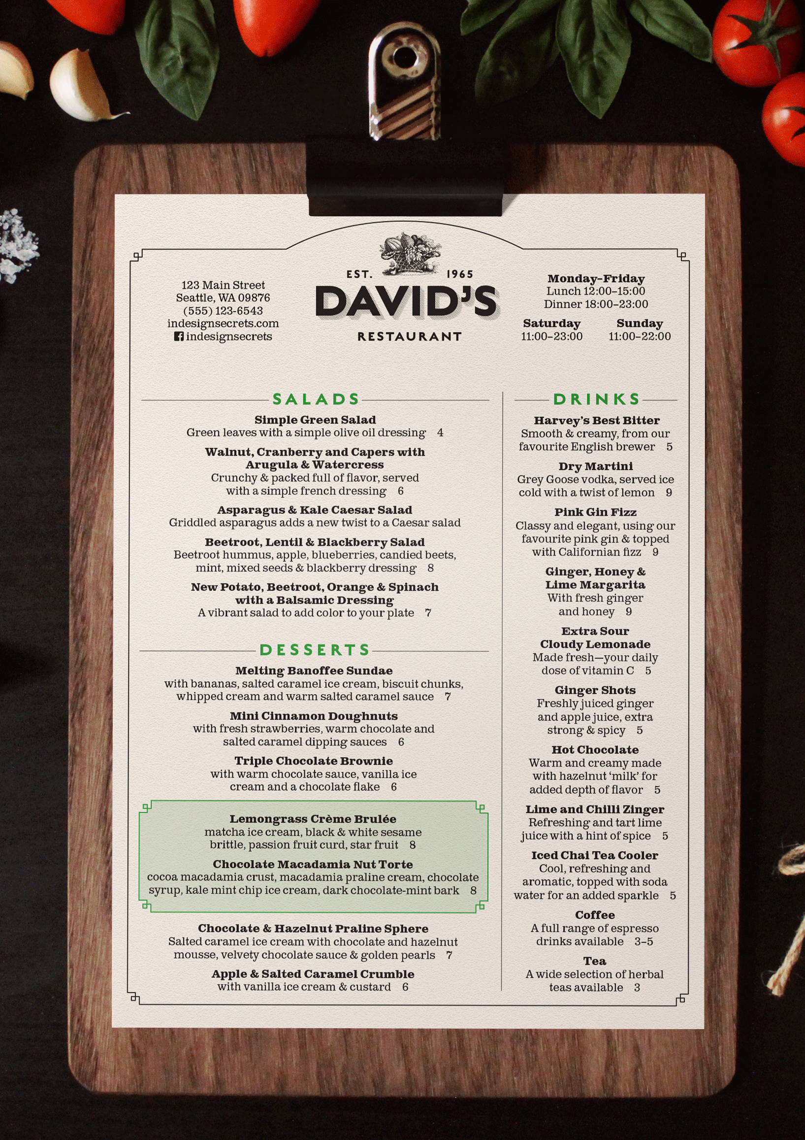
To add visual and tactile interest, the menu will be printed on an off-white, lightly textured paper, and presented on a clipboard (Figure 6).
The Page Elements
As I said earlier, designing a menu requires us to compress a lot of information into a finite amount of space. While run-in heads for the menu items would save space, the information would not be as clear, and the formatting of the text would be fussy. For readability, the text is in upper and lowercase, and I’ve used ampersands to save space—and because I just like ampersands. The center alignment of the text creates even white space on either side of the line, and to prevent visually jarring long and short lines in the same paragraph, I’ve turned on Balance Ragged Lines (in the Indents and Spacing section) and turned off Hyphenation. While hyphenation is a necessary compromise with prose, it has no place on a menu.
Using a layout grid means each frame can be docked into place on the page, fitting together like a jigsaw puzzle (Figure 7).
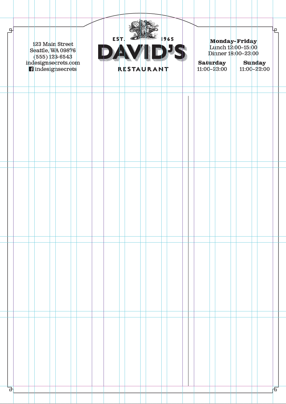
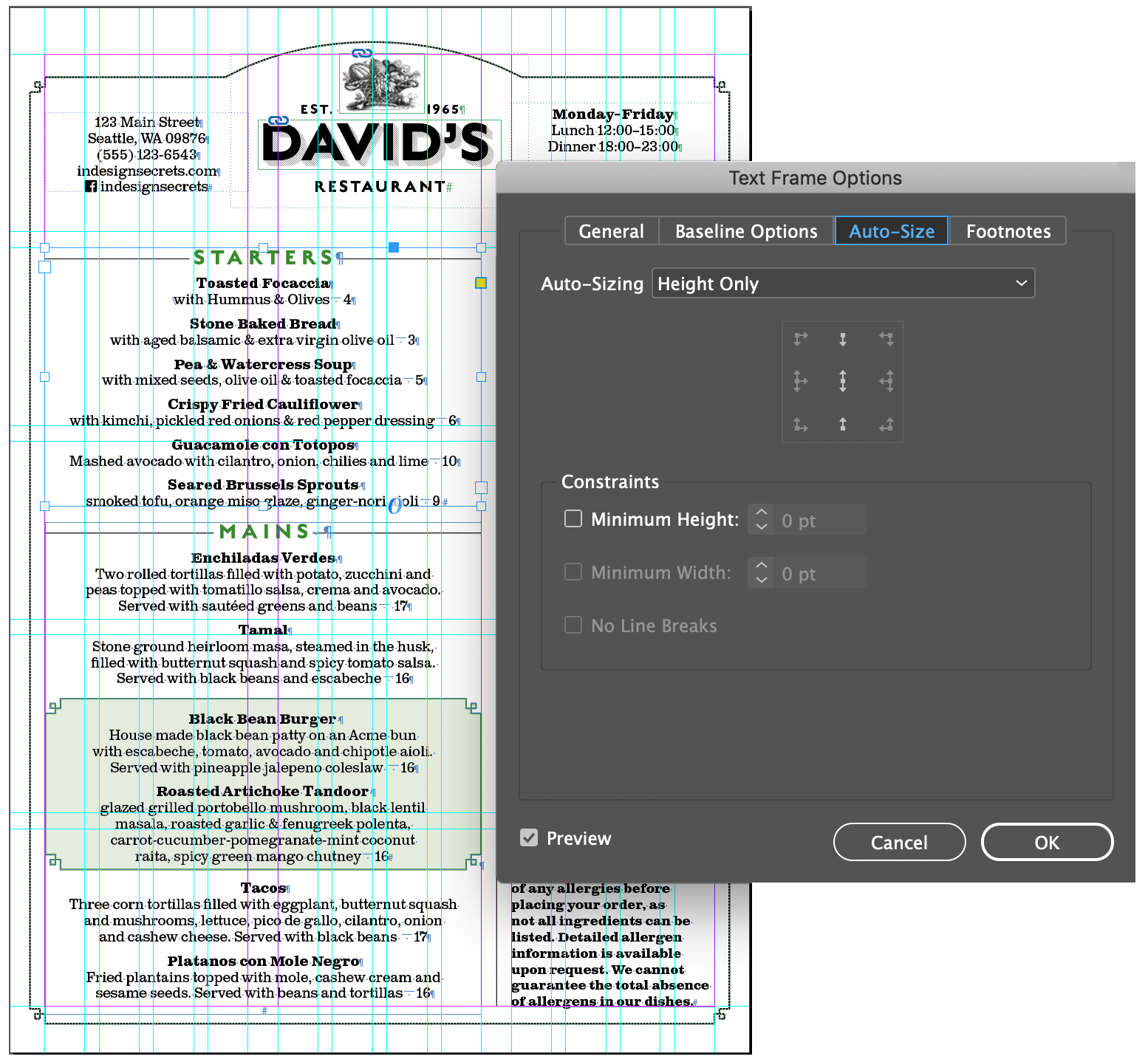
To make the document easier to edit by someone with basic InDesign skills, I’ve made each section its own text frame. The frames are set to auto-size (height only, from the top) to minimize any confusion about possible overset text (Figure 8).
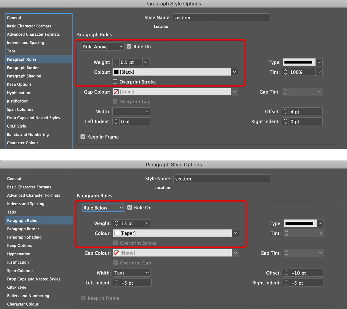
With so much information, the use of white space is critical. Each item is preceded with a consistent amount of space before, incorporated into the paragraph style definition. Rules (lines created with Rule Above or Rule Below) help to organize the information into sections. I’ve baked rules both Above and Below into my section heads (Figure 9). (For more on how to create lines that span across both sides of a heading, see this article.)
A rectangle with fancy corners—after all, when else can you get away with using fancy corners?—frames the page. At the top of the page it is combined, using the Pathfinder tools, with an oval to make an arch.
To help organize the space and to keep things consistent, I’ve set up a baseline grid with an increment of 6.5 points. That odd-sounding value is half the body text leading value of 13 points, which offers more flexibility for aligning lines of text.
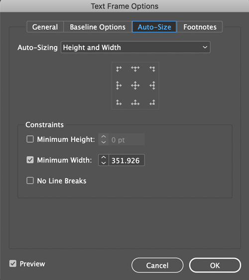
A common device on menus is to use shapes and/or shading to bring attention to certain items. I’ve called out the daily specials in a tinted rectangle. I originally created this with a combination of Paragraph Borders and Shading, but found that the tint could not be contained within the shape of the fancy borders, and so opted instead to make these into inline objects, which are set to auto-size according to the amount of content (Figure 10).
Fine-Tuning
In presenting the prices of the dishes, I’ve omitted the currency symbols, both to save space and because the customers know what currency they will be using. Tempting as it is to align the prices to the right so that they can be easily scanned (and which would allow me to write here at length about last-line indents and right-indent tabs), I’ve chosen instead to offset the price with just an em space (Cmd/Ctrl+Shift+M). This helps the guest to focus on the food rather than compare prices. This might seem like a cynical ploy by the restaurant to bury the price, but its intention is to draw focus to the dish rather than its cost.
There is a psychology around numbers, with prices ending in 99 suggesting value, but not necessarily quality, while those ending in 95 apparently suggest friendliness. My fantasy restaurant has no need for such fussiness or pop psychology, and so all the prices are round numbers.
Adding a bit of line art at the top adds visual interest and a vintage feel. However, because pictures of dishes are more suited to a diner or fast-food joint, both for aesthetics and for ease of reproduction, there are no photographs.
From My Table to Yours
While “David’s Restaurant” exists only in my head, whatever sort of menu you’re designing, you will face similar design considerations. Make sure that your font and color choices reinforce the restaurant’s image. The menu design should complement the style of the restaurant and the text should be both easily editable and readable. Squinting while holding the menu at an arm’s length is not a good look for the customers—although sharing reading glasses could be an icebreaker on a first date.
Commenting is easier and faster when you're logged in!

Recommended for you

New Contest! The Case of the Failed Find
Solve this InDesign mystery for a chance at winning a great prize.

InQuestion: Viewing Spot Colors and Blend Modes With Overprint Preview
This article appeared in Issue 112 of InDesign Magazine. Claudia McCue shows why...
Adobe Launches All-in-One Creative App, InDillushop/XD, Replacing Photoshop, Illustrator, and InDesign
[Editor’s note: This was our 2019 April Fool’s Post] In a surprise m...