

Designing an advertisement is usually good money but, if you aren’t careful, it could end up being more work than reward. For example, a client may ask you to design an ad that will run in several different publications. Naturally, your client wants you to design something that will appeal to her company’s target audience. However, because the ad is to run in more than one publication, that audience may vary.
To satisfy your client, you may need to design more than one version of the same ad. All of a sudden, the price you quoted to do the job isn’t looking so good, is it? Although it may be too late to ask for more money, you can do something to make the job go a lot faster. Rather than creating a separate document for each version, you can use layers to create variations of the ad in a single InDesign document, as shown in figure 1. This technique will save you time and your client money, which is just plain good business!

 Figure 1: You can design two or more versions of one ad on a single page using layers.
A Word of Wisdom
In any situation, you can better manage and control elements placed in a document when those elements are assigned to layers. For example, you can more easily rearrange page elements when they’re placed on separate layers. More to the point, layers enable you to selectively show and print page elements.
In this article, we’ll explain why the technique of using layers to create multi-version ads is so advantageous. But first, we’ll more clearly relate our definition of a multi-version ad and then introduce you to the Layers palette. Lastly, we’ll step you through the process of creating a multi-version layout, so you can see for yourself just how easy this technique is. Upon completing the example, you’ll have a new appreciation for layers and — if you choose to adopt this technique — a much-improved workflow.
Our Version of Multi-Version Ads
Multi-version ads come in many forms. The two most common types are regional and localized, but there are other situations that require an ad to have more than one version.
Regional ads usually refer to slight variations in content that allow for minor deviations in a similar society, such as the median age or economic status. Although the basic layout stays the same, certain elements, such as prices and graphics, vary in each version in order to target a diverse audience.
Localized ads are those that will run in different countries. For example, your client may want to run the same ad in more than one country. Even if the target market is the same, the text will probably need to be in more than one language.
Yet another example of a multi-version ad is when a client intends to use the same ad for a set time but wants you to make periodic changes. These edits may include expiration dates, prices, or perhaps new graphics for alternate merchandise. All these variations could cost you and your client a lot of time and money unless you have the foresight to use layers.
Case in Point
We’ll use the multi-version ad shown in figure 1 to further demonstrate our point. Both ads are of one document and share many of the same elements. However, the version on the left was de-signed for an East Coast publication whose primary circulation are doctors and the version on the right was designed to run in a women’s magazine whose circulation resides primarily in the Midwest. Although the same basic ad could run in both publications, some variations were needed.
First, prices are typically higher on the East Coast than they are in the Midwest; therefore, the cost of a phone call varies, too. As you can see in figure 1, it will cost doctors on the East Coast two cents more per minute to make a call than it will cost moms in the Midwest. To accommodate the two price points, separate layers are needed for each instance.
Tip: We purposely used a spot color on the prices in our ad. This spot color will require an extra piece of film for each ad when they’re initially printed, but the next time the price of a phone call changes, we’ll only have to output one piece of film per ad instead of four. (Note: printingforless.com uses standard CMYK inks., but it will convert spot colors to their CMYK equivalents when you order.)
Each ad is also designed with a different graphic to which each audience will relate. A graphic of a doctor is used for the audience who are primarily doctors, and an image of a woman in traditional, domestic attire is used for the audience who is mostly housewives. Each graphic is put on a separate layer so they can be alternately shown and printed.
Because of the nature of this ad, an expiration date is also needed, which the client wants us to periodically update. By creating a separate layer for each expiration date, we won’t have to submit any new materials when it comes time to change the expiration date. We also placed the expiration date in an area where the printer can easily strip in the new one without having to create all new film. This saves time and is a huge savings our client will greatly appreciate.
Without the use of layers, we’d have to create two separate documents — one for each ver-sion — to achieve what our client asks of us. For a variety of reasons — such as having to make the same correction twice — two documents mean twice as much work, which we like to avoid at all costs!
As shown in figure 2, layers were created for almost every object in the ad — not just the ele-ments that make up the different versions. In addition to the prices and expiration dates, the rest of the text is on separate layers for easier editing. The background image is on a separate layer to avoid accidentally selecting it while trying to select other objects. And the image of the cell phone is on a separate layer to make it easier to update, if necessary.
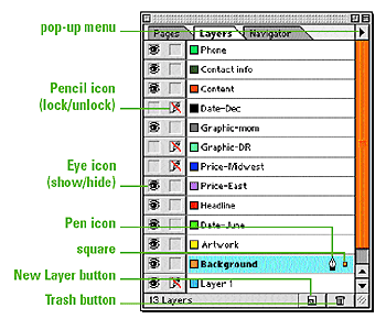 Figure 2: Set up your layers correctly and they’ll save you both time and money.
A Palette-able Feast
Layers are similar to transparent sheets of film that are stacked on top of each other. You can see through the transparent parts of the layers, but the parts that have something on them are opaque. The number of layers you can create is only limited by your computer’s memory.
The Layers palette is the hub of a multi-layered document. Everything you place in an In-Design document is assigned to the default layer unless you create and target a different layer in the Layers palette. As shown in figure 3, the default layer is named Layer 1.
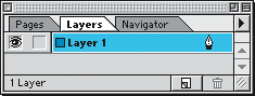 Figure 3: All documents start with one layer, named Layer 1 by default.
This and every other layer you may create have a separate stacking order, which is the order in which objects are placed and viewed on a layer. On each layer, the first item you place is positioned at the bottom of the stacking order and the last item you place is at the top. Any layer higher in the stacking order covers any preceding layers. The stacking order of objects on each layer can be changed using the Object > Arrange menu commands: Bring To Front, Bring Forward, Send Backward and Send To Back. The stacking order of actual layers can also be rear-ranged via the Layers palette.
Note: Master page items can be placed on separate layers too, but their stacking order can’t surpass that of document page items. Master page items always remain at the bottom level of the stacking order on their assigned layer.{
Layers can be manipulated several different ways from the visible controls on the palette. The first is the Eye icon. When a layer’s Eye icon is visible, all objects assigned to it are visible. Click on the Eye icon and it will disappear, as will all the objects on the page assigned to the layer. A layer that’s hidden this way won’t print. This is how you can show and hide layers in order to output a multi-version ad. You can drag through the Eye icon column to show or hide more than one layer at a time.
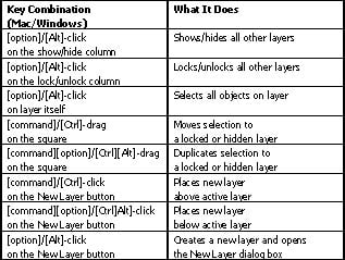
The next box displays the Pencil icon, which enables you to lock or unlock a layer. Like the Eye icon, you can drag through the locked column to lock or unlock multiple layers. If a layer is locked, no changes can be made to the objects on the page assigned to it — unless you override it with specific key commands, as shown in Table A.
Next is the colored box that appears just before a layer’s name. Whatever color is displayed in this box coordinates with the frames of all the objects assigned to the layer. This color key helps you determine which objects go with what layers.
After the layer’s name, a selected layer will display the Pen icon in the Layers palette. An active layer is also highlighted. If a layer is active, but not shown, or is locked, the Pen icon will display a red slash mark through it, indicating that any objects assigned to it can’t be modified.
A small, colored square next to the Pen icon also appears on the active layer when an item as-signed to that layer is selected on the page. This small square enables you to reassign selected objects to other layers, which we’ll demonstrate later. The final controls on the façade of the Layers palette are the New Layer and Trash buttons.
All these controls can also be accessed and executed via the Layers palette’s pop-up menu. In addition, this menu offers more global control, such as unlocking all layers and deleting all un-used layers. You can also merge selected layers and use the Paste Remembers Layers command to retain the layers assigned to objects being copied and pasted from other pages or InDesign documents.
Creating a Multi-Version Ad
Now, we’ll show you how to use layers to create a multi-version layout. Start by creating a new InDesign document. If necessary, choose Layers from the Window menu (or press [F7]) to display the Layers palette.
Tip: You can put the default layer to work by using it for notes to the printer (or client) about how you’ve set up the ad. Change the name to something obvious, like Note to printer and make sure to hide the layer so that it doesn’t print.
Begin to build your layout by selecting the Rectangle tool and clicking once on the document page. In the resulting Rectangle dialog box, enter 4″ in the Width text box and 5″ in the Height text box. Then click OK. Next, apply a fill and stroke color using the Toolbox and Swatches pal-ette. Currently, the rectangle is assigned to the default layer. To put it on its own layer, choose New Layer from the Layers palette pop-up menu. In the New Layer dialog box, rename the layer Background. As you can see in figure 4, there are a few other options you can select here, such as changing the color associated with the layer. For this example, however, just click OK.
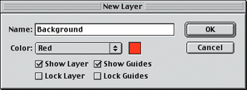 Figure 4: You can name and change the default settings of your layers in the New Layer dialog box.
Note: You can also create a new layer by clicking on the New Layer button, located at the bottom of the Layers palette. Then, double-click on the layer to open the New Layer dialog box to rename it.
Because you created the rectangle before adding the Background layer, you now need to reas-sign it to the right layer. With the rectangle still selected, look at your Layers palette. On the far right, you’ll see a small, colored square on Layer 1. Position your mouse pointer over it until your pointer converts to a hand. Next, click and drag the square up to the Background layer, as shown in figure 5. Then release your mouse. Now your rectangle sits on the Background layer and nothing is currently on the default layer. The color of the rectangle’s frame has also changed and now corresponds with the color assigned to the Background layer, also shown in Figure 5.
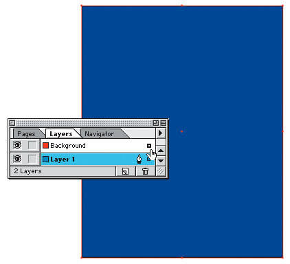 Figure 5: To reassign an object to another layer, select the object and then drag the resulting square in the Layers palette to the target layer.
Next, create a new layer and name it “Headline-spring.” Now use the Type tool to draw a text frame the size of the rectangle. Then, type “Spring has arrived!” The text is automatically assigned to Headline-spring layer providing the layer is still active in the Layers palette. All you have to do now is position and format the text as shown in figure 6.
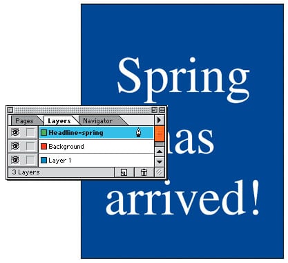 Figure 6: Putting the headline on a separate layer enables you to create other versions on additional layers.
To create the second version of the same layout, select the text with the Selection tool. Next, choose Edit > Copy. Click on the Eye icon in the Headline-spring layer to hide the text on that layer. Now, create another layer and name it Headline-summer. Then, choose Edit > Paste Into Place. Finally, select the word Spring with the Type tool and replace it with the word Summer, as shown in figure 7.
To view the first version of your layout, click on the Eye icon of Headline-summer layer to hide it and then click on the Eye icon of the Headline-spring layer to show it. Voilá! You’ve cre-ated two versions in one layout on a single page. This is about as simple a multi-version layout as you could get, but it serves its purpose.
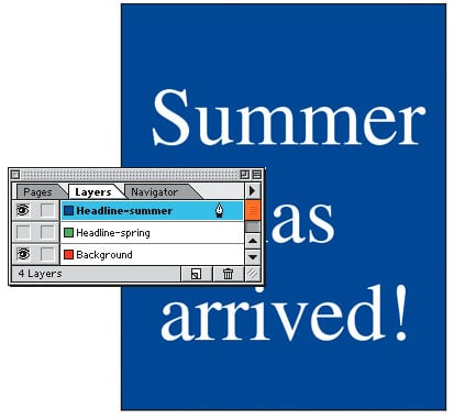 Figure 7: You can toggle between each version by clicking on a layer’s Eye icon to show or hide the items assigned to it.
To see how to change the stacking order of layers, create one more layer and name it Graphic. Next, draw a rectangle about 4 inches wide and _-inch high. Now, apply a stroke and fill color to it — making sure to pick a contrasting color to the color you applied to the text and background. Then position the rectangle over the first word in the headline (Spring or Summer). As you can see, the rectangle blocks the text. To get the rectangle behind the text, you need to adjust the stacking order. However, using the Arrange commands won’t work because they only change the stacking order of objects on the same layer. In this situation, you need to change the stacking order of the actual layers. To do so, click on the Graphic layer in the Layers palette and then drag it down and between the Background and Headline-spring layers, as shown in figure 8. When the line that separates the layers turns bold, release your mouse.
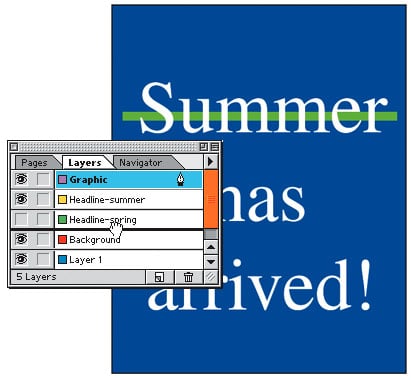 Figure 8: Objects on layers that are higher in the list in the Layers palette will appear in front of objects on layers positioned lower in the list.
New and Improved
As promised, we’ve shown you how to create multiple versions of a layout in a single document by using layers to separate your page elements. Along the way, you’ve also learned all there is to know about layers. As you can now plainly see, layers will save you an enormous amount of hard drive space, as well as time — and, as they say, time is money!
This article was last modified on December 11, 2025
This article was first published on December 24, 2003
Commenting is easier and faster when you're logged in!

Recommended for you
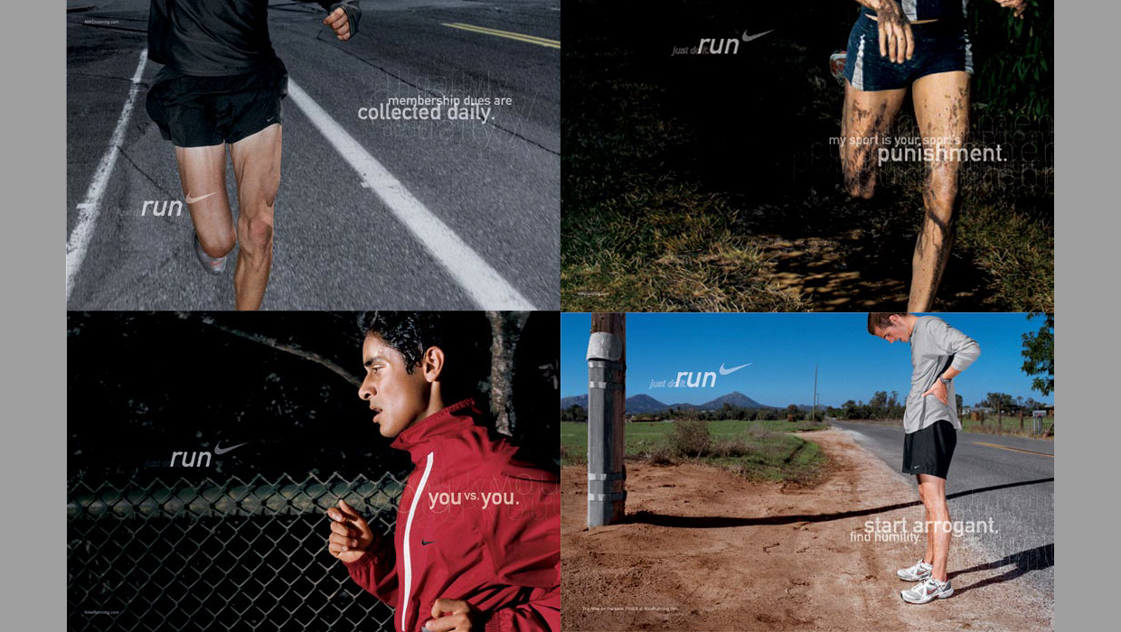
InDesigner: Wieden+Kennedy
When this ad agency switched to InDesign, their creative concept- ing process go...

Triple Triangle Releases Raster Write for CS2
Triple Triangle today released Raster Write for InDesign CS2. The new version of...
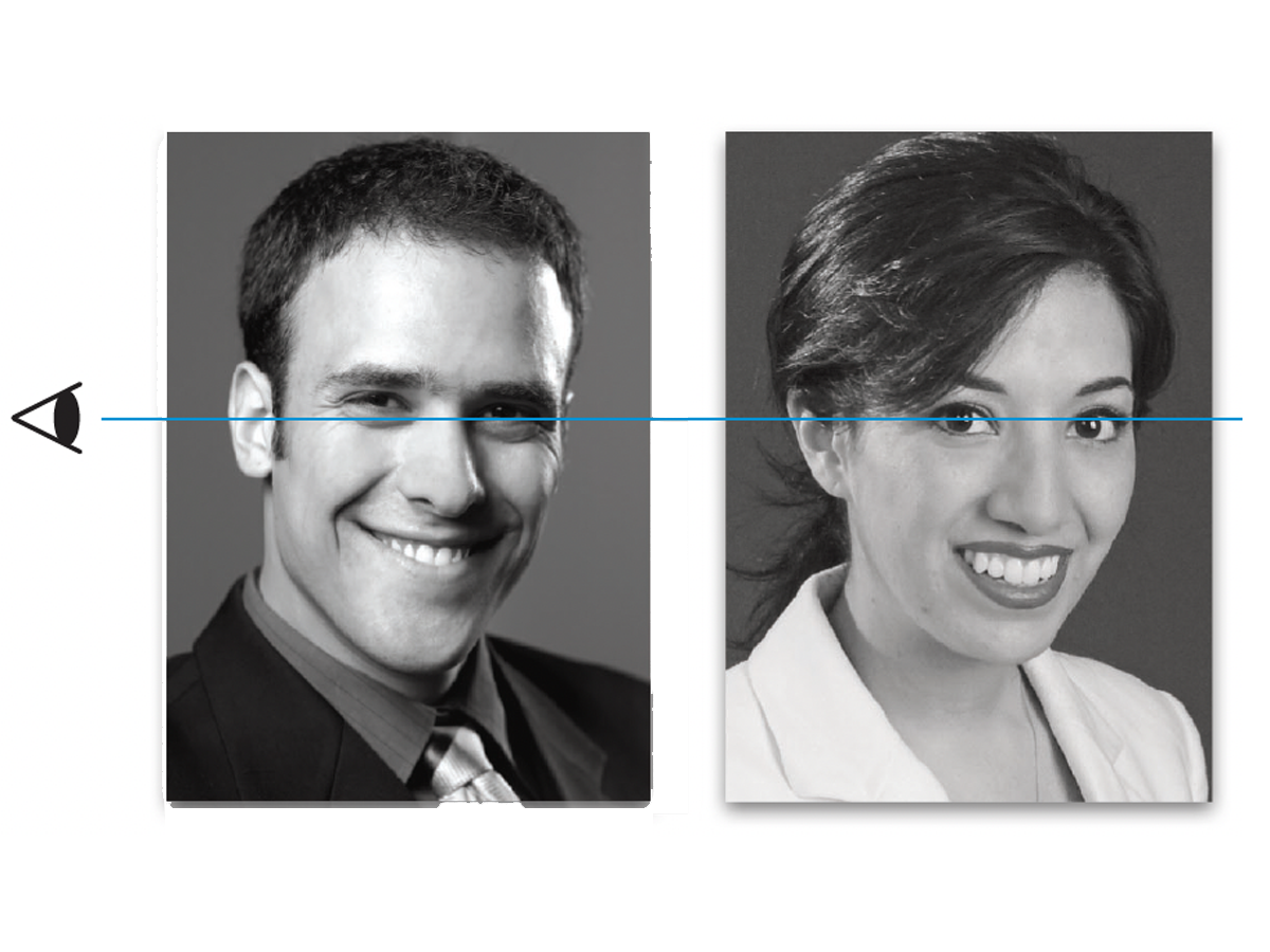
Before&After Design Tip: Crop Mugshots the Same Size
Photos of faces in a row or group should be presented uniformly