
“Before & After” Magazine”

You can subscribe to “Before & After Magazine” in PDF or Print.
Click here to learn more.
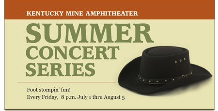
There’s nothing wrong with having a certain design style. But what if your style is formal and you’re creating collateral for a folk festival? For the design to work, you’ve got to use type, colors, images, and layouts that are authentic to each particular project.

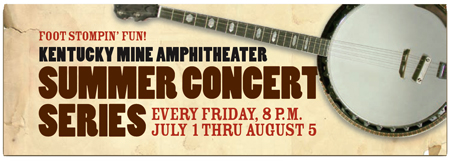
The original Web banner (top) for an outdoor concert series set under 150-foot pines is neat, smooth, and completely wrong for the event. The revised Web banner (bottom) projects energy, musicality, and a true sense of place.
This article has expired. However, you can still read the article by buying it from the Before & After site. Look for the article called “0617 – How to look real.” Since we’re big fans of the magazine, we recommend you subscribe for a full 32 articles (that’s four print issues for $42 or 32 downloadable PDFs for $24).
This article was last modified on January 10, 2022
This article was first published on August 24, 2005
Commenting is easier and faster when you're logged in!

Recommended for you

TypeTalk: Italic vs. Oblique
Most designers and related creative professionals are familiar with the terms It...

Mergenthaler Edition Releases Second Issue of the New Linotype
Following its highly successful relaunch of Linotype Matrix in magazine format l...
How to Prepare Screen Captures for Print
Excerpted from Real World Print Production with Adobe Creative Cloud by Cla...