
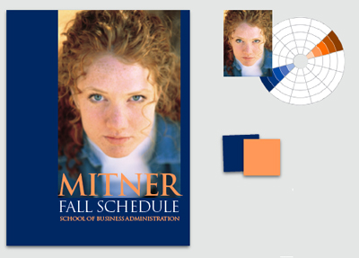
Choosing colors doesn’t have to be a guessing game. In this article from Before & After magazine, follow along as a designer finds fitting colors for a cover with a photograph and text. You’ll see how to pull coordinating colors out of a photo and how to convey a variety of messages with simple changes in hue.

“The cool colors — blues, mainly — make for a more serious, businesslike relationship and convey a direct, to-the-point message. Note that as the values get darker, her face gets perceptually brighter and apears to rise off the page toward you.”
We’ve posted this excerpt as a PDF file. Just click the Download link above to open the PDF file in your Web browser. (This how-to is formatted for easy onscreen reading. However, if you prefer paper, see pages 18 through 24 of the PDF, which repeat the information in a format suitable for printing.)
 .
.
Commenting is easier and faster when you're logged in!

Recommended for you

InDesign Basics: How Strokes Work in InDesign
New InDesign users are often confused by the term stroke. When we talk abou...
Tip of the Week: Easy Fake Duotones
How to create duotone effects applied to images with a simple blend mode techniq...

Before&After: Design a Flier That Sells
The key to an advertisement that sells is simple: Keep all eyes on the product.