

Newsletters. It seems that every organization has them, and few designers can escape working on one. But just because the genre is commonplace doesn’t mean your designs should be. This excerpt considers every angle and gives you great tips. Topics include building the nameplate, setting up the grid, selecting type, adding photographs, breaking up pages without artwork, and giving pages depth and variety when you’re limited to black and white printing.
In this feature from “Before & After Page Design,” John McWade gives us some great indepth pointers on designing successful newsletters.
We’ve posted the story as a PDF file. All you do is click this link “Newsletters & Newspapers” to open the PDF file in your Web browser. You can also download the PDF to your machine for later viewing.
This story is taken from “Before & After Page Design“.
You can buy this book on Amazon.com. Click here to go directly to the book.
Pages 1-15 excerpted from Before and After Page Design by John McWade. Copyright © 2004. Used with the permission of Pearson Education, Inc. and Peachpit Press.
This article was last modified on May 1, 2025
This article was first published on March 22, 2005
Commenting is easier and faster when you're logged in!

Recommended for you
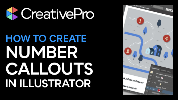
How to Create Number Callouts in Illustrator
Learn how to create and quickly apply number callouts in Illustrator through the...

The Universal Shortcuts
InDesign, Illustrator and Photoshop are similar, but what shortcuts do they shar...
TypeTalk: What You Want to Know
TypeTalk is a monthly question-and-answer column on typography. You ask, and not...