
Dear Pamela,
Finally had a chat with that world-traveling designer Jonathan Barnbrook, now back in his London office after treks to those diametrically opposed destinations Los Angeles and Denmark. Jonathan and his colleague Jason Beard work out of the Barnbook Studio in London’s Soho (complete with seedy sex shops viewed from the window, if one should happen to look).
Entre nous, Jonathan is one of those soft-spoken Brits whose persona is in total contrast to his ironic and anarchic design sensibility. He is an advertising director (usually associated with ads sporting award-winning type treatments) who designs everything from books and posters to — his latest venture — textiles, clothing, and watches. But he is probably best known for his edgy type designs, such as Exocet and Mason, which he did for Émigré, and more recently his Nylon typeface. (His Web site, virus.net, is not up at this time, alas.). He is wryly amused by the fuss surrounding his work, but that doesn’t stop him from attacking the next big thing.
Eclectic intelligence might be the best description of the Barnbrook oeuvre. His tour de force design for “I want to spend the rest of my life everywhere, with everyone, one to one, always forever, now,” the definitive tome on the work of artist Damien Hirst, captures the artist’s thoughts as well as the images by a bravado use of type which shifts from section to section parallel to Hirst’s art. This design prowess includes using subtle reverse type on black pages to blasting layered type floating over dense images which Barnbrook masterfully integrates with production techniques ranging from die-cuts to inserts to pop-ups. This book not only won every major award internationally but went into a second edition as well.
For the same publisher, Booth-Clibborn Editions, Barnbrook also wielded his interpretive use of type and image for “Why2K?,” a series of essays from prominent authors about the Millennium. Here he again shifts mood typographically throughout. What characterizes the work of Barnbrook is a sense of integration: text with image, type with emotional resonance. His layering techniques are ethereal; the type floats on the page and has dimensionality while capturing the essence of the content.
Barnbrook has now had a long collaboration with British bad-boy artist, Damien Hirst. In addition to the afore-mentioned Booth-Clibborn book, Barnbrook’s studio designed the poster and catalog for Hirst’s sensational exhibition “Theories, Models, Methods, Approaches, Assumptions, Results and Findings” at the Gagosian gallery in New York’s Chelsea district. Hirst’s work (16 sculptures, including a new series of paintings and “Hymn,” a 20-foot-tall bronze-painted anatomical model) explores his current preoccupation with the human body and the process of dying.
The poster is based on Hirst’s two-part piece (grey/white balls kept in the air by air pumps in large glass cases, a metaphor for the fragility of life, so to speak) that bears the same title as the entire exhibit. The catalog picks up this life/death theme and is meticulously designed in the style of medical books and medical research journals. Barnbrook’s studio is piled with stacked tomes used as references for the project.
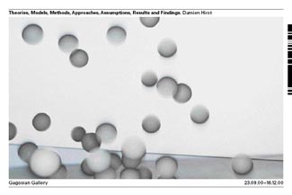
Barnbrook designed this poster for Hirst’s New York gallery show.
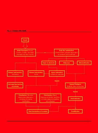
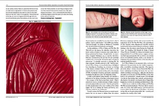
The medical aesthetic (if you will) is meticulously carried throughout the catalog. A glossy, sterile, white slipcase with hospital-blue lettering houses the exhibit catalog, which is blood red and bears a gold-embossed diagram of “changes after death.” The content of the catalog is almost entirely taken from medical publications as well. Jason Beard, who designed the catalog, says searching for relevant and parallel content for book was laborious because of Hirst’s reputation. Only the Journal of Clinical Forensic Medicine gave them permission to use the text from such articles as “Eight Cases of Suicide by Self-cutting or Self-stabbing” and “The Epidemiology of Violence.” Hirst’s art is subtly interspersed with gory close-ups of real-life wounds. Mimicking the visual language of medical books echoes the theme of Hirst’s new work: the exploration of life, body, and death.
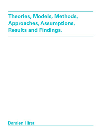
The exhibit catalog and its slipcase announce the medical theme.
There is original content, however, in two critical essays on Hirst’s new work. In one by art critic Gordon Burn, Hirst is quoted as saying, “I love the idea of solidity. But to actually find solidity in my body means that I will be a skeleton.” The second essay concentrates on Hirst’s depiction of scientific and medical themes over the last decade and is written by George Poste — identified as Chief Executive Officer of Health Technology Networks. Interestingly enough, Dr. Poste lists his contribution to the Hirst catalog under his directory of published works on the Web site.
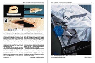 Barnbrook’s catalog design incorporates graphics from authentic medical texts.
The limited-edition catalog is available only through the Gagosian Gallery.
In an entirely different mind-set, Jonathan designed ads and posters for the London Barbican Centre exhibition “The Wilde Years: Oscar Wilde and the Art of his Times,” which commemorated the 100th anniversary of the death of the witty, flamboyant esthete. Because the exhibition features the work of Wilde’s contemporaries, the designs had to capture the atmosphere of the man and his times in a conventional way that would appeal to a general audience. Working with late 19th-century type forms and investigating the letterpress type of that period, Barnbrook renders the aura of this era through Uncial letterforms, subtle imagery, and layering techniques in Photoshop. The Wilde show ended January 11.
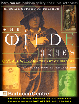
Barnbrook designed ads and posters for recent exhibit commemorating the 100th anniversary of Oscar Wilde’s death..
This article was last modified on January 8, 2023
This article was first published on January 16, 2001
Commenting is easier and faster when you're logged in!

Recommended for you

What happened to the Shear dialog box, Axis: Angle command?
It’s gone. Disappeared! Vanished! In previous versons of InDesign you coul...

Create Amazing Computer-Generated Art With Amberlight
Amberlight is an app for Windows and Mac from Escape Motions (makers of Fla...
PROOF-it-ONLINE Launches New Enterprise Proofing and Approval Management Solution
PROOF-it-ONLINE (www.proofitonline.com), the leading provider of online proofing...