

Dear Pamela,
After being dazzled by the bright design lights of London in my previous missives, I’m happy to be back home. I’ve been thinking about how design transcends borders and that often the most interesting things are found in the most unlikely places. Case in point: Scott Clum’s Ride Studio boasts an international reputation and clientele yet is based in an airy, peaceful, minimalist storefront in Salem, Oregon. Why Salem of all places? Scott originally came to the Northwest from LA to work with Morrow Snowboards for a month, and when the company took off he was hired as creative director and moved his studio to Salem. Now in its 12th year, Ride not only survives, but thrives. It seems like Scott enjoys operating on the edges: A former professional snowboarder (he still hits the slopes regularly), he conveys an aura of adventure in his work.
Take “Blur” for example. Scott and his friend from high school, the multi-talented Gavin Wilson (musician, photographer, illustrator), started “Blur” as a demonstration of doing a magazine their way — personal, esoteric, and inspired. The originators pursued their diverse interests (music, design, Mattel’s Hot Wheels, film, poetry, art) and they recruited a bevy of writers and collaborators including illustrators Matt Mahurin, Dave McKean, Kent Williams, and Marshall Arisman, as well as the artists, the Starn Twins. “Blur’s” design was as pulsating as music, with its typographic rhythm, visual solos, and lyrical messages. Published from 1992 until two years ago, “Blur” is now produced by Scott and Gavin as an on-line experiment at blurmagazine.com.
“Blur” projected the fluidity and energy that’s become associated with Scott’s editorial design. Scott expanded these ideas as an integral part of the Marvin Jarrett design mafia, which included David Carson, Vaughn Oliver, Chris Ashcroft, and P. Scott and Laurie Haycock Makela. Jarrett, the former publisher of “Creem” magazine, produced magazines that have become touchstones of late 20th-century design: “RayGun,” “Huh,” “Sweater,” and “Nylon,” for which Scott did the logo.
Scott’s work, in a word, moves. He renders type and makes it perform along with images on the page, but he also does this on the screen, in film, on snowboards. He breaks a word, a line, and forces the eye to put it together. Type is choreographed with photography and Scott’s own art. None of this is artifice. He conceives design as he perceives everything — organically. It flows from what it is, from its surroundings. It evolves and emerges.
An overview of Scott’s world is on both the Ride Studio Web site — the studio’s constantly changing portfolio — and scottclum.com, which features his most visible experiments in an interactive section called Punchhole. Here you get a cascade of ideas with his distinctive interplay of imagery, type, and movement. The work from Ride and Scott is impressionistic and emphatically artistic rather than commercial, but that is its point. Scott positions his work as dedicated to alternatives, committed to artistry. The working mantra is, Do it differently, organically, mentally, dynamically.
And clients hear it. Scott has done ads, videos, Web sites, film, and print. Recent projects include typographic bumpers for PC manufacturer eMachines, experimental concepts for Levi’s, and an original type treatment for the titling and credits of the forthcoming film “The Dangerous Lives of Altar Boys.”
Asked to create the TV spot bumpers for eMachines, Scott wanted not only to create a mark and an identity that captures the products but also to convey the potential of the brand, and what could be done with variations of the eMachines logo. So Scott, along with Ride’s Flash programmer Adam Royer, set up a proprietary Web site for the client with an animated style sheet of the eMachines’ type treatment. Keep a watch out for the eMachines broadcast spots.
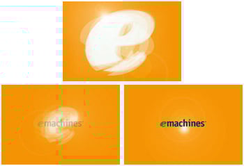
Ride’s TV Bumpers for eMachines use typography to establish a new brand.
For an internal meeting at its San Francisco headquarters, Levi’s asked Ride to create a presentation conveying Levi’s strategy for 2002. Challenged to show the company’s future direction in a dynamic way, Scott put together a three-minute film with a range of target groups. He combined symbolic representations and images for each, worked his signature type treatments, and added a music track. Although he knew there could be other approaches, using film did more than present new products or define potential audiences; it also emotionally captured Levi’s plan of action. “I wanted them not only to get it, but to feel it,” Scott says.
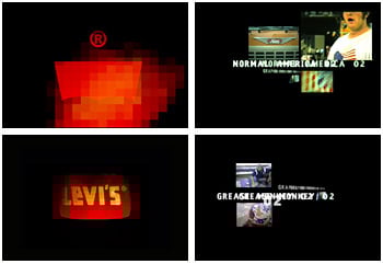
Overlapping typography in Ride’s short film for Levi’s expresses new directions for the company. Click here for a larger image.
This article was last modified on January 3, 2023
This article was first published on March 2, 2001
Commenting is easier and faster when you're logged in!

Recommended for you

InType: Type That Touches
Need an impactful type design? Try breaking the rules of word spacing.

TypeTalk: Change Word's Line Spacing, Part II
TypeTalk is a regular blog on typography. Post your questions and comments by cl...

InDesign Template: Restaurant Menu
This template for a restaurant menu comes in both letter and A4 sizes. It’s orga...