

Dear Pamela:
As you know, London is a haven for design mavens. The anticipation begins with the flight on Virgin Atlantic where the stewardesses in oh-so-red red uniforms stand against the purple plush interiors and chirpily ask if “Madame would like Baileys Irish Cream.” Virgin also provides in-flight goodies (individual TV screens, soft translucent travel packs with Virgin balms and earplugs, eye shades), and you can also sit back with Virgin’s well-designed in-flight magazine with really good articles including one on the ubiquitous bad boy of British art, Damien Hirst (more on him anon). So, when you actually arrive, you are primed for many of this capitol’s visual treats.
London as a city is always truly inspiring. But, it has a new focal image, the London Eye, that mega-Ferris wheel that looms over the Embankment. Its towering presence transforms all the familiar views. Glance up from St. James Park, and there it hovers on the skyline. It dominates every tourist spot with a view of the Thames. Although the London Eye was not universally accepted as it was being constructed, the final result is the look of London, ca. 2000. Crowds queue up to sit in eerie “pods” and the wheel moves at a snail’s pace, and even the potential critics who take this trip are amazed at how they can gain a whole new perspective of the London they know so well from these new vantage points. As one friend said, the experience is best appreciated with friends, a food hamper stocked with champagne, and a good camera.
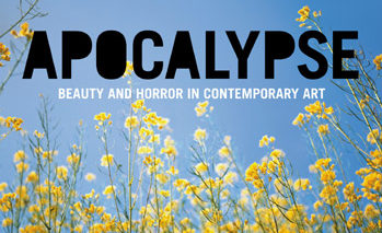
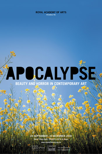
The sheer range of art in London is dizzying. For example, the Royal Academy of Arts once and forever dusted off its fustiness (it was founded in 1768) in 1997 with the aptly named “Sensation: Young British Artists from the Saatchi Collection” exhibit, featuring Hirst (cut up cows, encased sharks) and Jake and Dinos Chapman (sculptural aberrational forms in Reeboks). Currently “Apocalypse: Beauty and Horror in Contemporary Art” reaffirms that this is now a contemporary as well as an historical art space.
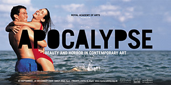
Although I left before its opening, you can view this sizzling show (featuring the work of Jeff Koons, the Chapman Brothers again, and others) inspired by the Book of Revelations on the Web. There you can also view the Underground posters done by Why Not Associates (who also had done the Sensation graphics). What is surprising about these posters is the subtle interplay of image and type treatment in these designs. Why Not Associates will be revealing all on the how and why of these graphics in my next missive. By the way, the Apocalypse exhibition is on until December 15th, should you be able to tear yourself away from the computer and hop on a plane.
Another event generating major buzz was the Damien Hirst exhibition en route to the newly remodeled Gagosian Gallery in New York’s Chelsea district. The freshly printed catalog — “Damien Hirst: theories, models, methods, approaches, assumptions, results, and findings” — is designed by Jason Beard, a protégé of Jonathan Barnbrook. Designer par excellance Barnbrook and Hirst had previously collaborated on that collectible book “want to spend the rest of my life everywhere, with everyone, one to one, always, forever, now.” published by Booth-Clibborn, the grandmaster of British design books. (Obviously Hirst likes long titles.) Booth-Clibborn, by the way, is also the publisher for the Why Not Associates bestseller. You can order both books from the B-C Web site.
I’ll drop you a line after I chat with Barnbrook as he reflects on his collaborations with Hirst, which also include the London restaurant Pharmacy and its take-away equivalent, Outpatient.
But if there is one must-see (and often) art venue in London, it is the Tate Modern. Housed in what had been Giles Gilbert Scott’s power station on Bankside, it has been architecturally transformed by the Swiss firm Herzog & de Meuron. The Tate Modern houses a vast, visual history of modern and contemporary art, while maintaining the framework of the power station as an appropriate metaphor. The space is awe-inspiring and the exhibitions overwhelm, starting with the commissioned two-story sculpture by Louise Bourgeois of a massive spider, Maman, which greets you as you enter the Turbine Hall. With work ranging from Carl Andre to Andrea Zittel, with Bacon, Hockney, Keifer and Picasso in between, the scope and scale of the collection is dazzling (and free).
In addition to the architectural bravado, and the intellectually challenging arrangement of the art, the graphic identity of the Tate is also compelling. Created by Wolff Olins, the logotype treatment itself shifts perspective, moving from clear to blurred as if the identity of the Tate Modern (and three other sites: Tate Britain on Millbank, Tate Liverpool, and Tate St. Ives) is in process and being redefined constantly. Check out the graphic identity and the museum’s outstanding collections on the Tate Web site. The site, by the way, was designed by London agency Nykris Digital Design and in itself is an interesting place to spend an afternoon, especially if one explores its outer reaches, such as a mildly subversive companion site.
Must dash. Much more to come, and very soon.
Yours truly,
This article was last modified on January 3, 2023
This article was first published on October 31, 2000
Commenting is easier and faster when you're logged in!

Recommended for you

Save and Export Photoshop Files Effectively
Save, Export, Generate… Photoshop gives you so many ways to save files. How do y...

PageProof Unveils FIPS-compliant Digital Signing for Secure Creative Approvals
Enterprise-grade, secure, verifiable digital approvals built into PageProof perf...

How to Remove All Hidden Photoshop Layers in One Click
Learn how to quickly clean up your Photoshop Layers panel by getting rid of all...