

In terms of leading and measure, Burt’s studies came to conclusions that, as Morison pointed out, “the printer and the scribe before him had discovered by observation.” Namely that 10 to 12 words per line was the maximum for comfortable reading, and that leading of 1/30 of the measure was usually just about right.
Burt also weighed in on the argument over the extent to which serifs actually affect the readability of type. Here he is unequivocal. His studies showed clearly that serifs made word forms more legible to children and word groups more legible to adults. Young readers also found faces with longer ascenders and descenders more comfortable to read, but they much preferred lining numerals over oldstyle ones.
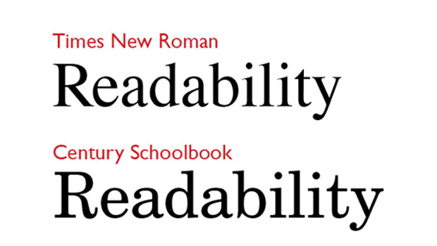
The impact of serifs is a point that Morison picks up and runs with in his introduction, taking us back to Greece in the 4th century B.C.E. where the first seriffed inscriptions made their appearance. As Morison points out, these serifs cannot be dismissed as mere decorative fillips, as they can’t be seen apart from their integrated role into the designs they help define. It took centuries for seriffed characters to become the norm, proof of the conservatism of readers and the persistence of forms to which they’ve become habituated. But once established, seriffed letters remained unrivaled until the early 19th century. Efforts by aesthetic movements such as that at the Bauhaus to strip letters of their “decorative” features and replace wholesale seriffed faces with sans serif faces were bound to fail, Morison says, because serifs are not simply decorative. They are forms that follow their function, to put it in Bauhaus terms, and as such are not options but necessities for text meant to be read en masse. Ad and display type, of course, is another story.
Typeface preference is always an interesting topic, and when the subjects of the study were asked to judge particular typefaces, they were inconsistent in their responses, rating faces more favorably in texts they enjoyed than those same faces used in reading situations they disliked. Morison sums this up succinctly in saying “they were disposed to confuse subjective, intrinsic legibility with private, aesthetic preference.” It’s one of those “wish I’d said that” lines that brings to mind overhearing endless “favorite font” discussions.
Another key point Burt’s book makes is the importance of the quality of the inking (and the related issue, paper quality) in the legibility and readability of text. When the book was written, ink on paper was the only medium in which type was consumed. Today, when type is widely read on screen, the point is no less well taken, because low and moderate resolution, anti-aliased type displays a lack of crispness and clarity similar to that of poorly inked type on paper, as seen in Figure 3.
Fig 3: I sought out the worst printing example I could find (top, from 1819, printed on bad handmade paper) to illustrate how poor inking can affect the readability of type. The Mac screen type is hazy, with poor contrast, compared even to the modest printing quality of a daily newspaper, although it’s better than the ugly letterpress work.

Presciently, the book also addresses the most common technique electronic device users employ to improve the appearance of on-screen type: enlarging point size. This doesn’t necessarily aid readability, though, because as Burt observes, “the bigger the type, the smaller amount of reading matter that falls within the eye span, and the larger the number of eye movements and fixation pauses.” (When reading, we apprehend word group by word group, and the pause during which a each is perceived and comprehended is called a fixation pause). So while larger type may address legibility issues, it is in fact a barrier to better readability by diminishing swiftness of reading.
Although many of his studies remain classics, Burt’s reputation took a serious post mortem hit when researchers looking into his controversial study on the inheritability of IQ levels discovered that he’d destroyed the notes of his original research. This led to accusations (and conclusions, for many) that the data had been faked. In a class-conscious society like the Britain of his day, there may have been a reason to tweak the data into yielding a given conclusion on genetic issues, but I don’t think his typographic investigations should be tarred with the same brush. Despite some quibbling around the edges, the typographic insights he documented 50 years ago still ring true today.
This article was last modified on August 2, 2021
This article was first published on June 5, 2012
Commenting is easier and faster when you're logged in!

Recommended for you

How To Create Sharp Digital Type Images
Images that contain type make frequent appearances on websites and blogs, ebooks...
InDesign Type: Choosing the Right Leading
By understanding and applying a few key principles, you can determine the proper...

TypeTalk: Hidden Secrets of InDesign’s Find/Change
TypeTalk is a regular blog on typography. Post your questions and comments by cl...