

I’ve been thinking about the proper way to type the symbols for inches and feet. (Maybe it’s all the talk on television about the inches of rain from hurricane Irene which is pounding outside my window as I write this post.)
We all know that we shouldn’t use smart quotes for measurements such as 5′ 3″. However, most likely you have the option for “Use Typographer Quotes” turned on in the Type preference. So what do you do if you want to quickly type feet or inches without having to go into the Preferences dialog box?
Fortunately you can easily switch between typing curly quotes and straight quotes by doing the following: On the Mac press the code Cmd-Opt-Shift and tap the quote key. On Windows press the code Ctrl-Alt-Shift and tap the quote key. This turns off the Use Typographer’s Quotes preference without having to open the Preferences dialog box. Then use the quote key to type the feet or inch mark. Then re-do the code to turn the preference back on. (It takes longer to explain than it does to do.)

While they are better than curly quotes, these straight, up and down quotes aren’t the proper marks for feet and inches. Notice that the curly quotes are also in the text. These were created by turning the preference for typographer’s quotes on and off.
Once you have inserted these straight (or dumb) quotes in the text, you may think you’re set. Sadly, you’re not. The straight, up and down quote marks are not the proper characters for feet and inches. Instead you want to insert a mark called a prime or double prime. These look like italicized versions of the straight quote marks.
Unfortunately not all fonts contain proper prime characters. My favorite font, Minion Pro, does not, while Helvetica does. If your font has prime characters you can find them and insert them into your text using the Glyphs panel.
But what do you do if you want proper primes but your typeface doesn’t have them? Well, remember I said that the primes look similar to italicized versions of the straight quote marks. This means you can apply the italic style to the straight mark to angle it like a prime. However, if you’re doing work with a lot of these marks, you want a way to automate the process of italicizing the marks.
Applying an italic to the straight quote marks simulates the appearance of a proper prime. This can be a cumbersome task to do for every instance of feet and inch marks.
However, no one wants to have to individually select and apply an italic font or character style to every instance of feet and inch marks?especially not if you’re doing a book on basketball players or a catalog on hardware measurements. That’s when the GREP style commands can save you loads of work. Now, don’t panic when you read the term GREP. I agree that most of the time, when we think of GREP, we think of complicated formulas. But the GREP formula can be very simple.
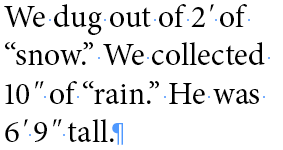
First thing you want to do is create a character style that applies the italic style. This gets chosen in the GREP style Apply Style menu. Then, you want to apply that character style to both the dumb apostrophe and the dumb quote marks. Ordinarily I would just type those dumb characters in the GREP text field. However, inserting a plain quote character would also italicize the curly quotes in the text. Fortunately a simple tilde (~) inserted before the dumb apostrophe or quote marks indicates that you want only those straight characters to have the italic style applied.
![]()
The (~) inserted in front of the straight quote marks applies the italic style to just the straight quotes for inches, not the curly ones. Similarly ~’ applies the italic style to just the straight apostrophe mark for feet.
Finally, if you want to move to a slightly more advanced technique, you need to handle the space between the digit and the quote mark. Look at the results of applying the italic style to the characters. You’ll notice that the marks are too far away from the last digit in each measurement.
In order to fix this, you need to create a GREP style that applies tracking to tighten the space between the digit and the mark. I created a style with the tracking amount of -100. You may need a different amount depending on your typeface and/or point size.
Once you have the tracking amount in a character style, you need to apply it to a digit in the GREP style. The digit part is easy; \d is the wildcard for an number. Applying the tracking style to this digit will tighten the space between that digit and the mark. (If you’re wondering why I didn’t use kerning, you can only apply metric or optical kerning as part of a style.)
But if you leave the GREP formula as just \d, you’ll not only tighten the space between a digit and the quote mark, you’ll also tighten the space between two digit numbers. The code \> applied after the digit code specifies that the digit must be at the end of the word which fixes the problem with two digit numbers.
![]()
The code \d\> applies tracking to just the final digit in double-digit measurements.
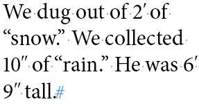
An example of how tracking can be applied to digits to move the italic primes nearer to the measurement.
Now there’s one more situation in the text which I confess I don’t know how to handle. This situation is when there a digit that exists without any mark following it. For instance something like “He improved his shooting over 50%.” In that case the tracking will be applied to the digit and any space or character that follows it?which is not what I want! I need a way to specify that the tracking style be applied only to those digits that are followed by an apostrophe or quote mark.
I welcome input from any GREP genius who can fix this situation.
This article was last modified on December 21, 2021
This article was first published on August 29, 2011
Commenting is easier and faster when you're logged in!

Recommended for you

All-Star Tips: 75 Tips to Make Working in InDesign More Productive and Fun
An amazing collection of 75 tips and tricks from a galaxy of InDesign All-Stars

TypeTalk: How Posters Work, by Ellen Lupton
How Posters Work is not only a beautiful catalog of famous posters, but also an...

Lost Type Recovered from the Thames
The tale of loss—and eventual recovery, a century later—of the Doves Type typefa...