

Making circular text in Photoshop isn’t a difficult process, but there are ways in which you can make it appear more impressive. Here, we’ll look at two different methods for creating circular text, in a graphic for the fictional Flintstone Tire company.
Step 1: Make a circle, type some text
Grab the Shapes tool, make sure it’s set to Paths rather than Shapes, and draw a circle. Then click the Type tool on the edge of the circle and type your text.
Step 2: Enlarge to fit
Make the text bigger, or increase the tracking – or a combination of the two – until it fits around the edge of your circle. You can then rotate the whole circle until you get the orientation you want.

Step 3: A better approach
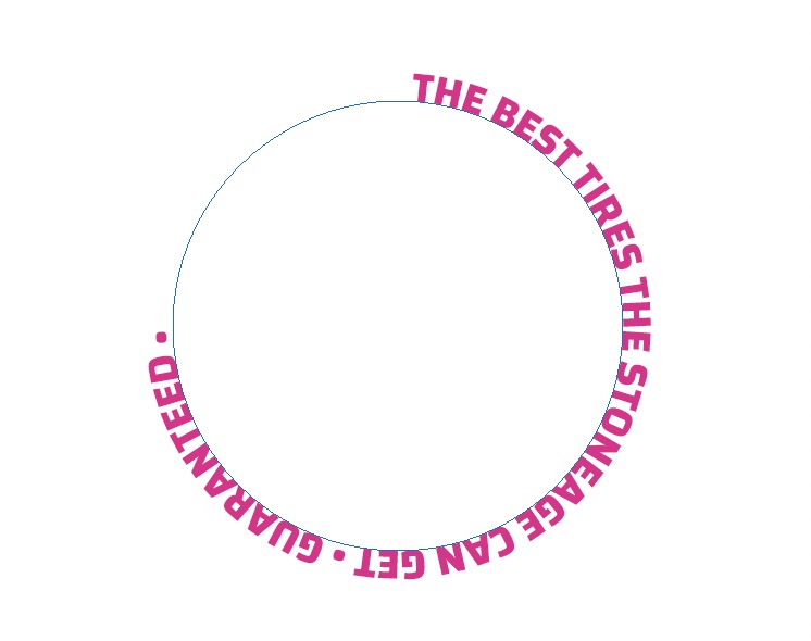
The text at the bottom is upside down, and so doesn’t read well. So here’s a better way to do it. First, delete that last piece of text.

Step 4: Duplicate the text circle
Duplicate the circle layer, and use the Type tool to retype just the text you want. It will look more or less the same as before.

Step 5: Flip the text
Grab one of the little handles inside the text circle, and drag it so that the text appears inside the circle, rather than outside it. This can be a little tricky, as the handles are both hard to see and hard to grab.

Step 6: Baseline shift
In the Character panel, reduce the Baseline Shift setting to bring the text down so that the tops of the letters align with the circle. Now, the bottom piece of text is the right way up to read.

Step 7: Another piece of text in a circle
You could use the same process to create the title text, which is here set in a condensed bold font. But there’s something ungainly about it; the bottoms of the letters are close together, but the tops are too far apart.

Step 8: A different approach
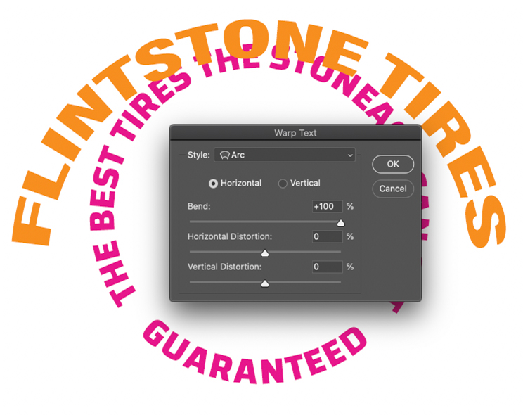
Here’s the second method of creating circular text. Begin by typing your text, with no circle, as a regular line of type.

Step 9: Warp the text
Open the Warp Text dialog from the Options bar when the Type tool is selected, and choose the Arc distortion. Set the Bend amount to its maximum value of +100.
Step 10: Scale to fit
When the Warped text is scaled down to fit in the middle of the circle, it looks wrong. The condensed type has been flattened, producing an ugly contrast between the horizontal and vertical strokes.

Step 11: Make it narrower
Using the Character panel again, change the horizontal width of the type – in this case, a width of 30% works well. Note how the characters all enlarge as they radiate from the center.

Step 12: Duplicate and flip the warp
Duplicate the text and set the bend amount to -100 to make it bend the opposite way. Here, I’ve added a black background to make the text stand out.

Step 13: Making the shadow, part one
We’ll now add a circular shadow around the outside of the text, which will give it a more three-dimensional quality. Begin by making a circle with the Shapes tool, this time set to Shape rather than Path. Make sure there’s no stroke, and open the Layer Style panel. Here, in the Blending Options pane, set the Fill Opacity to 0 so that the shape becomes invisible.

Step 14: Making the shadow, part two
Add an Inner Shadow, still in the Layer Style pane. Set the Choke and Size values until it looks right.

Step 15: The shadow result
Drag the new shadow Shape layer above your text, and use Free Transform to scale it so it’s the same size as the type layer.

Step 16: Finishing off
Duplicate the shadow Shape layer, and scale it so it fits the outer circle of text as well. Add any embellishments you like: I’ve added an f logo in the middle, and a glowing tire tread around the outside.

This article was last modified on February 17, 2021
This article was first published on November 20, 2020
Commenting is easier and faster when you're logged in!

Recommended for you
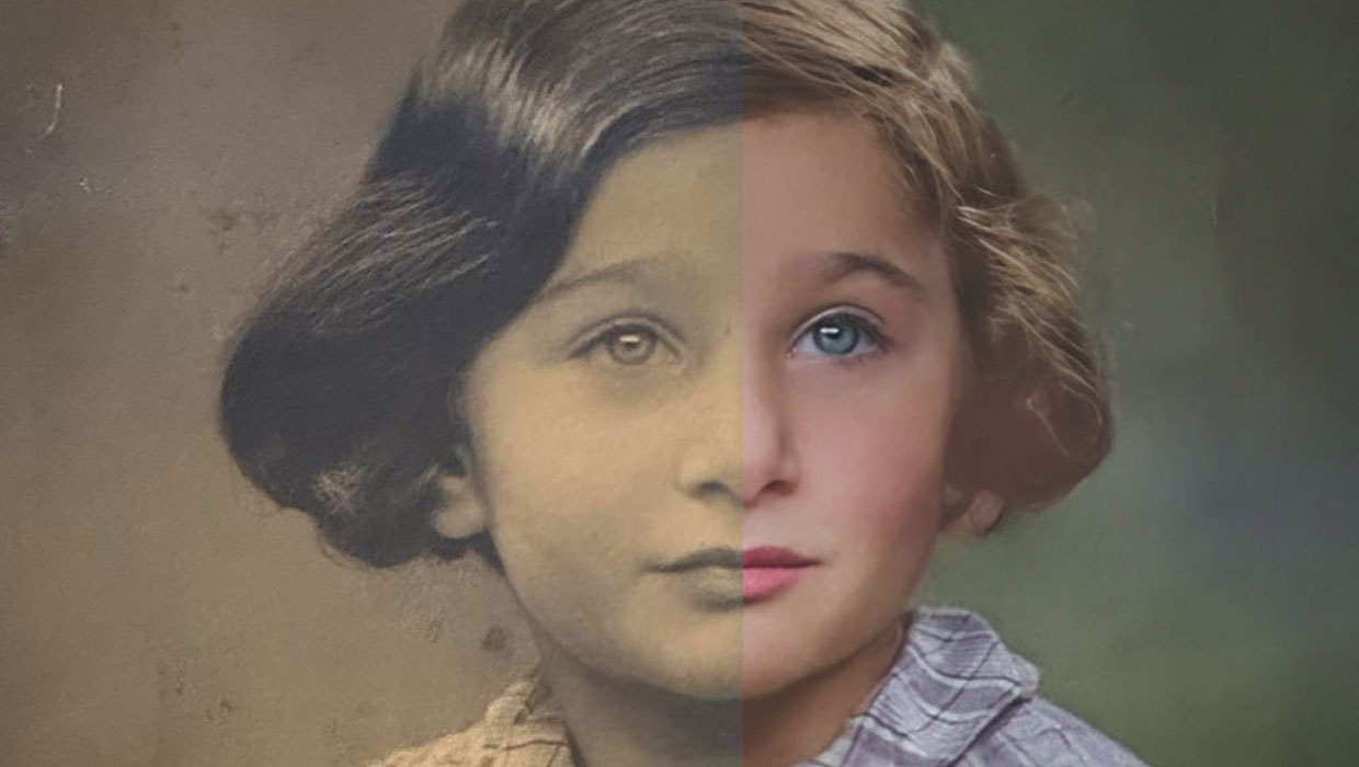
Using the Photo Restoration Neural Filter in Photoshop
This Neural Filter uses AI to remove scratches and other damage, and enhance fac...

Enlarging Images in Photoshop with AI Partner Models
A comparison of techniques for increasing the resolution of images with the help...

How to Remove Multiple Objects from Street Photos in Photoshop
This amazing tip for removing objects from busy photos won the Three Minute Max...