Creating Charts and Graphs Automagically with Data Merge and Chartwell

Charts are among the hardest visual effects to create well in InDesign. Most people try to import charts made in Excel or another program into InDesign. Others use a script such as Claquos to do it. But one of the coolest ways to make charts in InDesign is with the Chartwell font.
Chartwell lets you make a number of different types of charts — pie graphs, bars, lines, etc. — out of numbers in a text frame. That is, you type something like 20+30+50, apply the font, and violà, you have a chart. As you can see in this earlier article about it, it’s really quite astonishing.
But someone recently asked me about how one might create a lot of different charts based on data in a spreadsheet or database, and it occurred to me that the Data Merge feature could do the trick. Colin Flashman wrote up an amazing-but-very-complex-solution for this a while back, but it occurred to me that Colin probably didn’t have the Chartwell font! Chartwell makes this whole thing far easier.
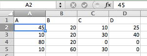
Here’s the example spreadsheet I’m working with (I just chose A, B, C, D as the column headers so I’d have something to work with in data merge; normally you’d use something more descriptive):
Now I can select that as my Data Source in the Data Merge panel. I’ll make a text frame and click the first variable in the panel, then type a plus sign, then the second variable, then a plus sign, and so on:

Next I select the text and apply the Chartwell font and the Pie style, then increase the size. And finally I assign different colors to each of the variables. (I used a nested style to apply them automatically.) Of course, it doesn’t look right at all until I turn on the Preview checkbox in the Data Merge panel, which replaces the proxies (like <<A>>) with the real data.
What’s great is that you can use the same data from the Data Merge panel multiple times in a document. So for example, here I’ve used the same data to create two different charts and also insert the actual numbers into a table:
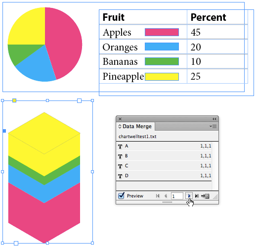
I love that I can click through each row of data while the Preview checkbox is on to see how it will look in the final merged document.
Currently Chartwell is sold by Vectro for $40 per style, or in a bundle if you need all the different kinds of charts.
This article was last modified on October 18, 2023
This article was first published on July 20, 2013
Commenting is easier and faster when you're logged in!
Recommended for you

Exploring Color Combinations with Data Merge
Learn the clever trick for showing all possible permutations of colors in a logo...

Data Merging Individual Records to Separate PDFs
One of the most common requests that I hear concerning Data Merge is “how do I b...

CreativePro Video: Enhance Charts & Graphs in Illustrator
In this week’s CreativePro video, Jason Hoppe shows off a couple of ways to add...


