
In Part 1 of this series, you learned a few best practices. Now it’s time to start saving Illustrator artwork for the Web. In this example, you’ll see how to create and save a button in the correct file format to be used on your web page. I’ll skim through the artwork creation (shapes, text), focusing on the best practices and optimizing the artwork.
Step 1: Create a New Document
Choose File > New to create a new document for your web content. In the New Document dialog box, choose Web from the New Document Profile menu (see Figure 1). This choice sets the units to pixels, changes the color mode to RGB so that all the colors you create are RGB, and gives you standard web page sizes in the Size menu.
Figure 1. Creating a new file in Illustrator.
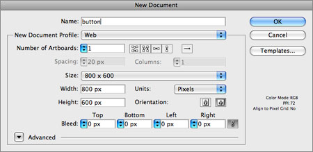
You should make the artboard(s) the correct size for the artwork. If you’re going to design a standard web page, the artboard dimensions should be approximately 970 pixels in width by 600 pixels in height (the standard size of a page these days). If you’re going to create a button or a logo, you want to match the artboard to the final optimized size (the size that the graphic needs to be on the web page).
Since Illustrator allows you to create multiple artboards, you may have many “pieces” for your web design in a single document–buttons, logos, and much more.
Illustrator will crop each artboard to be a single image when the artwork is optimized (saved for use on the Web). If you create an entire web page design, you most likely will need to divide the artboard into smaller pieces by using the Slice tools.
As mentioned earlier, clicking the arrow to the left of the Advanced option allows you to select Align New Objects to Pixel Grid. This can be a great idea for aligning content such as shapes and other artwork to the pixel grid for better precision.
NOTE: In web work, we don’t have a need for a bleed in most cases.
Step 2: Create the Artwork
Creating the artwork is obviously the bulk of the task, which I’ll leave to you, but I want to point out some useful ideas to help as you go along. Figure 2 shows some simple artwork I’ve created, which I’ll use as an example in the remainder of this article.
Figure 2. Example of artwork for the Web.

Since all of your beautiful vector artwork is rasterized when you save the content for the Web, it’s helpful to preview how the rasterized content will look. Choosing View > Pixel Preview and zooming in will show you the pixel grid to which your new content will be aligned by default, assuming that you chose Align New Objects to Pixel Grid in the New Document dialog box.
If you don’t want certain artwork to align to the pixel grid, or you copy-and-paste content into the document, you can change the setting for Align to Pixel Grid at the bottom of the Transform panel.
To align text to the grid, choose Type > Create Outlines, and then select Align to Pixel Grid in the Transform panel.
NOTE: Beware of aligning small amounts of text converted to outlines. The results will likely be less than satisfactory.
Make sure that artwork and artboards you create are in whole pixels, not fractions (60 pixels wide, not 60.021). The setting makes a difference in how the artwork is trimmed.
TIP: If your artwork is either too big or too small for the artboard (the artboard should match the size of the artwork if you’re creating a single button or logo), select the artwork, and then select the Artboard tool in the Tools panel. Choose Fit to Selected Art from the Presets menu in the control panel.
Be very careful with gradients. If your artwork uses a gradient that covers a vast area or is really short, and colors in the gradient are at opposite ends of the spectrum (such as black and white), you may hit banding issues. When you save content for the Web, it’s easy to optimize gradients so much that they appear to be banded–GIFs are especially troublesome. Try to confine your gradients to a smaller area–the top 100 pixels or so, for instance–rather than the entire page background, and make sure that the colors aren’t complete spectrum opposites. If that’s the situation and it can’t be helped, you may end up with an image that has a decent-looking gradient when the file is saved for the Web (with the correct file type), but a larger file size.
Select Object > Slice > Clip to Artboard. This option should be selected by default, but it pays to make sure. With this option selected, each artboard is saved as a separate graphic when you choose File > Save For Web & Devices.
Use symbols when you can. If you’re creating web designs, you most likely will reuse things such as button bases again and again. Most of the time, the best way to ensure consistency and make your life easier later is to determine which artwork you’re going to use multiple times, and save it as a symbol.
Create layered artwork. Whether in print or on the Web, organized files are easier for other people (or for you) to work with later.
Step 3: Optimize the Artwork
Once the artwork is created, you need to optimize it. If your document contains multiple artboards, make sure that the correct artboard is selected before optimizing.
Choose File > Save For Web & Devices. In the Save For Web & Devices dialog box, click the 2-Up tab in the upper-left corner. This step allows you to see the original artwork onscreen with the final optimized form, so you can compare them (see Figure 3).
Figure 3. The Save For Web & Devices dialog box.

In the split view, make sure that the optimized side is selected. Then choose the correct file type from the Preset menu: GIF, JPG, or PNG. Which of the presets you choose (GIF 128 Dithered versus GIF 128 No Dither, for instance) doesn’t matter at this point.
When the correct file format is selected, you need to select the optimal settings for your specific artwork (see Figure 4):
* If you choose GIF, you need to choose the correct number of colors and specify whether you want the image to have transparency.
* If you choose JPEG, you need to adjust the Quality setting. The lower the quality of the image, the greater the compression.
* If you choose PNG, you need to choose between PNG-8 and PNG-24. PNG-8 is similar to GIF, with simple transparency. A PNG-24 image allows for alpha transparency and more color.
Figure 4. GIF compression settings.

TIP: If you opt for transparency, you may need to set the Matte color. The Matte color setting should match as closely as possible the background color of the page on which the image will appear. Since GIF transparency allows only a single color to be transparent, the Matte color is used for the anti-aliased edges, to “fake” the transparency.
After choosing the correct file type and settings, you can also adjust the image size by clicking the Image Size tab on the right side of the dialog box (see Figure 5). This is a great way to create multiple versions (sizes) of the same graphic, or to resize the optimized image without affecting the original.
Figure 5. Extra options when compressing for the Web.

Preview the image by clicking the Preview in Default Browser button at the bottom of the dialog box. This action opens the image in a browser and displays a preview.
Click Save when you’re ready to save the image.
TIP: In the Save For Web & Devices dialog box, if you hold down the Alt (Windows) or Option (Mac OS) key, the Cancel button changes to Reset so you can reset the settings in the dialog box. The Done button also changes to Remember, so that you can capture the settings in the dialog box.
After you click Save, the Save Optimized As dialog box appears. From the Format menu, choose what you want Illustrator to save for you: only the image, the image and an HTML page, or just an HTML page. For this example, I would choose Images Only (see Figure 6).
Figure 6. Final steps in saving the image for the Web.
Allowing Illustrator to create an HTML page is useful if you’ve designed the entire layout in Illustrator on a single artboard and used the Slice tools to dissect the layout into areas.
From the Settings menu, choose Other. In the resulting Output Settings dialog box are a lot of settings for generating HTML code, and very few settings for saving a single image with no slicing (see Figure 10). One of the more interesting options in this dialog box is to choose Saving Files from the second menu from the top, and then deselect (or keep selected) Put Images in Folder: images near the bottom of the dialog box.
Deselecting this option prevents Illustrator from saving your image file into an images folder that it creates.
Click OK, and then click Save in the Save Optimized As dialog box.
Figure 7. Pay attention to these extra options when saving for the Web.

Summary
There you have it: Best practices for creating web content in Illustrator, and the method and methodology behind optimizing that same content for the Web. The great thing about setting up to save web content in Illustrator is that the next time you make a change to the artwork in Illustrator, you can go through the Save For Web process, double-checking your settings, and replace the image you just saved.
© 2010 Pearson Education, Inc. All rights reserved.
800 East 96th Street Indianapolis, Indiana 46240
This article was last modified on July 20, 2021
This article was first published on December 9, 2010
Commenting is easier and faster when you're logged in!

Recommended for you

ShutterStock in Japanese
ShutterStock® (www.ShutterStock.com) announced that its website is now fully fun...

Tip of the Week: Where the Heck Are My Scripts?
This tip was sent to Tip of the Week email subscribers on August 20, 2015. Sign...
Editor’s Picks for CreativePro Week 2023
Our Editor in Chief lists his eight can't-miss sessions from the upcoming Creati...