


Shadows
The strong shadow cast by a tree in front of the shop adds the drama that made the painting for me. Creating that shadow was a breeze. Photoshop has a brush tip that was perfect for this effect—Scattered Maple Leaves (Figure 23). If I may take a moment to brag, this is one of the brush tips that I created for the release of Photoshop version 7, the version where the Brushes engine was introduced.
Figure 23. The Scattered Maple Leaves brush in the Brushes panel.

In a layer, I stroked the brush using black for the Foreground color, filling the layer with leaves (Figure 24). The layer was blurred with the Gaussian Blur filter (Filter > Blur > Gaussian Blur), as shown in Figure 25. The mode for the layer containing the shadow was set to Multiply and the Opacity was lowered (Figure 26). This allowed the colors of the layers beneath to be affected, as would the colors in the real scene.
Figure 24. The scattered maple leaves fill a layer.

Figure 25. The layer with the scattered maple leaves was blurred.

Figure 26. The mode for the scattered maple leaves layer was changed to Multiply, and Opacity was lowered.

In some cases, the shadows needed to be distorted as they traveled along angular surfaces, as shown on the sides of the letters in Figure 27. To get this effect, I distorted them using the Distort feature (Edit > Transform > Distort). I also applied the Motion Blur filter (Filter > Blur > Motion Blur) to stretch the shadow, as would be the case in a real-life situation.
Figure 27. The layer with the shadow was distorted to travel along the sides of the letters.

Inside the orange, plastic letterforms, the shadow was created using a brown color (Figure 28).
Figure 28. The Scattered Maple Leaves brush was applied using a brown color to cover the orange plastic of the letters.

Creating a Canvas Texture
Another technique used in this painting is the creation of the canvas awnings that appear above the entrance to the shop (Figure 29) and the stitching that holds them together.
Figure 29. The awning over the door is made of canvas.

The canvas texture is a pattern that I created to simulate the look of canvas. Again, I studied a piece of canvas to get it right.
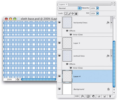
I started by creating a series of vertical lines of varying thickness (Figure 30). These lines were given a layer style of Inner Glow to give them an edge.
Figure 30. The pattern started with a series of vertical lines of varying thickness.

Inner Glow adds a color evenly to the edges of the contents of a layer. Because it is a glow, the default blend mode is Screen, which makes a color lighter than the current color of the layer visible, thus simulating a glow. The color I needed to use had to be darker to make the edges look like they were curled inward. To make Inner Glow work the way I wanted it to, I simply changed the mode to Multiply, so when I chose a color that was darker than the color of the layer, it would be visible (Figure 31).
Figure 31. The lines were given a layer style to give them dimension.

Then in another layer I created a series of horizontal lines that also contained a modified Inner Glow layer style (Figure 32).
Figure 32. In a separate layer horizontal lines were generated and given a layer style.

I created a new blank layer below each of the layers with the lines (Figure 33).
Figure 33. A blank layer was generated beneath each of the layers containing the lines.
NOTE: Creating a new layer will always put the new layer above the currently selected layer. To create the layer below the currently selected layer, hold the Command (Ctrl) key and press the Create New Layer button at the bottom of the Layers panel.
I targeted the layer with the lines and chose Merge Down from the Layers panel drop-down menu (Figure 34). This merged the layer into the blank layer, forcing the layer style to be flattened into the layer. I did this to each layer, the one with the vertical lines and the one with the horizontal lines. This was necessary because next I wanted to create the effect that the two sets of lines were interwoven. Masking or erasing the area where they intersect would have forced the layer style to reset itself to the new visible area and that would have destroyed the shape of the threads.
Figure 34. Each layer with the lines was merged with a blank layer to flatten its layer style.

I made the layer with the vertical lines a selection by Command-clicking (Ctrl-clicking) the preview icon for the layer in the Layers panel (Figure 35).
Figure 35. The layer with the vertical lines was made into a selection.

Using the Eraser Tool, I then eliminated the portions of the horizontal lines to simulate the interwoven quality of the cloth (Figure 36).
Figure 36. Portions of the horizontal lines were erased through the selection to create the look of interwoven fabric.

The entire image was then selected and Define Pattern was chosen from the Edit menu to make the fabric texture into a pattern.
The shapes of the awnings were filled with a solid color (Figure 37). In a separate layer, a large rectangular shape was filled with the canvas pattern (Figure 38). The pattern was then distorted to match the angle of the awnings (Figure 39) and then clipped with the layer of the awning shape (Figure 40).
Figure 37. The shape of the awning was filled with a solid color.

Figure 38. A layer was filled with the fabric pattern.

Figure 39. The pattern-filled shape was distorted to match the awning angle.
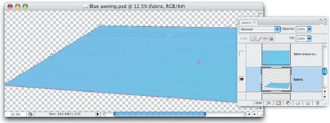
Figure 40. The layer with the fabric texture was clipped with the layer containing the awning shape.

Go to page 3 for the final steps!
This article was last modified on January 18, 2023
This article was first published on October 13, 2008
Commenting is easier and faster when you're logged in!

Recommended for you
Pantone 2.0: After 45 Years, the Sequel to PMS
On September 5, 2007, Pantone announced an entirely new spot-color-matching syst...
Scanning Around With Gene: When Chemicals Plus Electricity Equaled Beautiful Art
You could certainly argue that the graphic arts industry, even in its present co...

Scanning Around With Gene: Pay Up, or Else!
I’m at an age in life where my finances should be totally secure, but like...