

Excerpted from Photoshop Studio with Bert Monroy: Digital Painting (New Riders).
Reflections and Shadows
Paul’s Shoe Repair is one of those places that seems to defy the changes of time. As the surrounding landscape of Shattuck Avenue in Berkeley, California, has seen businesses come and go, this little shop continues to open its doors every day as it has for countless decades. The interior with its mountains of shoes yet to be done and the neat rows of shoes that have been repaired waiting for their owners to reclaim them give the shop the reputation of having served many generations of happy and loyal customers. Some of the displays of merchandise for sale are so old that they seem like props to accent the antiquity of the place.
Tucked away between other shops and restaurants, and partially hidden by trees that adorn the street, Paul’s Shoe Repair sits there calmly and quietly as hundreds of shoppers and university students rush by it every day.
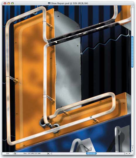
It was its outdated look and humble façade that attracted me to capture a moment of its lifetime. The worn canvas awning that protects the entrance, the stained neon sign, and the decoratively shaped tiles that cover the building, all gently bathed by the shadow of the tree in front begged me to commit them to the screen (Figure 1).
Figure 1. “Shoe Repair”

Many of the techniques that went into creating the painting were techniques that I had developed earlier, such as the damages on the concrete section above the awning (Figure 2). I employed the same technique that I used to create the damages on the wall in “Oakland” in the previous chapter.
Figure 2. The worn texture of the stone section above the awning was created the same way the stone was aged in Chapter 3.

In this chapter I discuss a few additional techniques and concepts behind this painting that will help you learn some very important practices when creating realistic imagery such as reflections and shadows.
Reflections
Learning how reflections work is simply a matter of studying the real world. As I mentioned in Chapter 1, I never guess at what something should look like, I study models and real-world objects to determine how something should work.
Let’s say you wanted to create an image of the straight-on view of an object being reflected into a mirror. You would only need to take the object and flip it horizontally (Edit > Transform > Flip Horizontal) to get a fairly decent reflection. If, however, the mirror was placed below or at an angle to the object, flipping the object vertically or rotating it would not be enough to produce a proper reflection. In this case, the reflection would show the bottom or unseen sides of the object, requiring you to alter the shape to produce the final effect.
In the following example, note the reflections of the neon tubes on the orange, plastic letterforms of the sign (Figure 3). Creating the reflections was an easy task but making them look right required a little alteration.
Figure 3. The neon tubes can be seen reflected in the orange, plastic surface of the sign.
The tubes were created exactly as the neon tubes in the previous chapter. The difference here is that the tubes are attached to a plastic surface that is reflective.
To create the actual reflection, I simply duplicated the layer that contained the tubes. Next, the layer was offset to the lower right to match the viewing angle (Figure 4). I renamed the layer “Paul’s tubes refl” to differentiate it as the reflection layer. It was then turned into a clipping group with the layer that contained the orange letterforms (Figure 5).
Figure 4. The layer containing the neon tubes was duplicated and offset to the lower right.

Figure 5. The duplicate layer was clipped with the layer of the orange plastic.

An in-depth explanation of a clipping group can be found in the Layers PDF file at www.peachpit.com/digitalpainting.
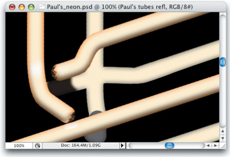
The one thing that needed to be altered was the area where the tubes bend inward toward the sign to connect to it (Figure 6). These tubes are bending away from the viewer toward the sign. But in the reflection they should appear to be bending the opposite way toward the viewer and away from the plastic sign. To accomplish this effect, I replaced the end of the tube with a new shape that would resemble a proper reflection, as shown in Figure 7. I also recolored the tubes to better simulate the soft reflection.
Figure 6. The end tips of the neon in the duplicate layer needed to be altered to act like a true reflection.
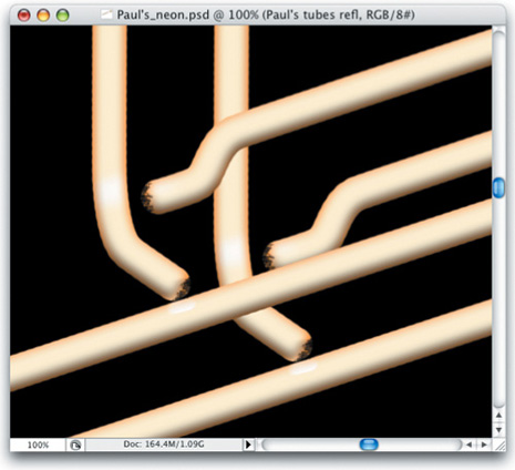
Figure 7. The tips in the duplicate layer were altered and recolored to look like a reflection.
Aged Neon
Another small detail that I needed to consider was the fact that these neon tubes were old. Years of glowing to attract customers have had their affect on the brightness of the neon tubes. Their glow is not consistent. There are sections of the tubes where the glows dim as the gases flow through.
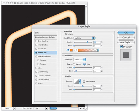
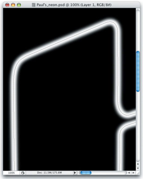
The tubes were paths that were stroked with the Paintbrush Tool using a hard-edged tip and a color that was a soft, warm white (Figure 8). The brightness of the white created the effect of light being emitted from the tubes. Creating the glow of the lit neon tubes was a matter of applying a few layer styles. Inner Glow gave them the orange haze along the edges. I chose an orange color that was darker than the color of the tubes. It was necessary to change the Blend Mode to Multiply so that the color could be seen (Figure 9).
Figure 8. The tips were paths that were stroked with a warm white.
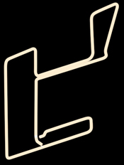
Figure 9. The tips were given an edge with the Inner Glow layer style.
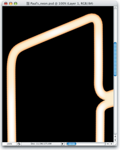
Bevel and Emboss gave the tubes their three-dimensional shape by adding a soft shadow along the bottom as well as an additional glow along the tops of the tubes (Figure 10).
Figure 10. The tips were given their roundness with the Bevel and Emboss layer style.

To produce the effect of the fading light, in a separate layer, the paths that were used to create the tubes were stroked once more with a soft-edged brush using a bright white color (Figure 11).
Figure 11. The tips were stroked in a new layer using a soft, white brush.
This stroke was erased in certain areas to make it appear as if the light was brighter in some spots and less bright in others (Figure 12). The end result was a neon that had uneven brightness, as shown in Figure 13.
Figure 12. The soft lines were erased in certain areas to simulate bright spots in the tubes.

Figure 13. The final tubes with the uneven light flowing through.
Rust
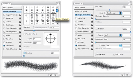
Rust that had eaten away at the metal portions of the sign (Figure 14) was created using a modified brush tip. The basic tip is exactly the same as the one I used to create the damages on the stone wall in the painting “Oakland” and the stone wall in this painting (Figure 15). In fact, in many situations I often use this particular brush shape.
Figure 14. The rust areas of the metal of the sign.
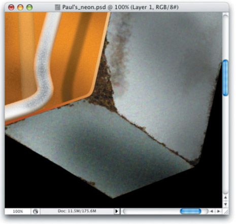
Figure 15. The brush tips have been modified to randomize the stroke.
Because the damages on the stone surfaces were visible due to the affect of lights and shadows within the damaged areas, the Fill Opacity for the layer containing the strokes was lowered to zero, so the effect was created using the layer style.
For the rust on the signs, the Fill Opacity was left at 100% because the stroke needed to be visible. Color made the difference here. One function of the Brushes panel that was not used in the other instances was utilized here—Color Dynamics. In the Color Dynamics section the Foreground/Background Jitter was set to 100% (Figure 16). This feature randomly applies the colors assigned to the Foreground and Background to the brush tips as they paint over the canvas. Altering the Saturation and Brightness Jitters introduced further randomness to the colors being applied. Adjusting the Hue slider just a bit added even more randomness. Pushing the Hue slider too far produces unwanted colors, so I kept it low.
Figure 16. The Color Dynamics section of the Brushes panel.
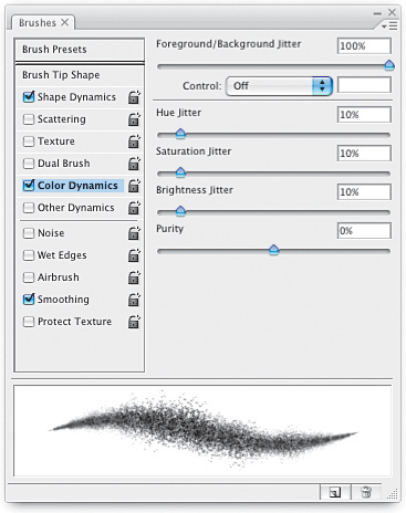
NOTE: The only problem with the Color Dynamics feature is that the preview box does not display the colors.
Setting the Foreground color to a brown and the Background to an orange (Figure 17) created the effect of rust when I stroked the canvas with the altered brush tip.
Figure 17. The Foreground and Background colors were set to simulate the colors of rust.

Fading Reflections
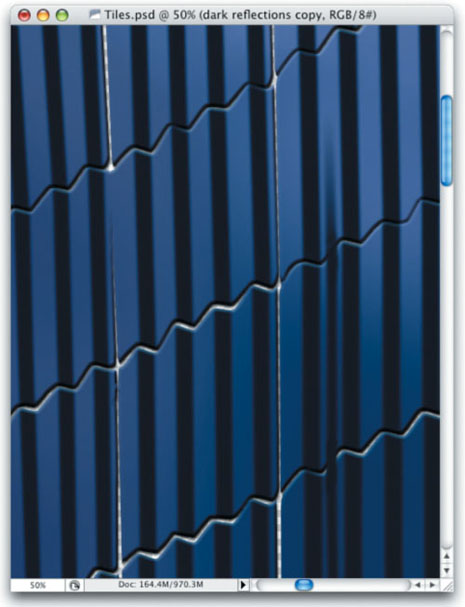
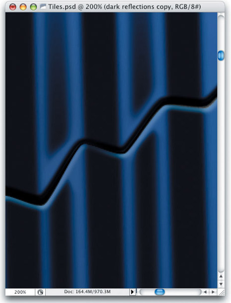
As you can see in Figure 18, reflections of lights and objects are visible in the ridges of the tiles on the building. These reflections lack detail due to the surface texture of the tiles and the limited area within the ridges. The reflections appear simply as tonal changes along the surface.
Figure 18. The reflections on the curved surfaces of the tiles.

To achieve this effect, I employed the Other Dynamics portion of the Brushes panel. This section controls the Opacity and Flow Jitter of a stroke.
A more detailed explanation of the Other Dynamics portion of the Brushes panel can be found in the Brushes PDF file, which you can download at www.peachpit.com/digitalpainting.
I set the Opacity Jitter to Fade (Figure 19). I set an amount that would produce a stroke that was long enough to cover the area of reflection and then fade out to transparent as the reflection ended.
Figure 19. The Other Dynamics section of the Brushes panel where the Opacity Jitter is set.

Choosing a dark blue color, I clicked once at the bottom of the ridge to be painted (Figure 20). Pressing the Shift key to connect one click of the Paintbrush to the next click, I clicked at the top of the wall of tiles. The result, visible in Figure 21, was a stroke that slowly faded as it reached the top of the wall.
Figure 20. With a soft-edged, dark-blue brush tip, a single click is set at the bottom of the tiles to be painted.

Figure 21. The result is a streak that fades as it travels upward.
The tiles are slightly rounded at the edges. This rounded surface disturbs the reflection. To get this effect, I added a layer mask where I painted the stroke with black to hide the areas of the stroke that fell over the edges of the tiles (Figure 22).
Figure 22. The portions of the stroke that fall over the tile edges were hidden with a layer mask.
Go to page 2 for many more tips and tricks!
This article was last modified on January 18, 2023
This article was first published on October 13, 2008
Commenting is easier and faster when you're logged in!

Recommended for you

Creating Rounded Text in Illustrator
Rounded text is great for adding a soft, human look to text, and is a good solut...

3D Printing With Photoshop CC
Adobe has been building increasingly sophisticated 3D modeling tools into Photos...
Develop Your Photography Skills Each Week with The Practicing Photographer
If you want to be great at anything, whether it’s baking bread, shredding...