


Reprinted with permission of the author and A LIST Apart: For People Who Make Websites
If you’re a designer, you work to communicate and convey meaning. So it’s important that you understand the mechanisms by which things and ideas acquire meaning; more than any other factor, your grasp of these fundamentals determines your ability to communicate effectively. Without fundamentals, you will flounder when faced with complex design challenges or constraints.
Today, as always, issues of style and popular convention occupy the attention of many, and may distract us from the essentials of our craft. This is especially true for those of us who did not come to web design from a formal design or art education, so I want to take this opportunity to examine what I deem to be the most important fundamental tool for conveying meaning.
Before we move on to specifics, though, let’s briefly examine the whole set of fundamentals. These basics of creative communication are consistent across art forms: painting, music, dance, acting, poetry, design, and all other artistic endeavors. I divide them into two categories: vocabulary and grammar.
The Fundamentals
Artistic Vocabulary: The vocabulary of artistry is found largely within the fundamentals of line, form, color, and texture. These elements form the content of our communication. Various forms of these elements have widely understood connotations; some universal and some cultural. For instance, angular lines and forms are generally indicative of strength, speed, and masculinity, while rounded lines and forms are generally associated with softness, slower tempo, and femininity.
Artistic Grammar: Communicative grammar is generally defined by contrast, balance, harmony, and distribution. These are the building blocks of composition, and they help convey context and manipulate relationships among content elements.
Despite the importance of these fundamentals, the language of art and design is no different from any other language in that the rules of its vocabulary and grammar do not fully define it. Moreover, most of the rules of language have exceptions, and some creative modes of communication make little or no reference to rules. Every language is lent nuance, style and character by the way that each individual uses it, and there are exceptions for every grammatical rule.
Yet, no language succeeds without structure. The fundamentals of communication are always relevant and necessary as reference points. Without the essentials, communication — be it verbal, written, graphic, musical, or physical — is impossible. In fact, those creative modes of communication mentioned earlier are only meaningful by how they contrast with widely understood reference points. These widely understood reference points get their meaningful essence the same way that everything else does: through contrast.
Contrast
Design is largely an exercise in creating or suggesting contrasts, which are used to define hierarchy, manipulate certain widely understood relationships, and exploit context to enhance or redefine those relationships… all in an effort to convey meaning. Contrast is important because the meaningful essence of anything is defined by its value, properties, or quality relative to something else. That’s right: nothing has much meaning by itself, which is one reason why design is important.
The function of contrast in defining meaning can be explained by comparing fundamental opposites: dark/light, soft/hard, fast/slow. Examples like these are useful because everyone understands the extremes they imply, but while there are extremes, there are no absolutes. The values are merely relative.
For instance, a cheetah is generally considered to be fast. But a cheetah is quite slow compared to a jet airplane. So saying “a cheetah is fast” is only meaningful when some relevant context is also communicated or assumed. Likewise, stating that “element X in the page layout is important” is only meaningful when the relative importance of that and all other elements has been established. In other words, every element on the page you’re designing has to be positioned, styled, sized, or otherwise distinguished in accordance with its specific importance and place in the overall communicative objective. If you neglect even one component, it may work to subvert your entire effort.
In addition to defining meaning and relationships, contrast is closely tied to human perception and survival instincts, as we’ll examine later, and this makes contrast a powerful and essential tool for designers. Simply put, contrast is at the root of almost everything you’ll accomplish with design.
There are several primary forms of contrast that designers typically use (Figure 1):
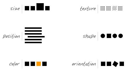
Figure 1. The primary forms of contrast include size, position, color, texture, shape, and orientation.
In a layout, contrast helps lead the reader’s eye into and through your layout. Each component of the page — graphic, textual, or interactive — has a job to do, and each of those jobs falls within a hierarchy that’s specific to the project at hand. Furthermore, each component is but a piece of the overall project message and objective. With creative uses of contrast, you can influence user choices and compel specific actions.
Page elements must not, of course, be designed or organized haphazardly. Content must be intelligently composed, and composition is defined by the information hierarchy — which is defined with, you guessed it: contrast.
For instance, let’s say that you’re designing a simple web page for which the main purposes are to 1) briefly describe what the company/service does, and 2) ask visitors to create an account and start using the service. Setting visual concerns aside, let’s look at the initial copy we’re presented with for each of these information components.
ABOUT COPY
Optimizr analyzes your web page or entire website and then transforms convoluted table structures and tagless content into lightweight, CSS positioned div layouts and semantic markup. The process is automatic and requires no knowledge of html or css. It’s 2.0-licious!
REGISTRATION COPY
Optimizr accounts include Individual Level, Pro Level, and Enterprise Level. You can create an account now by clicking here. Or you can follow these links to learn more about the different account types.
It’s immediately apparent that there’s virtually no stylistic contrast between these two sections of copy. But in order for this page to work, there must be a great deal of difference between them! One is information copy and the other is supposed to be action copy. Let’s try and inspire some action by making the action section’s communication style contrast with that of the information copy.
ABOUT COPY
Optimizr analyzes your web page or entire website and then transforms convoluted table structures and tagless content into lightweight, CSS positioned div layouts and semantic markup. It’s 2.0-licious!
One-click Optimizing! Optimizr’s functions are automatic and require no knowledge of html or css.
REGISTRATION COPY
Create an account >>
Individual Level
For individual users with one static website.
Learn more >>
Pro Level
For individual users with multiple static websites.
Learn more >>
Enterprise Level
For users with CMS-driven websites.
Learn more >>
Now, let’s use some graphic contrast to further define the hierarchy of information and elements on the page (Figure 2).
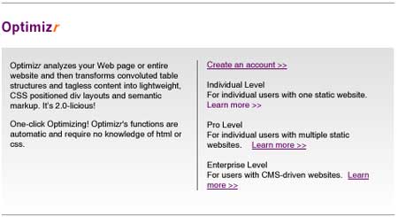
Figure 2. Here, little more than positional structure has been introduced.
In this example, there is not much contrast. The logo contrasts with the content because of its color and size, and the gradient draws the eye downward. The links on the right contrast with non-link text due to color and decoration. But beyond that, there’s not much to suggest which information or elements on this page are most important. Let’s change that (Figure 3).

Figure 3. Now, informational content and actionable content have been more appropriately defined and contrasted.
Now there is a clear hierarchy of importance among the page elements and a more compelling call-to-action area. Important information is contrasted by size, color, or decoration and actionable elements have a common color to communicate that they’re related in some way or have a common purpose. Now that we’ve increased the contrast between elements, page visitors don’t have to read everything to know what’s most important. With a quick scan, they can grasp which information is vital and how to “get started” once they’re convinced that they need this service.
As we’ll see next, this ability to communicate vital information via a quick scan is particularly important when we try to exploit natural human tendencies.
Following and Directing Human Behaviors
It’s no secret that designers have to appreciate things most people either take for granted or are not consciously aware of. In fact, unconscious awareness is one of the primary realms we seek to manipulate through design. In order to exploit natural human tendencies and manipulate perceptions, though, we must first understand them.
Designers should know that we humans habitually scan our surroundings. We may focus on one small area or item for a time, but when we change our field of vision, we first begin to visually “consume” that new view by performing a quick scan. In doing this, we unconsciously look for elements of contrast — things that stand out from the forest of mundane elements — as part of our instinctive threat-detection process.
This instinct isn’t limited to spotting a crouching lion in a leafy green forest. Website visitors quickly scan a page’s layout and decide how and where they’ll begin consuming the content. If you’ve used contrast to craft a visual information hierarchy, you can compel viewers to look where you want them to. If you’ve done a really good job, with intelligent contrast, calls-to-action, etc., you can even compel them to follow a specific path through the layout.
Other natural tendencies can be exploited to make your design even more compelling. For instance, Westerners typically begin their consumption of a page of information in the upper left-hand area. If you place some information that is highly conspicuous according to contrast in that area, you can be reasonably sure that it will be seen and consumed first — by Western users, at least. This doesn’t mean that other areas of the page can’t ever be effective locations for important information; contrast can be powerful enough to overcome certain natural tendencies. But contrast in combination with a composition that exploits natural human behavior will always be more effective, as we can see in Figure 4:

Figure 4. With the largest, most conspicuous text element in the upper-left area of the layout, it is clearly the most important element on the page.
In Figure 5, the effect is still strong… just not quite as strong as the previous one:
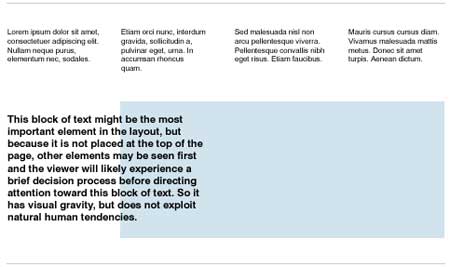
Figure 5. With the largest text element placed below other, smaller text elements, it is less clear which is the most important element on the page.
It’s worth noting that people are unpredictable: and each brings his or her own objectives and whims that shape the process of encountering your designs. So despite your best efforts, it’s inevitable that your success in directing user attention will vary. Of course, it’s still your job to have a significant impact on this experience, so you’d better know what mechanisms work, and why.
Newspapers can provide excellent examples of how to craft an effective information hierarchy and define the order in which readers will consume content (Figure 6).
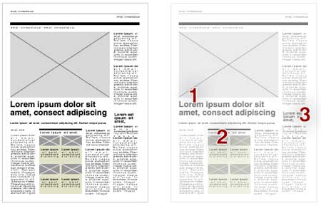
Figure 6. This typical newspaper layout illustrates a clear hierarchy of information, according to contrast.
In this example of a newspaper layout, the contrast of text size, images, color, and position on the page creates a predictable order of consumption. The largest image and largest text are paired to define what will likely be seen first (1). The contrast of color and the presence of images are compelling enough to define the likely second stop for the reader’s eyes (2). Note also how that area repeats the heavy horizontal header-line, which helps to capture the reader’s attention. Because of its size, the headline on the right will probably earn the reader’s attention next (3). Understanding how the mechanisms in this example work can prepare you to craft other experiences for readers.
Of course, this sort of contrast can only define the likely order of what readers will “see.” Getting them to actually read the content depends on other factors, such as how compelling the headline is and how engaging and interesting the story is — and in this realm, too, there is ample room for intelligent contrast.
In Closing
The information and examples presented here barely scratch the surface of this subject. Contrast is everywhere and a part of everything we see, do, experience, and understand. Look for it in your own work and beyond. Get into the habit of finding contrast in everything you see, and of calculating the information hierarchy of things in your daily experience. In other words, look deeply. This sort of habit can pay healthy dividends in your design work.
Contrast is just one component of design fundamentals. Get cozy with all of them and apply them to your work first before you move on to the non-fundamentals. Your work will be better for it.
Andy Rutledge is an artist, composer, and semi-independent designer in Texas. When not working, biking, or banging on the piano, he’s usually found ranting about design or professionalism on his personal site, Design View.
Originally published by Happy Cog.
ISSN: 1534-0295 Copyright © 1998-2007 A List Apart Magazine and the authors.
This article was last modified on December 17, 2022
This article was first published on May 30, 2007
Commenting is easier and faster when you're logged in!

Recommended for you

A Star Is Born: Deke McClelland's Photoshop Music Video
You’ve probably heard of prolific software trainer Deke McClelland. Hell,...
P22's Foxtrot Font Family Designed for Text & Display
Press Release The P22 Foxtrot Pro family of fonts is the latest design by Norweg...
Color Management is Not Color Correction
In the webinar I presented to the Graphic Artists Guild titled Color Manage...