
Contextual Alternates in OpenType Fonts
Adobe's Bickham Script and House Industries' Ed Interlock display two different approaches to using OpenType's contextual substitution.

This article appears in Issue 4 of InDesign Magazine.
As OpenType was developed jointly by Adobe and Microsoft, it’s not surprising that the Adobe type library was the first to be converted entirely to OpenType format. All of the Adobe Originals typefaces, as well as typefaces Adobe licensed from other foundries, are available as OpenType fonts. Many of the Originals, too, have been developed as OpenType Pro fonts, which include extended multilingual support and may include advanced typographic features. As Thomas Phinney, program manager for fonts and core technologies at Adobe, pointed out to me after my article in issue 3 of InDesign Magazine, the “Pro” designation actually refers only to extended Latin-alphabet language support; some of the Adobe Originals also include Greek and Cyrillic character sets, but that’s not required for a font to be called “Pro.” Nor are extra typographic features necessary, although Adobe is known for providing those.
In some of its fonts, Adobe has deliberately pushed the possibilities of OpenType technology in order to show how it can make finer typography easy for a font-user to apply. In particular, the OpenType “contextual features” — changes that take place depending on the context of how the type is being set and what else is in a block of text —make some surprising effects possible. The most spectacular of these may be Bickham Script Pro, an extended version of Richard Lipton’s earlier Adobe Originals typeface, Bickham Script.
A Business Hand for the Eighteenth Century
Bickham Script is an ambitious script typeface that makes extensive use of “contextual ligatures” and “contextual alternates.” It’s a copperplate script, based on an English writing style of the 18th century; although it may seem surprising to us now, this “round hand” style was commonly used in business correspondence at the time. Its basic letterforms are solid and even,
with the high contrast and steep angle that come from writing with a pointed quill (Figure 1). An 18th-century English writing master might be delighted with the regularity achieved in Bickham Script, but what we notice, since this is a modern digital font rather than an individual’s handwriting, is the variation and irregularity that OpenType can give to the words.
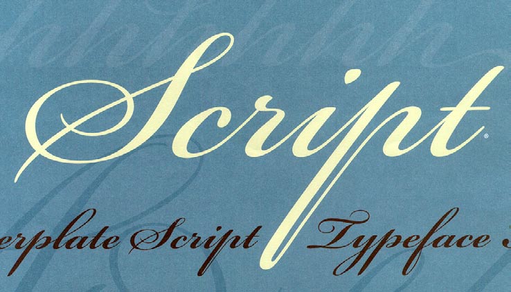
Figure 1: Bickham Script Pro is an elaborate typeface based on a style of handwriting that was once considered quite functional and straightforward.
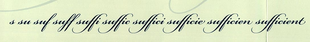
Figure 2: As you type more letters of a word in Bickham Script Pro, the font chooses the appropriate form of each letter to go with the other letters in the word, or on the line.
Artificial “Ed” telligence
At the opposite end of the display-lettering universe, House Industries has just released the Ed Benguiat Font Collection, a series of display faces based on the commercial lettering and type design of the prolific New York graphic designer Ed Benguiat. One of the five fonts in the series, Ed Interlock, puts OpenTypes contextual features to work to achieve a very different effect from that of Bickham Script. The one thing they have in common is that both are meant to look spontaneous, as though they had just been done by hand. House Industries, in its usual wisecracking way, refers to this as “tricknological wizardry” and calls the way the fonts works “artificial ‘Ed’telligence.” The letters in Ed Interlock look bouncy and blocky, the sort you might see in playful headlines from the 1960s or 1970s (and indeed what you saw then might have been done by Ed Benguiat). Although Benguiat himself says that “I originally included a bunch of alternate letters for Photo-Lettering composition,” House’s Ken Barber drew “nearly 1,400 custom ligatures for Ed Interlock in order to mimic real hand-done lettering.” Ed Interlock has a cheerful lowercase, with the usual f-ligatures and such, but the real heart of the font is in its caps: in an all-caps setting, the wealth of multi-letter ligatures can produce a tight block of closely interlocked letters (Figure 3).
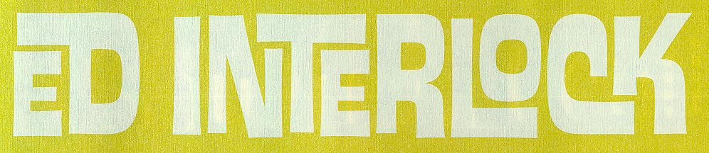
Figure 3: Ed Interlock is based on a lettering style that Ed Benguiat developed for Photo-Lettering in the 1960s and 1970s.

Figure 4: A few of Ed Interlock’s custom features, including two- and three-letter ligatures.
Commenting is easier and faster when you're logged in!

Recommended for you

Special Characters
Nigel French weighs in on how to locate those hidden gems on the Glyphs panel—an...

A Script for Accessing OpenType Features in InDesign
This free script makes it easier than ever to access OpenType features like disc...

Tip of the Week: Using Discretionary Line Breaks
How to use discretionary line breaks to avoid bad breaks when using en spaces an...