
Communicating with Charts
Build your charts, graphs, and data visualizations with these helpful tips and plug-ins.


This article appears in Issue 126 of InDesign Magazine.
Creating beautiful charts and graphs is one of the biggest challenges designers have when communicating data. It’s hard to make them informative, easy to read, and visually engaging—not just because they’re hard to design well, but also because it’s challenging to find the tools to do the job. So I’m going to offer you some useful tools, tips, and tricks to make your data deliver maximum impact, with less time spent creating these important graphic elements.
Now I have to warn you; I geek out over data visualization. Charts and graphs that are well designed draw me in when I am reading. I enjoy looking at the design and technical aspects of data and how it helps support the story visually. But even better, I get excited when I find tools that can help creative pros build charts and graphs faster and easier.
We Are Visual
The old adage that “a picture is worth a thousand words” is increasingly relevant nowadays as people consume visual content from their phone, tablet, and computer—and read less. Research shows that 90% of information transmitted in the brain is visual. Studies also show that people remember 10% of what they hear, 20% of what they read, and 80% of what they see. Good visuals go a long way in engaging viewers and making a lasting impression (Figure 1).

Figure 1. Research shows our intake of visual information has a lasting impact on how we learn.
Learning is easier with visuals. The better constructed the visual, the better the story will be told and committed to memory. Visual processing comes much faster than reading; people read about 20–28% of words on a page. Research shows we process images
60,000 times faster than text (Figure 2).
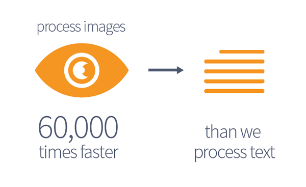
Figure 2. Studies also show that we process images 60,000 times faster than we read text.
This is supported by the way we immediately react to content or design we see before we ever read the words. Are we engaged by the layout, design, and visuals, or not? This reaction prompts an “I like it” or “I don’t like it” response before we even get to the actual text.
Displaying Data
Determining the best way to show data is the first step in making great charts and graphs. Is your data best displayed as a chart, graph, or infographic? Charts and graphs are terms that are commonly interchanged, but there are important differences that are worth understanding. Generally defined:
- charts are any graphic representation of data;
- graphs show mathematical or statistical information;
- infographics combine data with text and icons to tell a story.
Once you figure out which approach you’re going to take, the next step is to decide how you’re going to build your chart, graph, or infographic.
Charts and Graphs in Illustrator
Illustrator’s chart tools can create column graphs, stacked column graphs, bar graphs, stacked bar graphs, line graphs, area graphs, scatter graphs, pie graphs, and radar graphs. One noticeable omission from this list is the radial graph, something I would like to see added someday.
(Actually, I should point out that you can use either the Pie chart option in the Chart tool or the Ellipse tool with the pie chart angle calculations to create a radial chart. When combining the pie chart with the Polar Grid tool and a clipping mask, you can create a radial chart. You can find the step-by-step process of creating a radial chart in Illustrator here.)
To create a chart in Illustrator, select the appropriate Chart tool, and drag an area on the artboard the size of the chart. The chart input box appears. Data can be entered manually or by clicking the import icon to import from an Excel or data file. To flip the X and Y axis, a click of the Flip Axis button does the trick. To accept the values, click the check mark at the end of the box (Figure 3).
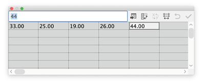
Figure 3. Input the data manually or with the import button. Transpose the row/column, flip the X and Y axis, edit the cell style, revert, and commit.
Once the data is committed, the graph is created. Visually the graph is not exciting at first, since the font defaults to a standard typeface and the colors are shades of gray. But you can easily jazz up components of your graph with the Direct Selection tool or the Group Selection tool. You can edit the text, choose a new font, or apply different colors. The X and Y lines can be hidden by selecting the stroke and setting the weight to zero. The bars can be selected and changed to a more inviting color palette (Figure 4).
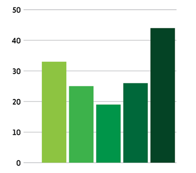
Figure 4. With the Direct Selection or Group Selection tool, each object can be selected and edited.
Editing the data used by the graph is an easy process. Just choose Object > Graph > Data or Object > Graph > Type, and plug in the new data. Any edits made to the data or type of graph is applied, while the fonts, colors, and styles you applied are retained (Figure 5).
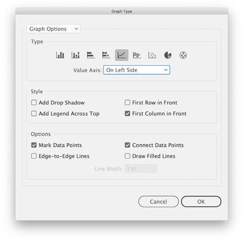
Figure 5. Edit the chart type, style, and other options while keeping the newly applied attributes or styles.
Save the file as an .AI file or PDF, and it’s ready to be imported into your presentation or layout.
Charts and Graphs in InDesign
Unfortunately, charts and graphs are not a native feature in InDesign. But that doesn’t mean you’re out of luck, since there are some very useful third-party plug-ins and fonts for making charts and graphs.
For example, Cacidi Charts CC is a plug-in that allows you to build charts directly in InDesign. Like with Illustrator, you can enter data directly or import from a CSV file. The plug-in can be found here. (For more information, see the review from Issue #104.)
Cacidi Charts adds a new panel in the Window menu. Chart styles include Pie, Circle (Radial), Column, Bar, Stacked Column, Area, and Line Scatter. To enter data, just click in the data entry field, type, and remember to press Return when you’re done (Figure 6).

Figure 6. Data input and chart options in the Cacidi Charts panel. Chart styles help to keep the look of your charts consistent
This can make for a tedious process when entering or deleting a lot of data. Importing a CSV file via a drop-down menu saves you from having to manually input your data. Once the data is imported, columns or rows can be added or deleted by right-clicking on the column or row to remove or add space. Moving the data around, however, is all manual. If you’re used to moving rows and columns freely in InDesign tables, you might tire of the cut-and-paste process here.
With the data in place, select the chart style, and click Create. Changes are displayed in real time and can be easily adjusted. When you’re choosing different chart types, the data remains intact, and the new chart is created. Each chart style you choose creates a separate container and is stacked on the previous chart. There are several options for chart customization. Depending on the chart type, you can edit the style, size, labeling options, and value representation. Once you choose the options for a chart, you can save them as a Chart Style, which is a very welcome feature.
Editing color is not an option in the Cacidi Charts panel. Green, blue, and red are the default colors on an active chart. These colors can be changed once the chart is converted to an object, done by choosing the Convert Chart to Object command. Shapes become editable vectors, and text is set in individual containers.
Overall, this is an easy solution for creating charts InDesign rather than creating them in Illustrator and importing them. The design of the charts is nothing noteworthy; in fact, the design is limited due to the color choices. Illustrator offers more options for editing an active chart in terms of fonts, colors, and design, but then you have to do the work in Illustrator. When it comes to the Cacidi Charts CC plug-in, you’ll have to weigh convenience vs. price to see if this is a good fit for your needs.
Scripting Pie Charts in InDesign
InPie Beta is a free script for InDesign. It’s simple to use, as its singular function is creating pie charts. While the developer doesn’t appear to have a website, you can find them on Facebook here, and you can download the script here.
Once the InPie script is installed, you can access it in the User folder in the Scripts panel (Window > Utilities > Scripts). Enter data in a text container, with the values separated by commas, or by cells in a table. Highlight the text, and run the script. The Pies Generator dialog box opens, allowing for some basic editing and a few formatting options (Figure 7).

Figure 7. Pies Generator dialog box
The result you get is a simple pie chart with interesting colors and labels that leave some room for improvement. The pie object can be ungrouped and further edited as shapes and text (Figure 8).

Figure 8. InPie chart with value labels. Ungroup to edit the color and text labels.
Another pie chart script is the venerable Claquos from Indiscripts. They are reportedly working on a “version 3” which may be out by the time you read this.
Creating Charts and Graphs with Fonts
Having the ability to chart or graph data in any of my applications is a big hit with me. But what about making charts and graphs in applications that lack those features? The answer is to use a font with some very intelligent features built into it. The Chartwell fonts, found here, provide this ingenious solution, preventing the need for plug-ins or dedicated applications to build your data. Chartwell has a simple yet clever solution creating charts and graphs. When the Chartwell fonts OpenType feature is enabled, simple strings of numbers are transformed into chart elements.
To use Chartwell, create a text frame, and enter the values you want to represent in a chart, for example, 12+33+44. Then select the type of chart you want from the list of installed Chartwell fonts (Figure 9).
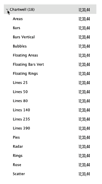
Figure 9. Chartwell fonts offer a variety of data-graphing solutions.
Turn on Ligatures, and then choose the Contextual Alternates from the OpenType options, and the chart is created. The color can be specified by selecting each value, and applying a color; the chart will reflect the corresponding colors (Figure 10).

Figure 10. Colors applied to the text will be reflected in the chart.
In InDesign, the values and colors can be edited using the Story Editor. Select the graph, open the Story Editor, change the values, and apply a color to each value (color does not show in the Story Editor, so you have to select the text); the graph will update.
I found that the resulting charts were small—in some cases, very small. Since this is live text, you can easily make a bigger chart by increasing the point size of the text. Converting the chart text to outlines (Type > Create Outlines) allows you to directly edit the shapes and have more flexibility in applying fills and strokes.
Since these charts are based on fonts, there are no options for captions, legends, callouts, or X- and Y-axis information.
For more on Chartwell fonts, check out this helpful article by Colin Flashman and Cinnamon Cooper’s article in Issue #78.
Chartwell is the most full-featured charting font available, but it’s not the only font in town. Another fascinating (and free) charting font is called Amazing Infographic, available here. And if you’ve ever wanted to make little mini “sparklines,” consider using this font.
How to Make Your Charts and Graphs Visually Engaging
With the different options to create charts and graphs, the goal is to create visuals that are easy to read, impactful, and compelling. I look at chart and graph design as a play: The actors, the stage, the props are color, type, and design. Everything needs to work well together for the drama (or comedy!) to work.
Color
Colors help support the theme and voice of the story being told. Fewer colors work well for keeping things cohesive. Too many colors can lead to confusion as the chart or graph becomes visually noisy. I try to limit my color usage to five or fewer.
Reds are strong, emotional, intense colors with high impact. Orange offers high impact, a warm tone, and is less forceful than red. Yellow is warm and bright, but it can be hard to read on a light background. Blue is cool, offers good contrast, and can be soothing. Green is cool and has a strong tie to nature. Purple can be a warm or cool color and offers good contrast.
Creating a palette of colors that work well together can be a challenge. I use the interactive color guide at color.adobe.com. On the Adobe Color website, you can search by keyword(s) and access thousands of user-generated color combinations instead of creating your own color palette. These colors combinations are easily loaded into your Swatches panel in many Adobe applications (including InDesign). Illustrator and InDesign have a mini-version of the Adobe color website built in as the Adobe Color Theme panel, so searching for and loading colors is easy to do right in the application (Figure 11).

Figure 11. Adobe Color themes and color.adobe.com are excellent and integrated resources for finding and adding colors to your design.
Don’t forget that using tints of a color can be a strong way to show differences without adding a new color to the design. I generally avoid using solid black on any of my charts and graphs as it can create too much contrast. Tinting the black to 60%–80% helps reduce the contrast and lets the other colors speak to the content (Figure 12).

Figure 12. Limit the amount of colors in the design. Using tints of colors can help create separation without adding more colors. Tinting the blacks back to 80% lessens the sharp contrast.
Type
Fonts have a character all their own (no pun intended). Using that visual voice that the fonts have is very important. People recognize the voice and the meaning of the font before they ever read the content. When I design, I create a list of type that best displays the voice of the design; I call this “type-casting.” Just as an actor is called up on stage to speak a line, the typeface is doing the speaking visually, and that voice has to fit the role. Choosing a typeface to represent each kind of music visually shows its character or voice and helps support the story (Figure 13).

Figure 13. Type-casting each word with the typeface clearly shows the characteristics of the font. The kind of music is evident by the typeface chosen for that role.
Pick the most appropriate typeface to graphically support the data or story you are telling. Sans serif fonts often work well for charts, graphs, and infographics due to their clean, more streamlined look. Data in a chart is meant to support the graphic representation, so a clean font helps make for a clean chart or graph. Serif fonts are good for reading larger amounts of text, but their style may not sync well with data visualization. Slab serif fonts can be used for a headline as they are as intricate as serifs, yet still give a clean, impactful presence.
Type size
Consider where the data is being presented. Charts and graphs on social media can benefit from larger type on callouts and data points to signal to the reader quickly, this is what to focus on. In social media, the attention span of the viewer is short, so the impact has to be immediate and direct. Set the point size of the type based on relevance of the words or numbers; ask what is the most important takeaway from what is being represented.
Type location
The location of the data and callouts impacts the user’s ability to read and understand the chart or graph. Here are some Dos and Don’ts for chart design (Figure 14):
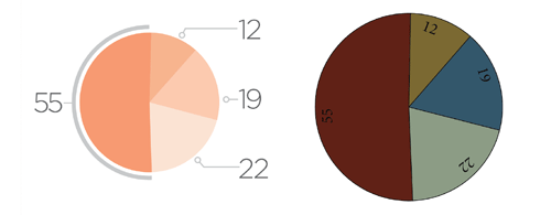
Figure 14. The DOs (left) and the DON’Ts (right) of chart and graph construction. Clear, concise, and simple construction creates an effective, impactful chart.
DO:
- Place the type in a consistent manner on the chart
- Keep things in alignment
- Use consistent spacing data or callouts
- Create contrast between the data and chart
- Tone down or tint back anything is that is not immediately relevant to reading the data
DON’T:
- Place type partially over a chart or graph
- Try to wedge information into a pie shape (have a callout off to the side instead)
- Put too much into a chart, especially a pie chart
- Use more than 5 colors (try 3 colors and use tints)
- Use elaborate or decorative typefaces
Lines, arrows, and callouts
To locate the data points or emphasize a callout, solid lines should be your default. Solid lines, by nature, can be diversionary and separating. Just remember that lines are not the most important part of a chart or graph; they are supportive. A huge pet peeve of mine is seeing arrows on a chart, pointing to a location and having a value there. If you’ve made a good chart, you won’t have to hit the reader over the head with clumsy gestures like this.
Lines have many styles; dotted, dashed, encompassing, suggestive. They do not need to touch the chart or graph exactly where the focus should be. Instead, lines can suggest or guide the viewer gently and directly into the data. Arrowheads on lines can be replaced with dots, circles, squares, or perpendicular lines to better support the style of the chart or graph (Figure 15).

Figure 15. Lines can be supportive, encompassing, or suggestive. Data can be emphasized or separated by suggestion rather than by strong division or strong impact.
Remember that you can often get more out of a chart by converting it to paths and editing it manually (Figure 16).

Figure 16. Charts and graphs created in Illustrator or InDesign may not be the most impactful design. Editing a chart further (center and right) breaks it from the data but lets you make it visually more engaging, cleaner, and more effective at supporting the story.
Accessibility Issues
Creating a design that breaks from the original chart or graph data can be a problematic issue if the final presentation or PDF is for general consumption. Accessibility issues (also called 508 compliance in the U.S.) can arise when creating a visually impactful design that is not accessible to people with disabilities. A chart or graph that is still in its native form can provide the end user with a description based on the underlying data. Once a chart or graph is broken out from its original creation and edited, the active type and data may no longer translate or be readable. In these cases, metadata would have to be manually added to the image to describe the chart or graph to the end user. For much more on adding these kinds of Alt tags and creating accessible PDFs, see Issue #46.
Enjoy the Process
Today’s viewer and consumer of content spends less time reading and gathers more information by viewing images. Pushing the design of your charts and graphs can make them more impactful and engaging—and offer you the chance to have fun and be creative in the process. Representing data in charts, graphs, and infographics can be time consuming. But there are third-party plug-ins, scripts, and tricks for InDesign that can take a lot of the pain out of graph making.
Commenting is easier and faster when you're logged in!

Recommended for you

InDesign Magazine Issue 145: Designing with Gradients
Issue 145 has articles on designing with gradients, page numbering, InDesign's h...

InDesign Magazine Issue 149: The Accessibility Issue
Issue 149 has articles on Tools and Services for Accessibility, Accessible Color...

Exporting Graphics From InDesign
How to export graphics for websites, PowerPoint, or Word documents efficiently f...