
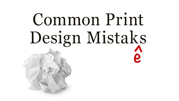
With the current emphasis on digital media many graphic designers are overlooking some gaps in their print design education and workflow. As a result print production artists are having to correct more simple mistakes and oversights in the print design work they receive. And while more graphic designers are proficient at programs like Adobe Illustrator and InDesign, simple production techniques like the appropriate use of CMYK color, are beyond them.
Logo designers and those designing graphic tees or print patterns today don’t necessarily know how (or when) to use spot colors, or why we use the Pantone color libraries. This is why despite all the resources available for designers online that many art directors and creative agencies still value a formal design education and background. Understanding these few basic ideas will help you avoid making fundamental mistakes that can be costly and drive a print service provider crazy.
PPI and Print Resolution
Understanding the appropriate resolution of pixel-based images in pixels per inch (or PPI) for print jobs is still something many designers struggle with. First, don’t confuse PPI with DPI, which stands for dots per inch, and is a measure of the capabilities of an print output device. When it comes to resolution, it is not as simple as using 300 PPI for print and 72 PPI for web work. All print jobs are not the same. Different jobs will be printed with different hardware on different materials and different types of paper and stock, so they will have different requirements. 300 PPI is overkill for your at home printer and typical paper, 120 or 150 PPI would be more appropriate and will often yield better results. This level of PPI is what is typically used for newspaper print. Images destined for magazines can use anything from 300 PPI to as much as 600 PPI, depending on the material the magazine is being printed on. And don’t assume that all parts of a job are the same. The cover might be printed in 600 PPI where is the interior pages (with the exception of gatefolds) might be printed at 300 PPI. Understanding different types of print media and their requirements is extremely important and something that is overlooked by far too many designers today. When in doubt, check with your print service provider. For more information, check out Lesa Snider’s article The Truth About Resolution.
Total Ink Coverage for Various Materials in Print Design
Total ink coverage (also known as total area coverage) has to do with how different types of paper material absorb ink. For example, printing a photo in a newspaper will require a different amount ink than printing that same photo on card stock or coated paper. Use too much ink (or too little), and your job will not look as good as it should. Total ink is determined by the overall combined values of all inks being used, (e.g. cyan, magenta, yellow, and key or process black). To learn how to reduce the total ink in a CMYK Photoshop document, check out Bart Van de Wiele’s article on the subject. Again, consult your print service provider to find out what the ink limit is for your job, so that you can adjust your designs appropriately.
Converting Fonts to Outlines
Whether or not you should convert fonts to outlines when sending a job to a printer has been a controversial topic. Converting to outlines is a way of freezing the appearance of text, so no unexpected changes will occur after the file leaves your hands. But in most cases, like when you’re sending a PDF to your printer, it’s completely unnecessary. If you’re using Adobe InDesign, the fonts are embedded and subsetted in the PDF by default, so there should be no problems with font substitution, missing characters, etc. However, there are certain instances when you may be required to convert fonts to outlines. If that happens, be sure to check out articles like Converting Text to Outlines the Right Way at InDesignSecrets.
Printers Marks and Bleeds
Understanding how to appropriately use printers marks when required and how to add the proper amount of bleed is extremely important. However, as many graphic designers use local print shops or even office-supply stores for the printing, they never learn what printers marks are or what they mean. Many smaller printers cannot handle complicated print jobs such as diecut or even regular bleed, and as a result some graphic designers never get any experience with these type of print jobs. When confronted with the request like this from a new client they will find themselves scrambling through Wikipedia and YouTube, or trying to remember the one week they might’ve spent on it in college, so that they don’t turn down the assignment. It’s actually very easy to add marks in most apps. For example in Photoshop CC 2014, you can find the options for controlling marks and bleed in the Print Settings dialog box.

Print Isn’t Dead
A lot of these techniques may not seem that important considering all the rhetoric about the death of print and how engaged we are in digital platforms. But print design is far from dead. It is alive and well and is more accessible to the average everyday consumer than ever before. There’s also a growing demand for good print design because of the boom in entrepreneurship, freelancing, and side jobs.
With this in mind, it is important that the standards of good print design be maintained and graphic designers strive to educate themselves as much about print media as possible. By addressing some of the common mistakes discussed above, designers can deliver better results to a larger range of clients and demonstrate the value of the print experience for a brand.
This article was last modified on January 23, 2015
This article was first published on January 23, 2015
Commenting is easier and faster when you're logged in!

Recommended for you
Gifts for (or from) Type Lovers
Get your holiday shopping started with Ilene Strizver's gift list of type-relate...

Using Edit Original and Edit With in InDesign
Sign up for the InDesign tip of the week to get a new tip, roundups of new artic...

Move Pasteboard Items to Current Spread
Editor’s note: The scripts mentioned in this article still work in InDesig...