
Classic Concert Posters Reimagined
With the tools in your design toolbox, and some inspiration from iconic artists, you can create posters that rock.


This article appears in Issue 64 of InDesign Magazine.
Many a graphic designer’s introduction to the profession has been through the design of music flyers: advertising gigs for your own band or for your friends’ was a way to keep down costs, but more importantly to convey the band’s aesthetic beyond the music. Long before the term “branding” was thrown around, the look of the poster conveyed the style of the band. For this article, I have recreated/mashed up four different posters, each reflecting a different design style and musical genre and raising unique issues. I know this is InDesign Magazine, but in this age of the Creative Cloud, for many of us, it’s becoming all just one big toolbox. Of course, there are certain tasks for which InDesign is not well suited. For that reason, I’m using Illustrator (with some help from Photoshop) to create effects that aren’t easily achievable in InDesign. But don’t worry, even if you’re not a seasoned pro in these apps, you’ll be able to follow along and produce these kinds of results in your own work. Now, sit back, put on some of your favorite tunes, and let’s see if we can pick up some good vibrations.
The Jimi Hendrix Poster
My first example is the poster for a Jimi Hendrix concert at London’s Royal Albert Hall (Figure 1). I began with a Google Image search, both to survey the variety of band flyers and posters and to find appropriate images to repurpose. 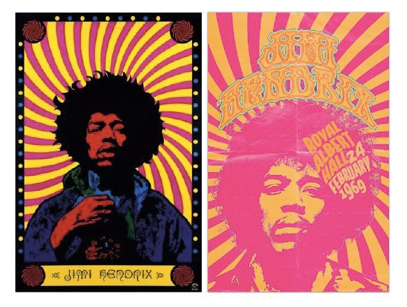 Figure 1: The original Hendrix poster and my “remixed” version. Not surprisingly, some images are far too low-resolution to use in print (and involve potential copyright infringements), so I need to change them significantly, both from a technical and a legal standpoint.
Choosing a color palette
While I like using Kuler to
create color palettes, in this instance I used a more expedient approach. I wanted the colors of the poster to be suggested by the cover for Axis: Bold as Love (the second Jimi Hendrix Experience studio album, released in 1967). I copied and pasted a low-res image of album cover art into Illustrator. Then I used the Image Trace panel (Window > Image Trace) in Color mode, to reduce the number of colors to nine (Figure 2). I expanded the result and made a Color Group of the selected artwork, checking the box to make the colors global for ease of editing thereafter.  Figure 2: Creating a color palette from an Image Trace result in Illustrator.
Creating the background
Buried among Photoshop’s custom shapes is a registration target—perfect for a psychedelic background (Figure 3). If you don’t see this shape, choose All from the widget at the top right of the Shape panel dropdown. I drew this—size doesn’t matter since it’s vector artwork—then copied and pasted it as an editable compound path into Illustrator, where I scaled it to cover the whole artboard.  Figure 3: The “psychedelic” background begins with a Photoshop custom shape. Next, I converted it to a Live Paint object, allowing me to color the individual segments. I used orange and magenta—colors of similar value that intentionally vibrate. I then applied a Stylize > Twist effect to make it even more groovy (Figure 4).
  Figure 4: Scaled to cover the whole artboard, and stylized with a Twist effect, the original shape is unrecognizable.
Vectorizing the image
For the Hendrix picture, I vectorized a low-res image in Illustrator. Image Trace can be a frustrating tool—it comes tantalizingly close to producing great results, but ultimately it gives you an image that screams “Image Trace.” For better results, prep the image first in Photoshop. Anything you can do to selectively adjust the contrast and mask elements you don’t need beforehand will save time. For this particular image (Figure 5), I masked the background, and applied an Unsharp Mask filter to accentuate edge detail. Then I increased the contrast using a Levels adjustment layer and painted in selective contrast on a Dodge and Burn layer filled with neutral gray in the Overlay blend mode (painting with white at low opacity to lighten the image beneath and in black to darken). The result may look crude, but all I’m concerned with is how Image Trace will interpret the pixels. Using a Black and White trace, anything darker than 50% becomes black, anything lighter turns white. I want a result that’s as simple—and as iconic—as possible, while still conveying the essence of the portrait.  Figure 5: The low-res screen capture is prepped in Photoshop with a mask and contrast adjustment. This can then be image-traced in Illustrator and filled with color. Links work the same in Illustrator as in InDesign, so I can go back and forth to adjust the result: place the image, apply Image Trace; then, as necessary, I can edit the image in Photoshop to make adjustments based on what I see. Photoshop offers far more control over the contrast than the Image Trace controls—I want to use these, but only after I’ve adjusted the contrast to get it as close as possible to what I want. For the Image Trace settings, in the Advanced options, I moved the Paths slider to the right for a more accurate trace, and chose Ignore White, so that the negative space is not drawn as a vector object (Figure 6). This meant that I needed to add a solid shape behind the face detail, because having the background show through is distracting.
 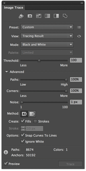 Figure 6: Advanced options in the Image Trace dialog box give you much more control over the final results.
Adding the type
When browsing typefaces for the Jimi Hendrix poster, it’s hard to overlook one that’s actually called Hendrix. Wary of falling into the novelty font trap, after trialling some others, I think it’s the best for the job. “Hendrix” is available from fontcraft.com for $18. You can download a trial version from dafont.com. Illustrator has excellent features for working with display type, including the ability to add multiple strokes to live type through the Appearance panel (Figure 7).  Figure 7: Illustrator offers more features than InDesign for creating effects with live text, including multiple strokes to text and for warping. And then there’s the ability to apply warping to the text (Photoshop has the same 15 warp styles). These canned styles are just the starting point. Thereafter, you can customize the warp using the Mesh tool, pulling the individual nodes to shape your type like Silly Putty, adding or subtracting nodes as necessary, which is essentially what I did with the venue and date text. And all the while, the text remains editable. That said, there’s no point in fetishizing “live text”—ultimately there’s more flexibility with the rotation and scale of individual letters if you convert the type to outlines (Type > Create Outlines or Command/Ctrl+Shift+O). Just get it as close as possible in its still-editable state before you commit.
Adding the texture
To finish the piece, I added texture in the form of some folds and creases to “age” the poster. This is easier in Illustrator or Photoshop than in InDesign. While Photoshop allows more flexibility, I prefer to keep the whole composition in Illustrator. For that reason, I placed the texture on an Opacity Mask layer in Illustrator (Figure 8).  Figure 8: Using an Opacity Mask to add texture to the composition. This may seem confusing at first, but after a few goes, it makes sense. Here are the steps: Open the texture in Photoshop (I used files from texturepalace.com). Because we only need the gray values, I converted the file to grayscale and increased the contrast with a Levels Adjustment layer. In order to retain the layers, I saved it as a .psd file. For the texture to apply to the whole composition, you’ll need all the artwork on one layer. Organize the individual elements into logical groupings, naming each group, and then make a master group of everything: you can drill down to the sublayers to manage the artwork thereafter. Target the layer, and then, in the Transparency panel, click Make Mask. This will create a mask that is black: deselect the Clip option to revert it to white. With the mask thumbnail selected (it will have an orange border), place the texture file and size as necessary. If you need to adjust the contrast of the texture, use the Links panel to edit the texture in Photoshop, and then update the link. The other three posters applied similar techniques—to avoid repetition, I’ll only discuss the differences.
The Johnny Cash Poster
The Johnny Cash poster is a reworking of a Hatch Show Print poster (Figure 9). Hatch Show Print is a letterpress studio based in Nashville, TN since the later nineteenth century and famous for their country music posters. They have designed many Johnny Cash posters, so the style felt appropriate.  Figure 9: My inspiration: the Hatch Show Print poster
Stylizing the guitar
Starting with an image of a Martin guitar (which the Internet informs me was Cash’s favored brand), I converted it to a line drawing in Photoshop. First, I converted the layer to a Smart Object, applied the Pixelate > Fragment filter, and then changed the filter blending mode to Divide. I stumbled on this trick a couple of years ago—I don’t know why it works, but it usually does (Figure 10).  Figure 10: The original guitar picture and the “line art” version created in Photoshop. I placed the image in Illustrator and applied Image Trace. After expanding the result, I scaled the vectors and rotated as necessary. I copied the interior portion, joined the open endpoints, and filled with red. The blending mode is set to Multiply at 90% so that it combines with the yellow stars beneath. The poster’s border is roughed with the Warp tool.
The Pink Floyd Poster
This one is inspired by the famous 1955 Beethoven poster by Joseph Müller-Brockmann and also by the “Op Art” poster commemorating an early Pink Floyd concert (Figure 11).  Figure 11: My inspiration: Joseph Müller-Brockmann’s Beethoven poster and the Op Art interpretation of Floyd’s famous Live at Pompeii. Illustrator’s Polar Grid tool makes this easy. Draw a polar grid, holding the Shift key to constrain it to a perfect circle. As you do so, tap the right/left arrow key to increase or decrease the number of radial dividers, and the up/down arrow key to increase/decrease the number of concentric dividers. Position the center of the polar grid at the bottom left of the artboard—much of it will spill over onto the pasteboard. Apply no fill and no stroke to the grid, and then use the Live Paint tool to convert it to a Live Paint Object. As such, you can mouse over and fill the individual segments to your liking (Figure 12).
  Figure 12: Using Illustrator’s Polar Grid tool.
The Clash Poster
For the Clash poster, I wanted a low-fi photocopied look—as suggested by the image in Figure 13, which I think (though I’m not certain) is an authentic flyer advertising one of their 1978 concerts (diehard Clash fans among you will note that my picture is later than 1978, but hey, it’s just an example).  Figure 13: My source material: the original 1978 flyer and a band photo. For a photocopied look, I increased the contrast of the picture in Photoshop, placed it in Illustrator, added a clipping path to reveal the individual band member, and then copied this three times, adjusting the clipping path as necessary. The obvious filter choice would be Photocopy, but this gave a result that was too outlined, so I used Stamp instead, making sure I had chosen Black as my fill color (Figure 14).
  Figure 14: Illustrator’s Stamp effect is the key to creating the photocopied texture in the Clash poster. Applying Photoshop filters in Illustrator can significantly slow your computer’s performance. Had I known in advance that this is what I wanted, I would have applied the filters in Photoshop, but because I was still at the “working it out” stage, I chose to do this in Illustrator. As with other examples, it is the use of a texture, applied as an Opacity Mask, that brings the piece to life.
Distressing the type
To introduce imperfections to the type, I used Illustrator’s Touch Type tool. This allowed me to make the baselines slightly uneven—the way they might look with press type. Finally, I added Opacity Masks to the type layers and painted on these in black to blunt the ends of the letters (Figure 15).  Figure 15: Using the Touch Type tool and painting on an Opacity Mask to add imperfections to the type.
Conclusion
These four examples span a range of styles: psychedelic, letterpress, Swiss modern, and punk/DIY. It’s informative and lots of fun to re-create these styles with the tools we have today. If you’re looking for a challenge between your day-to-day bread and butter work, consider dipping into the back catalog of music or theatre posters and recreate or remix them—you’ll be surprised at how much you learn along the way.
Commenting is easier and faster when you're logged in!

Recommended for you
Creating a Blend Mode Test Layer in Photoshop
Blending Modes use a top layer to change the appearance of the layer, or layers...

CreativePro Video: Using Illustrator’s Shaper Tool
In this week’s CreativePro video, Michael Ninness demonstrates the power of Illu...

Illustrator Downloadable: Art Deco Borders and Brushes
Custom patterns and brushes to add a sleek and swanky style to your designs