
Choosing Type for Digital Documents
Nigel French shares his best advice for using type effectively in PDF, DPS, and other onscreen documents.


This article appears in Issue 60 of InDesign Magazine.
If you’re like most InDesign users, you set type for both print and on-screen viewing—it’s rarely just one or the other anymore. For some of us, creating digital publications may be all we do. But the tricks and techniques we use are derived from traditional scenarios of print on paper, rather than pixels on screens, and the “rules” of typography were written long before anyone had swiped on an iPad. So what adjustments and accommodations, if any, should we make when designing digital documents? I should point out that I’m not talking about type for websites or EPUBs, where readers can scale text to larger or smaller sizes and reflow content (although many of the same considerations apply). Instead, I’m specifically concerned about type for PDF documents or tablet editions created with DPS, or rivals like Twixl, AppStudio, or Aquafadas—where the type size is fixed, or if it can be magnified, where the content does not reflow. Thankfully, there are more commonalities with print typography than there are differences. All that common sense stuff about readability still applies. But when designing for on-screen viewing, there are some special considerations.
Type Size
To start with, there is the reading distance. The further away your body text, the bigger the text needs to be. Reading distance on a desktop or laptop computer doesn’t vary much, but with an iPad it can vary significantly. You might use your tablet on the desk, on your knee, on the sofa, or in front of your face on a crowded train. This means a variety of reading distances, some of them greater than the reading distance of a typical printed newspaper or magazine. In order to make the type readable in all instances, the furthest reading distance should define the
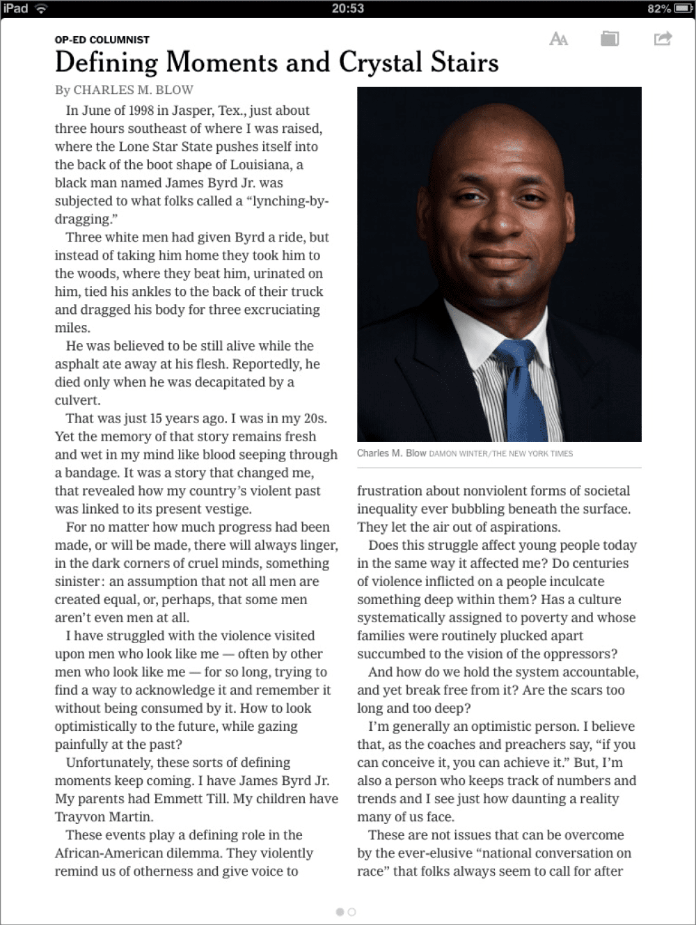
type size, and in particular the body text size. Then there’s the issue of resolution. At present, it’s still fair to say that, all things being equal, a backlit screen with type rendered as pixels—even a Retina or HiDPI display—is harder to read than a clean piece of paper crisply printed with ink. Granted, the convenience and flexibility of a tablet may outweigh this disadvantage, but the resolution of paper is still higher than the screen resolution. The greater reading distance and lower resolution of our tablets mean that screen type should be set bigger than print type. With a larger size come more pixels, and more pixels produce the illusion of higher resolution. Digital magazines and newspapers (those specifically designed for tablet reading rather than those merely repurposed from their print versions) use a body copy size of 16 to 20 pixels, with a leading value of anywhere between +3 and +6 pixels, depending on the properties of the typeface and the width of the column (Figure 1).

Figure 1: Type viewed at actual size on an iPad
Type Choice
When choosing body copy for digital publications, you’re essentially after the same qualities of readability that you want in print:
- Choose a high x-height, open counters, a medium weight, easily discernible figures, and not too much modulation between the thick and thin parts of the stroke.
- Just as you would in print, avoid typefaces that are too heavy, as they have a tendency to fill in and block up (for example, a lowercase i in bold sans serifs has a tendency to look like an l).
- Avoid modern faces like Bodoni, as the contrast between thick and thin parts of the stroke can be hard going for extended reading.
If your project is both screen- and print-based, consider choosing a typeface family that works both in print and on screen to help provide a consistent experience. No matter how readers access the content, there is instant brand recognition. Note that standardizing your type usage across media may not necessarily be well received by your established audience, as IKEA found when they “fired” Futura in favor of Verdana in their print catalog. Choosing a typeface designed specifically for screen is a logical place to start. Readability studies have found Matthew Carter’s Verdana and Georgia to be more legible than fellow system fonts Arial or Times New Roman because of their higher x-heights. But with screen and font technologies improving all the time, studies of readability of type on screen age like dogs. Verdana and Georgia may be legible, but after more than a decade of having little else to choose from, they are overexposed, and can look like default choices. A high x-height may be important, but it shouldn’t overshadow other considerations. To revisit David Carson’s maxim from the 1990s: Don’t mistake legibility with communication. Nevertheless, the essential point of those studies remains valid: typefaces with larger x-heights use more pixels for the x-height region of the font, and more pixels equates to higher resolution, which in turn means greater legibility. Today, Adobe Typekit allows us to think beyond Verdana and Georgia (Figure 2).
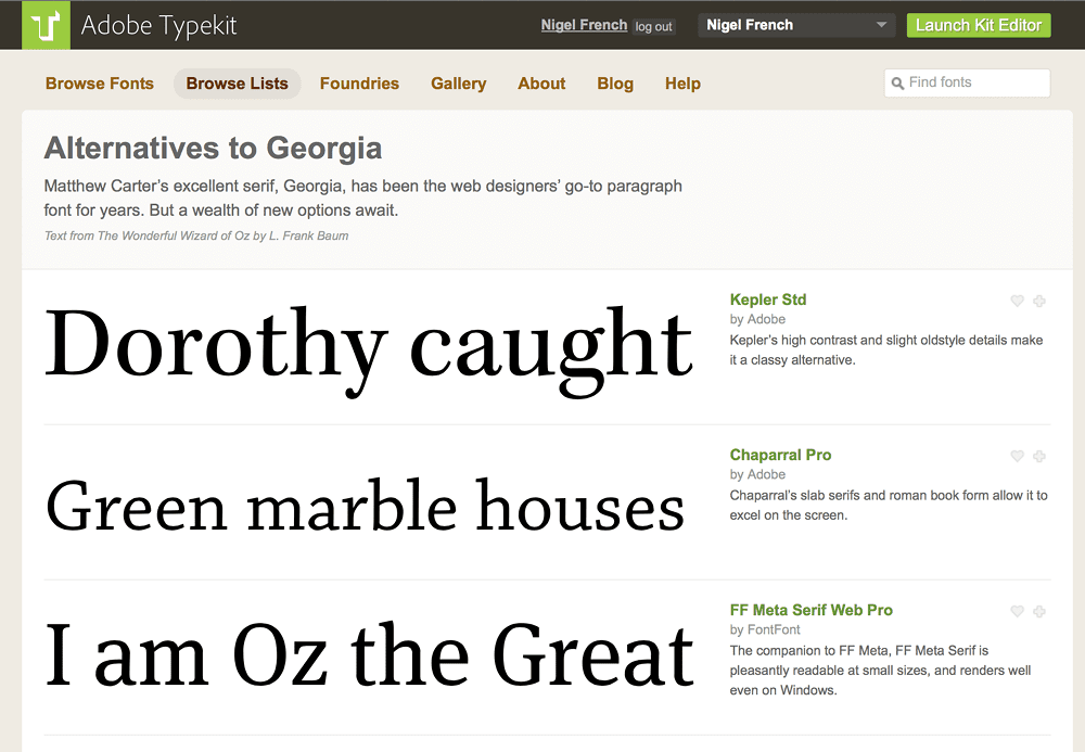
Figure 2: Typekit allows us to think beyond Verdana and Georgia; it even provides a page of alternatives.

Figure 3: The Properties filters in Typekit
Serif vs. Sans
The age-old question “Which are more readable: serif or sans serif?” is worth revisiting in the context of screen typography. At sizes below 12 point (practically speaking, credits and captions) serif typefaces can be blurred by anti-aliasing, the process by which details, especially curves and diagonals, are smoothly rendered in pixels. For this reason, it’s broadly true that sans serifs work better at small sizes on screen. They are simpler and tend to be more mono weight, with less modulation between the thin and thick parts of the letterforms. But above 12 points, it’s less about whether the font is serif or sans serif, and more about making informed choices. If your typeface has the right properties, there’s no reason why a serif typeface can’t perform as well as a sans serif.
Letterspacing
Because pixels tend to mush the edges of letters, type on screen benefits from a more generous letterspacing or tracking than you would apply to type in print. Exactly how much more depends on your personal preference—as a starting point, add between +3 and +5% to the letterspacing values you use for print. You can set this in the Justification settings that are part of the Paragraph Style options.
Contrast
In print, the combination of black ink on white or off-white paper makes a lot of sense: common sense, economic sense, and technological sense. On screen, even though color doesn’t cost a penny more, black text on a white background remains a combination that’s hard to improve upon. But because tablets have a stronger contrast than paper, many designers favor a dark gray/light gray combination—with type at 80% to 90% on a background that is anywhere from 2% to 10% gray.
Putting it to the Test
Let’s take a look at the type specs used by some critically acclaimed Newsstand publications. Note that these specifications are approximations; I’ve derived these figures simply by trying to replicate them. Some of the typefaces shown are proprietary, but I am concerned here with relationship between the size, leading, and column width.
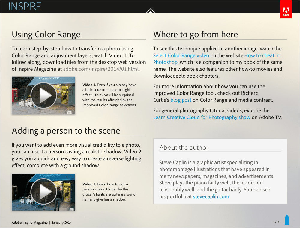
Adobe Inspire:
point size: 19 leading: 23 column width: 451 pixels
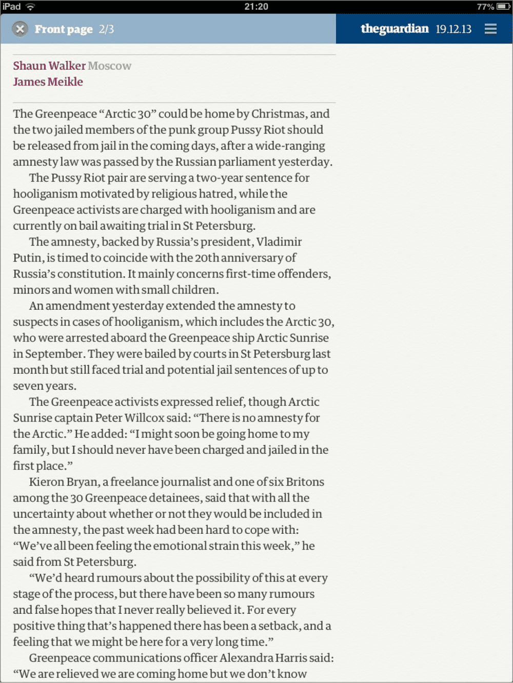
The Guardian:
point size: 18 leading: 24 column width: 480 pixels
National Geographic:
point size: 18 leading: 24 column width: 574 pixels

Wired:
point size: 20 leading: 26 column width: 594 pixels
Martha Stewart Living:
point size: 17.5 leading: 21 column width: 348 pixels
New York Times:
point size: 17 leading: 20 column width: 316 pixels
At the End of the Day
Reading on a tablet is different from reading type on a printed page, but not so different. The biggest adjustment print designers need to make is getting used to making the body copy so big. Beyond that, it’s just a matter of melding the traditional, common-sense rules of good typography with an understanding of the specific qualities of pixels and screens versus those of print and paper.
Commenting is easier and faster when you're logged in!

Recommended for you

Variable Fonts: the Future is (almost) Here!
Ever since the demise of hot metal typesetting and the eventual rise of digital...

TypeTalk: Answers to Your Type Questions
TypeTalk is a monthly question-and-answer column on typography. You ask, and not...

InType: Making Text Fit
When you have too much text to fit a given space and editing is not an option, u...